8

We've recently launched a redesign of a popular forum, and a lot of users are stating that the redesign is now too bright for them to read, which is obviously not good for a forum.

Here's a typical post and a screen shot of the site:
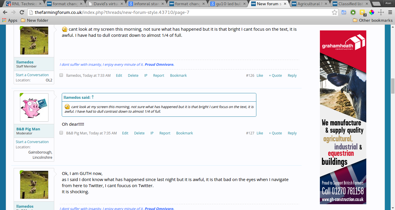
enter image description here

Large version

We deliberately made sure that we didn't deviate too much from the old site, for instance the white in the background is the same white as the old site, and we made the text darker. We did make the font black, and change it to open sans, but I would have expected this would have improved the experience of the site not dampened it? The only other thing that changed is the blue around the site, which I'm wondering is making the site feel brighter?

Are there any tips to make a site feel less bright or improve the legibility?

I've gone through these related questions:

And the one thing I have changed from that screen shot is to stop using pure black and use a softer shade instead.

6
  • 3
    I am curious to see an actual screenshot of what it looked like before. Commented Jan 24, 2015 at 13:01
  • 1
    this xenforo.com/community :) that's not the site in question but that's the stock theme we were using. Commented Jan 24, 2015 at 13:02
  • 1
    Welcome to the site, @Alan! Your first link was broken, so I've redirected it to what I thought you meant to point at. If you meant to point at some other article, feel free to fix it. +1 for a concrete, answerable, researched question. Commented Jan 24, 2015 at 17:30
  • Established online communities hate change. This isn't necessarily a sign that your design is any better/worse than before. It's more of a sign that the change process wasn't maybe managed as well as it could have been with the members of the site.
    – DA01
    Commented Jan 24, 2015 at 19:25
  • 2
    The old theme was a tad bit gray (rgb(252, 252, 255)). Try darkening it to an off white... Commented Jan 24, 2015 at 21:09

4 Answers 4

7

Contrary to the other answers in here, I'd say there's nothing particularly wrong about your site's color choices.

We spend all day looking at light backgrounds and dark text (MS Word, StackExhcange, lots of IDEs, etc.)

I have a hunch people aren't complaining about the colors on your site. They're complaining that you changed the design of their site. 'Their' site is the key factor here. Any succesful online community will include a large member population that feel that this is 'their' site. And this is justified. And no one likes it when someone comes and changes the design of your site.

My guess is that they're more upset about change--not what the change is specifically. In the future, be sure to manage change when you have a large online community. Make sure people are aware of what's coming. Open up beta access. Etc.

At this point, compromise. Lighten the text slightly and/or darken the background slightly. Make it feel like their complaints were heard and some change was made in response to them.

1
  • I think there might have been some of this, we were lucky in that our members really helped, and we were able to listen and iterate quickly on the things which the majority were saying needed fixing. :) It's been a good learning experience for me :) Commented Jan 24, 2015 at 20:51
6

What causes the issue is staring at a very bright background continuously. This causes the cells at your retina to get tired, which makes reading almost impossible.

There are two fixes:

  1. Avoid using large very bright backgrounds (duh!). Any large surface should be something other than bright white.
  2. Variation. The issue is not really caused by something being too bright. (As you said you used the same white.) It is caused by the users only looking at something with a bright background all the time. There should be darker surfaces people look at, so the eyes can rest. Large images, titles with colored backgrounds, sidebars... doesn't really matter what as long as it is something people spend time looking at, so that they do not spend all their time looking at something bright. Optimal for reading might be making the font very large, as that would give your retina lots of variation and proper average brightness, but it isn't really usually practical. You can also give the background subtle low contrast texture.
14
  • I really like the subtle texture idea, I might well give that a go. Also as you state I think the site is "cleaner" now than it was, and because we have less dark patches that could be causing fatigue, another thing to investigate. Thank you :) Commented Jan 24, 2015 at 14:33
  • 1
    Do you have citations for this ("cells in your retina getting tired")? It goes against most everything modern GUIs provide (we spend most of our day staring at bright backgrounds with dark text)
    – DA01
    Commented Jan 24, 2015 at 19:26
  • 2
    Aren't we looking at a white background with dark text right now as we read your answer?
    – Dane
    Commented Jan 24, 2015 at 21:01
  • 2
    In fact, it is not about contrast or even brightness. It is too much white, which contains all colors and stimulates all photoreceptors, all the time. Commented Jan 24, 2015 at 21:43
  • 1
    @VilleNiemi It's all very interesting science, but I don't know that it really fits the context of the question. Again, this isn't something out of the ordinary. Most modern GUI's have rather bright backgrounds and rather dark text--not to mention that most printed content is exactly the same.
    – DA01
    Commented Jan 25, 2015 at 1:59
3

It looks like you have improved the UI that it is actually more readable now than before. You have changed from serif font to sans-serif which increases readability on screens. The factors that effect readability are the following:

  • Choosing a legible font

  • With legible font size

  • Sufficient contrast

  • The right length of lines

  • Distinct sections

Reference: Impact of Fonts and Readability on Conversion

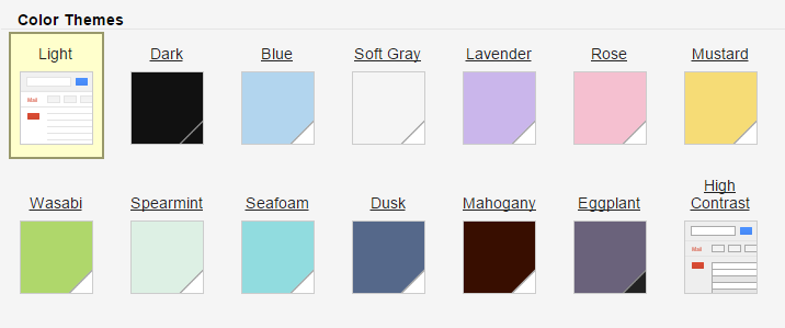
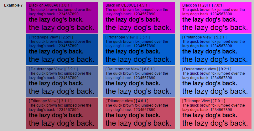
But maybe your complaining users expected something else. Maybe they want the ability to change the UI themself using diffent themes on the site which, if you are signed in, can be managed under a settings menu. There are a lot to chose from when it comes to readability and color schemes. It doesn't have to be black on white. The following is a colorful example (even if I wouldn't chose them) of black text on colorful backgrounds that all passes contast ratio in order to be readable.

enter image description here

Ref: Black Text on Colors that just pass at several contrast ratios

More examples are found in Google's GMail app theme settings

enter image description here

That's just a few ideas that comes to mind. Another way would be to simply ask your users in a survey what they think of your brand new design, and what they feel are missing...

2
  • This is a great answer :) Thank you! I think we should do a poll, we've certainly had a lot of discussion take place about the redesign which helped us get to where we are now. Commented Jan 24, 2015 at 13:51
  • @AlanHollis Your Welcome! It's never wrong to ask your users :-) Commented Jan 24, 2015 at 14:48
2

I think what could be happening is that combined with the change from serif to san-serif and the use of quite a black font on a virtually white background is causing a ghosting contrast problem especially when moving on to sites with quite a light font.

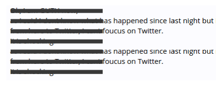
The sans-serif font results overall in more ink on the page because the strokes are a constant width, so the 'squint' effect is of a very dark grey. These examples are as a guide, but here's the sort of squint effect you might see (on the left):

enter image description here

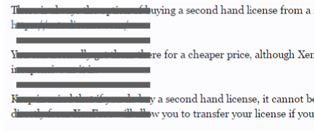
Meanwhile, the serif font results overall in less ink on the page because there's thin strokes in the detail and so the 'squint' effect is of a mid to dark grey.

enter image description here

When you read text which is quite dark and it's against a very light background, when you look away at another light area, you see a set of ghost lines - something like this:

enter image description here

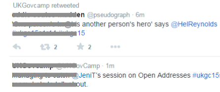
Now Twitter has an even lighter font, although it is sans serif, so the overall squint effect might be like this:

enter image description here

Now - notice that Twitter has a different line spacing to your forum.

So if someone reads your site for a while and then switches to Twitter

  • a) They're already getting eye strain from the high contrast
  • b) The ghost effect is greater
  • c) The line spacing is different
  • d) The font colour on Twitter is lighter

The result is that many factors are falling into place for there to be a rather nasty interference pattern which takes some time for the eye to adjust to whilst the ghost effect fades away.

enter image description here

Depending on where you look, the interference pattern may be reduced or compounded, resulting in a kind of swimming effect making it hard to focus on some areas.

Hard to say this is definitely the problem, but there's a good chance this is at least not helping the situation!

See @BennySkogbergs answer for the rest of the story :)

3
  • Your 'squint effect' has validity, but really has little-to-nothing to do with serif vs. sans. It has to do with the actual color of the text. In your sample screens, font smoothing is simply rendering the serif faces lighter.
    – DA01
    Commented Jan 24, 2015 at 19:31
  • @DA01 well there is more font smoothing going on in a serif font, resulting in an overall lighter effect, even if the actual font colour is the same. Plus there may just be less pixels covered. Commented Jan 24, 2015 at 19:44
  • @DA01 This is an interesting question: Could I save printer's ink/toner by changing the font? Commented Jan 24, 2015 at 19:59

Your Answer

By clicking “Post Your Answer”, you agree to our terms of service and acknowledge you have read our privacy policy.

Not the answer you're looking for? Browse other questions tagged or ask your own question.