5

I am designing a business web based application for professional users. I have doubts where to best place filters and navigation bar.

ATM we placed the navigation bar to the left - ultimately we are expecting to have a large number of navigation links in it arranged according to a business hierarchy. We have also talked to our users and they prefer the (collapsible) left hand side navigation.

But I am not sure where to place the filters - problem is that users are also expected to be filtering quite a lot. In additionthe number of fields / conditions may also be quite large in certain cases.

We have two options:

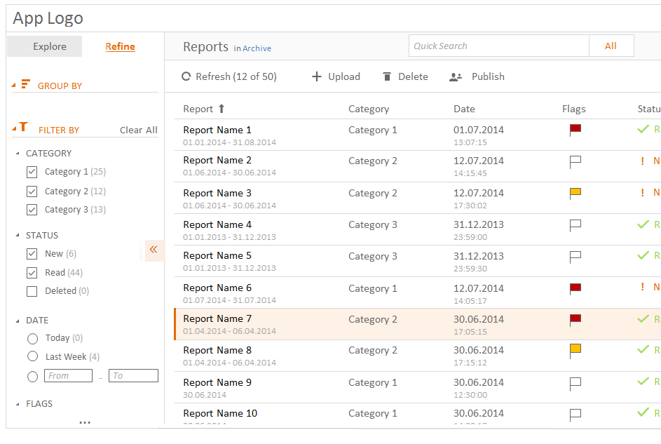
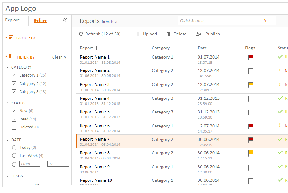
  1. Place the filters (Refine sub-tab) on the left hand bar as well - when clicked it would show the typical fields on which to filter + options to setup more filters.

  2. Place the filters (Refine icon) in the top right corner - when clicked, an additional panel would expand where the filters could be setup. If set, the filters would show at the top of the screen as s series of "tags".

Both options have drawbacks & benefits.

Filters on the left allow for better filters presentation and less clicks - but switching between "Explore" and "Refine" sub tabs might be confusing.

Filters at the top eliminate the navigation confusion but but the interactions required to set them up require more clicking. In addiiton the (sometimes) narrow screen coupled with a large number of filters may cause stacking and not as good presentation.

I am curious which option do you think would be best?
1. Nav + Filters on the left

2. Nav on the left, Filters on top

4
  • Are there a limited amout of "view groups"? Commented Jan 14, 2015 at 14:56
  • Theoretically no. In practice I would expect to have max 8 maybe 10.
    – Odie
    Commented Jan 14, 2015 at 15:57
  • Would the users really need to use them at the same time? (I mean, click something in the explore tab, then click something in the filter, and then immediately go back to the explore tab, or is it like more like: click something in the explore tab, then make a lot of filtering and when finishing maybe go back to the explore tab )? Commented Jan 14, 2015 at 16:01
  • I would imagine the latter - i.e. select the view, click something on filter, stay a while on the view, maybe re-filter, maybe drill down to details (click on a record) etc. Definitely not select view - filter - select another view in a quick succession.
    – Odie
    Commented Jan 14, 2015 at 16:07

1 Answer 1

1

According to the comments about what would be the common use:

select the view,
click something on filter,
stay a while on the view, maybe re-filter,
maybe drill down to details (click on a record) etc.

Definitely not select view - filter - select another view in a quick succession.

I would suggest the first option => Left. Reasons:

  1. Flow: From left to right, you can easily explore => then make some filtering and then get the results.

  2. Common use: Most of the pages that use filtering place them on the left, so users are used to that, resulting more intuitive.

  3. "Visual load": By placing everything in the same section you avoid populating the page, making the page cleaner and more pleasant to use.
  4. More space for showing data: I don't know about the resolution of your users but there's considerable number of people using resolutions close to 1024xSomething. I would prefer to consume "horizontal space" rather than vertical. Even if they have the option to collapse it, the data below it will move up and down.

Some advice:

  • Use color matching for tabs.
  • I like the collapse button to be in the position of this image, but it's just a personal preference, don't take it as a real advice. enter image description here

Your Answer

By clicking “Post Your Answer”, you agree to our terms of service and acknowledge you have read our privacy policy.

Not the answer you're looking for? Browse other questions tagged or ask your own question.