8

With a recent Chrome update, I now have a switch person button next to the three standard Window Title Buttons that are used all the time:

  • Minimize Window
  • Restore Window
  • Close Window

When Chrome is maximised this appears immediately between the 'new tab' and the 'minimise' buttons.

enter image description here

I have mis-clicked this button over and over again today, and I wonder, is it an acceptable user experience to place application specific buttons in this sacred area, which is always used for those same three actions?

Note: I'm not a desktop developer, so I know that Chrome may be hiding the Windows Title Bar entirely, and have replaced it with this faux-title bar, but the question is the same, because to the use that region with those three buttons is the same.

2
  • I wouldn't say it's off-limits from a programming perspective but rather that Chrome deliberately omitted the option to turn that icon off/on. I am with you in saying that it should not be there because Chrome is basically introducing a click-penalty in a location which did not have one before and that general area is used so frequently that they could have easily chosen a different location such as placing it to the left of the hamburger menu. Maybe they will change this in a future update.
    – MonkeyZeus
    Commented Dec 12, 2014 at 17:40
  • 1
    If you're looking for a short-term solution, it looks like I do not have that icon because I have no usernames saved in my Chrome browser. I just log into GMAIL through their login page because I am so archaic.
    – MonkeyZeus
    Commented Dec 12, 2014 at 17:42

3 Answers 3

6

I would say that putting an extra button there is generally a bad idea for the reasons you stated; you expect there to be just three buttons, and you accidentally click the "switch user" button a lot.

Now, here's why it is a bad idea:

  1. The Icon for switch user is fairly similar to the minimize Icon
  2. Switching users is probably used far less than minimize/maximize/close buttons and should be relegated to a menu option
2
  • Not sure when it happened, but pretty sure quite awhile ago, the "Switch User" icon/button got moved down to the area where the Extensions icons are located. Commented Jun 7, 2021 at 20:36
  • And almost 10 years later from my answer, Microsoft keeps putting more and more junk in the title bar for Word, Excel, etc. making me mouse much more to drag the window around without clicking on useless information details... Commented Mar 9, 2023 at 19:21
6

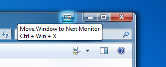
The only application I know which puts an additional button there is Display Fusion (a software to improve the experience with multi-monitor setups).

That extra button moves the window to the other monitor:

The extra button added by display fusion

In this case I would say this is appropriate since the associated action controls the window in a similar manner as the other buttons and I'm using it almost as frequently.

1

I've found that a lot of power users tend not to use the standard central restore button- perhaps the risk of accidentally hitting X is too great- and they instead like to make their windows bigger and smaller by double clicking on the windows bar- most usually in that top right corner due to there often being a myriad of options towards the left.

For these people I would imagine this button is a particular annoyance.

I think the key here is the golden rule of consistency, which, with this button trying to camouflage itself in with the standard eternally consistent 3 icons, is really broken pretty badly. True, there is at least a bit of a gap left between the new button and the minimise button, but if the developers really really had to feel the need to put something up there (which they shouldn't have) they should have differentiated it more.

I also have to doubt the utility of this option. In this day and age I'm sure most people have their own personal computer and don't have to share with other people. It strikes me that 'switch user' would be an option that comes up once a blue moon when Auntie Dorene is visiting and you don't want her stumbling on your unsavory web surfing habits whilst she checks the weather. i.e. its something that deserves to be hidden beneath a window somewhere, not a big flashy button to be casually clicked as part of standard every day computer use.

2
  • 1
    Regarding the note about double clicking the title bar to maximize/restore windows: the title bar is a much bigger click target than the restore button. Personally I prefer using WinKey+Up and WinKey+Down, but if my hand's already on the mouse then the title bar is the next most convenient target. Commented Dec 15, 2014 at 15:38
  • Wow! I've seen the keyboard shortcuts list a lot, but somehow didn't notice the WinKey + Up/Down arrow! I usually have a gazillion windows open so I'll find that handy. Commented Mar 9, 2023 at 19:17

Your Answer

By clicking “Post Your Answer”, you agree to our terms of service and acknowledge you have read our privacy policy.

Not the answer you're looking for? Browse other questions tagged or ask your own question.