3

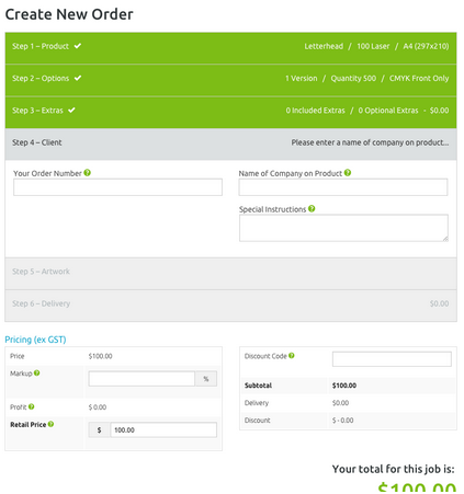
I have a web application that has a very large form. That form is split into several tabbed areas, which divide the entry of the data in to logical blocks.

I have a single submit button outside the tabbed content area.

On submit I need to show the user errors, which may quite likely be on tabs that are currently hidden.

  1. I need to highlight which tab contains errors
  2. I need to tell the user why a particular element has an error (required, formatting, etc)

Can anyone suggest a good way to approach this? One way would be to turn the tabbed form into a wizard, but on a very large form like this, it is useful to switch from one tab to another and then go back if you want to, without be forced to go through a next/previous style navigation.

0

2 Answers 2

2

1. Limit inputs to things that are required

It should be very clear to your users why they are being asked to input anything on a form. I assume you are already doing this and there are still just too many inputs that different users may want to use on your very large form. In that case, consider putting all required inputs up top and then grouping optional inputs in an advanced collapsible area that is hidden by default.

enter image description here

2. Provide real time validation on each input

There are very few cases where it makes sense to prevent a user from typing certain characters as they fill in an input field. Don't prevent invalid data from being entered but Do provide real time feedback so users know when the application is expecting something different.

enter image description here

3. Consider using vertical scrolling (accordion) instead of tabs

Horizontal tabs have limits and also suffer from having a universal order. In some cultures the far right tab is considered first but in no cultures is the item at the very bottom considered to be first or most important.

Vertical scrolling is preferred on touchscreens and even on desktops with mouse wheels, page down key, and other hardware that we have all become accustomed to.

enter image description here

0

Consider using "badges" on tabs with an error: http://getbootstrap.com/components/#badges

(Even if you're not using Bootstrap, the concept is still relevant.)

This is a very popular technique, used by many major websites and apps, to prompt users to click on something because they want to investigate what the unread message is. Of course, you'll want to color it appropriately to reinforce that it's an error (e.g. red). You can even add a tiny hint of animation to the badge to draw attention to it, although it needs to be subtle.

This technique will only be effective if all of the tabs are always visible at the top of the screen. If they are not, for example if they've scrolled down on the page, you may need something more aggressive. When they click the submit button, you can display a dialog box that says something along the lines of:

You have X entry errors on step X. Would you like to go there now?

(If there are multiple errors, you can start with the first one just to keep it from being overwhelming.) This is slightly more intrusive, but it gives them a convenient shortcut to jump to the error. And considering they've already clicked the submit button and they're expecting the form to submit, the dialog box won't be interrupting them while they're filling out the form.

I would still recommend the first, more subtle option (badges), and switch to the dialog box if user testing reveals that they simply aren't obvious enough.

Your Answer

By clicking “Post Your Answer”, you agree to our terms of service and acknowledge you have read our privacy policy.

Not the answer you're looking for? Browse other questions tagged or ask your own question.