4

I have a dynamic form consisting of a number of choices, where the user makes a choice at each point using a radio button (toggle implementation of radio button behaviour)

Depending on the choice the user makes for the first question, I would like to set the subsequent choices to a certain state, and disable them.

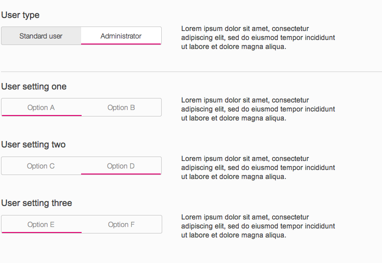
The concrete example is that when the user specifies that they are creating an Administrator user, I would like to disable the rest of the radio button controls, BUT leave them in place as I believe that they clearly communicate the choice the user has made, and the options that are available if the user changes their choice (from Admin to Standard user)

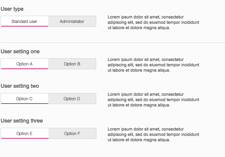
Adding a standard user All options are enabled when the user is adding a 'Standard user'
Adding an administrator - the controls are now disabled Options are pre-selected, but disabled when the user is adding an 'Administrator'
My first question is, is there anything wrong with the approach above?

I am being challenged on this, and the suggestion being made is that when the user selects 'Administrator', the buttons should be replaced with text explaining the state they are now in - see the next image. The main justification for the challenge is that 'we should not show controls the user can not interact with'.
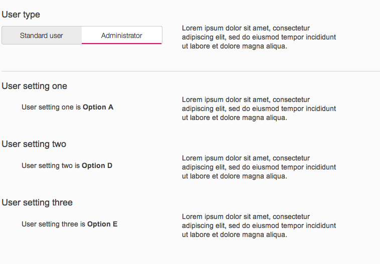
using copy to explain the disabled state

Now, I prefer my initial approach mainly for aesthatic reasons - it looks better, the design aligns better and there is no drastic change to the UI between selecting 'Standard user' and 'Administrator'.

My second question (assuming there is nothing wrong with my preferred approach) is how you would justify my approach? Any examples?

3
  • I found the first scenario confusing because of the way my eye has to jump around the place to take in the information. I understand scenario 2 better but it is still confusing. I'd be a fan of progressive disclosure and show more options on the select action
    – colmcq
    Commented Nov 18, 2014 at 10:10
  • All the scenarios use the same pattern, so you could say they are equally confusing - they all require the user to read the buttons/text in a zig-zag pattern. I have improved that by stacking the buttons and the instructions vertically, but that wasn't my question - the question is whether there is anything inherently bad about disabling radio buttons in a scenario like this
    – vedran
    Commented Nov 18, 2014 at 21:39
  • No it is not inherently bad. But is is also not inherently good in my opion.
    – paparazzo
    Commented Nov 19, 2014 at 14:31

2 Answers 2

2

It depends on what your user needs to be able to do.

For example, the following cases would support responsive disclosure (hiding the options that are not needed based on the earlier selection)...

  • the administrator wants to see what options are available to the normal user
  • a new user isn't sure whether to pick administrator or not and wants to know what options are available for each role

...whereas the following cases would support responsive enabling (disabling the options that are not needed based on the earlier selection)...

  • the user wants to set up administrative options in a hurry and doesn't care about options available to the normal user
  • all new users already know what role they want and don't need to compare roles

...and the following cases would support your alternative option of stating what the user needs to see without actually showing it as a form

  • the user is a novice with respect to computers in general
  • the user is likely to be visually impaired and will be hearing the interface through a screen-reader

There's no one universally correct answer. Responsive disclosure vs responsive enabling often becomes a religious debate, but it should just depend on what the key things are that your specific user needs to do. Note: the platform or domain you're developing for may also have a standard that should be followed.

2
  • Thanks @3nafish. I don't have strong arguments either way (we cater for all types of users you mentioned above). My preference was for showing disabled button, but that was only based on visual appeal.
    – vedran
    Commented Nov 20, 2014 at 5:35
  • @vedran, If you cater to all those types of users, you may want to pick one as a primary user. If the interface tries to do everything for everyone, it will be smoothly-designed for no one. I'd suggest researching your users and determining which type of user matters most to the success of your product. Commented Nov 20, 2014 at 14:45
0

This layout could be seen to be confusing to your users. By using multiple choices you imply that they can be changed by interacting with them, when they cannot. So if you are not offering the functionality to change the options then I would avoid this design.

enter image description here

Your Answer

By clicking “Post Your Answer”, you agree to our terms of service and acknowledge you have read our privacy policy.

Not the answer you're looking for? Browse other questions tagged or ask your own question.