48

I am working hard on the new design of an online shop using all the best practices. But I had this strange thought: What if a design is so good that it worries the user?

When you see something well designed, you might think that there is a price to pay for that (eg. Apple). So if people are looking for the best price, maybe a good design could be a disadvantage.

Is there a rule that says:

  • low design = low price
8
  • 9
    This completely depends on what your definition of "Good" Design actually is. I believe that Good Design is not the same as a visually appealing style that may suggest affluence.
    – Jimmery
    Commented Nov 10, 2014 at 10:33
  • 53
    I've always suspected that this is why eBay has always been so ugly. They want to convey "bargain" and "discount" through bad design. Commented Nov 10, 2014 at 14:54
  • 3
    @KenMohnkern Surely if they are delivering the message they want, then the design is good?
    – vascowhite
    Commented Nov 10, 2014 at 19:54
  • 2
    The only time I can remember having this "worry", might be too strong of a word... slight suspicion might be better, is when I am looking at a very nice-looking site and I am expecting, or looking for, a free service/resource. However, I would go on and confirm that the site is actually looking for payment before I go elsewhere. It makes for a very good experience when I am pleasantly surprised. I don't think this applies to online stores though - where you will be paying for a product. Commented Nov 10, 2014 at 20:42
  • 13
    Since when did Apple ever design things well? For them, it's the price that inspires a feel of luxury, not the quality of their product designs. As an indisputable example, their mice have always been terrible.
    – Keavon
    Commented Nov 10, 2014 at 22:49

9 Answers 9

43

I believe there's some sort of misconception here. How good a design is is not in correlation with how expensive or premium something seems.

A design can't be "too good" for its users. In the package of design (the art of applying knowledge and best practices into a solution) knowing one's target group and speaking to that target group accordingly is also included. In the package they can't be separated.

Certain aspects, like interaction design, IA, color picking, etc. are practices based on cognitive science and platform guidelines. They are universal and can't be "too good" for any target group (small disclaimer here for market variations, what works and what doesn't eg. color wise in specific markets).

Target group aspects, such as visual expression, communicative tone, stock imagery etc. are target group oriented and WILL differ between products depending on what feelings you want to evoke in your users/customers. Here it's easy to to form misconceptions if you don't know your customers/users well.

To illustrate: A user browsing for some product has never thought "This seems a bit too reliable to me.. I feel like I understand what I'm getting here a bit too well.. If there were just a few elements of uncertainty I'm sure I would definitely buy this product..". Ie, making a design worse will never convert a user. However, if you're packaging the trampoline you're selling like it's the next Rolls Royce then customers will think you're dishonest, unreliable and false and will find business elsewhere.

So in summary, a design communicating to your users in an inappropriate fashion isn't a good design. And again: How good a design is is not in correlation with how expensive or premium something seems.

8
  • 4
    Unless users have subconsciously associated "glossy" sites with top-notch visual production values with a tendency to introduce "dark patterns", or patterns designed to trick the user, after the user has become emotionally invested. Commented Nov 10, 2014 at 16:27
  • 8
    Would point out that cognitive science isn't necessarily "universal" - much of the research, underlying assumptions and derived "best practices" are largely based on American/European concepts tested primarily on American/European audiences. Considerable biases may exist in assumptions underlying IA, interaction patterns, customer motivations, etc. Yes, it's still about knowing your audience, their culture, etc, but I'd caution the assumption of a universal tool set for divining that information.
    – mc01
    Commented Nov 10, 2014 at 18:33
  • 1
    @mc01 that's fair enough. but if you have a look at global enterprises and their products, the absolute majority will apply the same pattern universally, no matter the market. And it works because it's the best common denominator. Sure, iconography and terminology will differ, but behavior will persist because otherwise you cause fragmentation and disorder, maintenance overload and inconsistency. My answers handles what works in practice, not what could be optimal in theory. Commented Nov 11, 2014 at 9:25
  • @tepples designing down for a user's paranoia will surely compound the issue in the consumer space.
    – Gusdor
    Commented Nov 12, 2014 at 10:38
  • 1
    random point of order (I swear to God, I'm not a grammar Nazi) : emotions are evoked, not invoked. Commented Nov 13, 2014 at 13:52
22

Ryanair (Eurpean Airline based in Ireland) used to trade on their 'we are very cheap and we provide absolutely no frills at all' service

And used to have a suitably cheap and nasty website to match ( all garish colours and animated gifs )

Since they changed strategy recently to not ""unnecessarily piss people off (see quote below from their CEO ) " they've also change the website to something a bit more 'professional'.

http://www.theguardian.com/business/2013/sep/20/ryanair-image-change-which-survey

Compare http://www.ryanair.com/ today to internet archive captures from 2001, 2004, and 2009 when it was still sporting the unprofessional, MySpace-of-Travel motif.

So the design of the website does need to match the brand ("cheap" versus "expensive")

5
  • I've always found the ryanair site (old or new) to be reliable. That's important if you can't be bothered to speak to your customers. And it works for customers too (I prefer to check in online than at the airport desk.) On the downside, they make it clear they'e not going to support outdated browsers (whereas other airlines do.) I've better experience on the Ryanair website than on Iberia. There's nothing worse than suddenly finding the website broken and you're going to have to queue for checkin. Especially as Iberia / British airways only let you check in online 24 hours before flying. Commented Nov 10, 2014 at 17:23
  • 4
    Might this example simply coincide w/the timing? All websites looked awful in 2001. Most still looked awful in 2004. 2009 was still dominated by desktop browsers & Flash. The new site looks much nicer, but it's not unique - it looks like every other airline site redesigned for web-savvy mobile users in the past 2-3 yrs. Perhaps it wasn't so much a deliberate change in brand identity as natural evolution of business? Customer thought: "if they can't implement/maintain a modern website, how good are they about maintaining their planes & crew?"
    – mc01
    Commented Nov 10, 2014 at 18:59
  • 1
    Seeing that 2009 site reminded me to pay my gas bill.
    – wberry
    Commented Nov 10, 2014 at 22:53
  • 1
    I personally like simple functional UI, and don't mind or sometimes prefer very basic appearance to very flashy appearance. Even the 2001-2009 Ryanair sites seem immediately understandable to me: "Look a list, oh I see how it's sorted. I can see the prices on one page and click one to book it? Excellent!" I think I prefer all of those to the more "modern" but less functional current Ryanair page, where the info provided is limited and advertising images and mixed in. It "looks nicer" but I would actually be annoyed by if comparing to the previous sites which to me feel more useful.
    – Dronz
    Commented Nov 11, 2014 at 18:32
  • Needed to say, the older one is more practical.
    – yo'
    Commented Nov 12, 2014 at 20:45
4

Since you are selling something (you mention online shop), this could be a risk.

Some research suggests that users may opt for uglyness over a design that is 'too good'.

In a simple study comparing two banner adverts, the one with the crude design and bad fonts achieved a click-through-rate of 0.11% compared with only 0.07% for the more professional design.

http://www.mrgreen.am/affiliate-marketing/the-ugly-truth/

The article below links to a survey (NYT article) that shows people strongly dislike being advertised to. If your website looks like it has been carefully crafted by marketing executives to sell something to your users, the design might be "too good".

http://www.conversionvoodoo.com/blog/2010/04/increase-your-conversion-rate-by-making-your-site-uglier/

(this also has some research comparing the effectiveness of simple vs glamorous marketing emails).

1

To add to AndroidHustle's answer or present it more theoretically, it seems that design can't possibly be too good. You can think of design as the practice of communicating something in the presence of some constraint. Assume a design is some embodiment of "optimal", at or past a threshold of what may be considered "too good". This presents a situation where communication between the design and the user is completely unfettered. It can't be too good, because its fundamentally aligned with how the user thinks.

To demonstrate a contradiction: Assume a design is too good. This implies there must be some quality about the design that causes the user some discomfort. Then, there exists some other design that avoids this quality. This design is better than the "too good" design, but lacks the "too good" negative quality.

Edit: Just to clarify, a user's worries about the price of the design can be included in this "negative quality" analysis. Even if design is a signal of value, it doesn't seem implausible for a good design from a usability, aesthetic, etc. perspective to signal exactly the appropriate value.

(Forgive me for this answer, I had too much fun trying to sound mathy...)

1

I think we should understand that design is not a thing:

design

/dɪˈzʌɪn/

noun

  1. purpose, planning, or intention that exists or is thought to exist behind an action, fact, or material object.
  2. a plan or drawing produced to show the look and function or workings of a building, garment, or other object before it is made.

  3. a decorative pattern.

verb

  1. decide upon the look and functioning of (a building, garment, or other object), by making a detailed drawing of it.

It is more about the thought processes that goes into things before they are created.

Putting into this context, you can spend a lot of money designing something to be cheap.

Moreover you could safely say that low- (I'd prefer the word poor- or lack of-) design could be the mismatch between your ability to gauge the target audience or stakeholder/user needs to the outcome expected, and this not necessarily reflect in a low price, but rather in a potential lost client.


To answer your question simply, well designed stuff can be expensive or cheap, and there's a premium often that is paid for brand name /trendy aesthetics / robust build / quality materials / extended durability of an object which happen to be more tangible.

1
  • 2
    The design definition above has three noun definitions, and the description of a noun (on Dictionary.com at least) is that "Nouns are often described as referring to persons, places, things, states, or qualities, and the word noun is itself often used as an attributive modifier."So it seems that design is a thing. Even in the definition above, a plan, a drawing, a decorative pattern...these are all potentially attributed to what makes a design.
    – Dmacatude
    Commented Nov 12, 2014 at 19:36
1

(Not so much a fully stand alone answer, as an interesting affirmation of certain ideas expressed already in other answers)

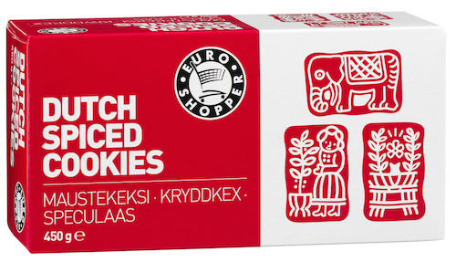
There is a Dutch supermarket chain that throws a lot of money at market research and data analysis (at least compared to the other chains here). Their own brands follow a nice marketing trick where they offer three product versions in three price categories: euroshopper, AH and AH excellent. There is probably some difference in quality as well, but the most important thing right now is that people who feel they need to buy cheap food will always buy the cheapest brand and the cheaper it feels the more people will buy it. A couple of years back they gave this approach further shape by redesigning their euroshopper products in a terribly cheap looking simplistic style:

enter image description here

Instead of the original which looked like (had a hard time finding old product photos and this one is a bit unsharp too making it look less delicious than in real life):

enter image description here

Now, I definitely wouldn't say the new design is bad however. It looks cheap and fairly modern, so in the sense of accomplishing it's goals it's an incredibly good design (as per the other answers). But to answer your real question:

Yes, making a design too luxurious/expensive can be bad for business, making a design too good not so much.

1
  • I was on my way making the same type of example, in Norway you see all the big grocery-stores create their own branded food-series as a cheap alternative, and they all use the same ultra-minimalistic 'cheap' design.
    – Velkommen
    Commented Nov 13, 2014 at 10:48
0

Sometimes a good design is too good for users. This is why a good design should follow the MAYA (most advanced yet acceptable) principle. You can read more here: http://www.uxbooth.com/articles/deliver-the-future-gradually/

0

Not 100% related, but... One example of when a design is "too good" for a target user group could be when you have a set of experts that is currently using a user interface, and that the target user group (experts in this case) benefits from having a complicated user interface to work with (i.e. it'd take a lot of time to train new people in using the user interface).

I've experienced this myself in the B2B context to be honest, especially when radically improving existing user interfaces, that some of the existing users got scared because it was so easy to use that they felt anyone could learn to use it (meaning the experts aren't needed anymore).

0

low design does not necessarily equal low price.

one might find a way to make a design that is both good and cheap, but it would probably take considerably longer than it would if more money got thrown at it.

I've found this helpful:

triangle of expectations management

1
  • Welcome to the site @HomerSimpson. I think you may be misinterpreting the OPs question. He seems to be asking about whether users interpret a high-quality design to correlate with a high price, whereas you appear to be writing from a product management perspective to say that they do not necessarily have to be correlated. Do you have any evidence that most people (or most users in a particular group) will understand this model? Commented Nov 12, 2014 at 20:58

Your Answer

By clicking “Post Your Answer”, you agree to our terms of service and acknowledge you have read our privacy policy.

Not the answer you're looking for? Browse other questions tagged or ask your own question.