1

I'm developing a simple cash flow system to a college work and couldn't realize a good way to present the form to register the values that are received and paid.
My idea is to make it as simple as possible, so the user won't have to insert much information (I tried various personal finances softwares in my short life and abandon a lot of them because the form to register a transaction are annoying).

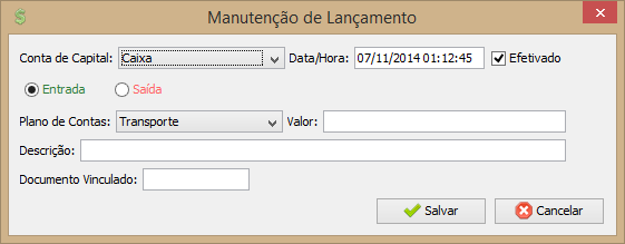
A picture of my current form:
Register
Explanations/translations:
"Conta de Capital" is the bank account related to the transaction.
"Data/Hora" is the date/time of the transaction.
"Efetivado" indicates if the transaction already happened or if is waiting something.
"Entrada" and "Saída" indicates if it's an income value or an expense.
"Plano de Contas" is the user defined category of the transaction. Like "Gas", "Food", "Transportation", etc.
"Valor" is the value of the transaction.
"Descrição" is some description that the user could want to register [optional].
"Documento Vinculado" is the number of a document related to the transaction, like an invoice number [optional].


Things that I thought I could do:

  • Put a title identifying that it is an income value and a button to change to expense
  • Let the user insert the "Plano de Contas" (category) freely, just like the GMail tags: GMail tags
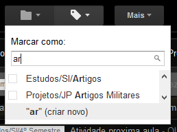
    (I did't make it already because is a challenge to me to do that and I don't have so much time).
  • Hide the date/time field as the user will hardly feel the necessity to change it.


Well, help me deciding what's the best approach to make the software easier to use.

2 Answers 2

2

As a quick start you might want to have a look at this: http://www.nngroup.com/articles/form-design-white-space/

As mentioned in the article effective use of white space makes it easier to fill up a form. Make use of the best practices mentioned in the article.

I think the information hierarchy should be such:

  1. Entrada/ Saida - These could be in form of tabs
  2. Conta de capital
  3. Valor
  4. Efetivado

  5. Plano de contas

  6. Descricao
  7. Documento Vinculado

Also, make use of '*' to indicate mandatory fields.

1
  • Thanks for your help, the article are very interesting, but I followed my intuition and talked with the user to finish the form.
    – Dinei
    Commented Apr 18, 2015 at 20:03
1

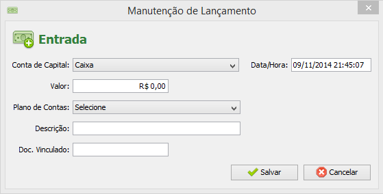
For those who wants to know what was the final result of my work, I'm posting an image here:

Manutenção de Lançamento

I put two buttons in the system menu to access this form: one for the incomes (in Portuguese, "Entradas") and other for the outcomes ("Saídas"). As well, I put an icon and a big text in the top representing this to make the user aware of the transaction being inserted.

I also removed the "Efetivado" checkbox, assuming that all the transactions inserted in this window are already done. There are other moments on the software flow that the system itself generate transactions automatically, those are transactions not "Efetivado" (waiting for the user to confirm them).

Your Answer

By clicking “Post Your Answer”, you agree to our terms of service and acknowledge you have read our privacy policy.

Not the answer you're looking for? Browse other questions tagged or ask your own question.