4

I am having some trouble figuring out how to do an interface that has these characteristics:

  • allows user to enter several sets ("cases") of data. Minimum one, and there is no limit but say 12 is probably about the max it will ever go.
  • user usually knows ahead of time exactly how many cases they need
  • nevertheless, it is good to allow the user to order and reorder cases until they are happy with the ordering. This should include deletion and insertion of cases
  • user can select one and only one of the cases to be their "main" case. This is quite important.

I think that's about it.

Current Interface:

I have the following user interface just using HTML and JS.
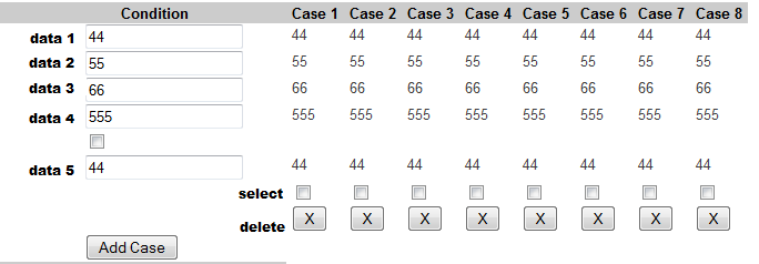
enter image description here

To be honest it feels a little clunky and wonky and does not have a "good solid" feel to it. It is not quite satisfying to use, it feels like driving an old car that's about to fall apart and you need some knowledge and skill to operate it properly and know what to click for it to work the way you want. But it works, and it does the job.

To explain what's not intuitively clear ...

  1. user enters data under Conditions. There is always 5 data pieces, they are part of a set.
  2. User can click Add Case button to add a new case, which will be numbered as {number of previously last case + 1}, and those show up on the right of the Condition box with the info user already entered in the Condition box. Users cannot edit the entered cases, but can delete them by pressing X.
  3. User can select a case to be Main by clicking the "select" checkbox above the X for that case. It probably should really be a radio button, but the way it is coded now, it is a checkbox, clicking which sends an AJAX request to the server, which sets the $_SESSION var to indicate that this case is now Main.

Note: this particular form is part of a bigger form.

I think it is reasonable to say that while the current UI works... it is not exactly clear, friendly, or usable.

Question:

What I am looking for in this question is UI design and functionality that will help both the user and the developer.

Namely,

  • make sense to the user -- make it reasonable and clear where and how to add, edit, delete, and possibly reorder cases.
  • make it easy, and clear on how to indicate Main case
  • make it easy on developer as well, i.e. no checkboxes for something that can use a radio button, and no without AJAX or SESSION vars in play when there is no need for such complexity.

What I am thinking of doing right now is using the mimimal set required for HTML Forms to capture all the information I need, and then submit it in a single Submit click, without resorting to storing things in the sesssion vars as it is doing now. Also, maybe make cases expand vertically instead of horizontally, and make them all editable instead of having a single editable window. Also, I don't know how I can make them reorderable, but that can be put into another question later. Reorder-ability is I think a more or less pain-free standard feature that can be used. Browser where this will be utilized is Mozilla Firefox (latest version).

2
  • Also, I am new on UX Exchange and will appreciate any tips on how to make this question better.
    – Dennis
    Commented Oct 2, 2014 at 18:05
  • 1
    I'd say definitely flip the orientation so you're not expanding the table to the right. Content is generally fixed width and it's not usually an issue to scroll down (and if your table is fixed width, then adding 1 column shrinks the rest, which is undesirable).
    – bdimag
    Commented Oct 2, 2014 at 18:26

2 Answers 2

2

I saw this question, made some sketches, got distracted, came back to see that @dan1111 had described the majority of the fixes. In fairness though, all that's happening here is the application of some design conventions.

The biggest variation is regarding the addition/editing of cases. I've proposed that the inputs mirror the data in the table. This could also be used as mode for editing.

Regarding your point about making things easier on the developer: Of course, a goal should be to make things as clear and simple for everyone, including developers, but the reality is that as the web evolves and the tide of technology rises, providing good user experiences often involves utilizing controls and inputs that are more sophisticated than checkboxes and radio buttons. This is perfectly summed up in Everett McKay's excellent series of articles "Don't Design Like a Programmer", which I recommend you take a look at.

In any case, here's a wireframe of the proposed UI:

enter image description here

6
  • Yup, radios would do, but in a separate col. Re: Edit "...make it reasonable and clear where and how to add, edit, delete, and possibly reorder cases."
    – dennislees
    Commented Oct 4, 2014 at 19:36
  • So there's inconsistency in the spec. Surprise surprise.
    – dennislees
    Commented Oct 4, 2014 at 21:25
  • Cripes. In my last comment I pasted in sentence from the OP "... how to add, EDIT, delete...". I may be guilty of not balancing out every nuance of the described functionality before I threw to together a hasty wireframe. Gimme a break. I've put as much work into helping this particular stranger on the the internet as I'm going to put. And I've put many times more effort into this belabored point than I'm happy with. The OP is perfectly welcome to take the idea and evolve it, as are you. I'm happy to discuss higher level concepts of the design with the OP or anyone else, otherwise I'm done.
    – dennislees
    Commented Oct 5, 2014 at 14:56
  • woah .. did I miss some now-removed comments? regardless. thanks dennislees, that looks fairly reasonable and pretty much in tune with what I have described. One thing that jumped out at me -- I can make the fields editable all the time rather than provide an edit button. That is, remove the step of clicking edit, and just use input fields at all times. And the use of radio buttons or buttons to Make Primary is really more up to the user.
    – Dennis
    Commented Oct 6, 2014 at 14:48
  • 1
    e.g. vitalets.github.io/x-editable/demo-bs3.html?c=inline How exactly you implement would depend on how users most often edit (single items? complete rows?) but something like has a higher chance of deliver a good user experience than a lot of data sitting around input fields.
    – dennislees
    Commented Oct 6, 2014 at 15:11
2

A few suggestions:

  • Cases should be rows, not columns. As bdimag already mentioned, there are some display problems with the current format, particularly when you can add an arbitrary number of cases. In addition, I would say that making the cases be rows would be more intuitive to the users.
  • Add/edit cases in a pop-up overlay. The current "add case" functionality is confusing, because it appears on the left of the table, but the new case will be added on the far right. I suggest replacing this with a div that appears overlaying the window and has the form for adding a new case. The same form can be used to edit a case, simply by populating it with the existing case values. Just put an edit button on each row.
  • Give cases "move up" and "move down" buttons for reordering. This should be sufficient if reordering isn't a very common operation. A drag-and-drop interface would be the ideal implementation, but that would be a lot more complicated to create. You could also have an option for position when adding or editing a case.
  • Do away with checkboxes for selecting a single case. As you already realize, this isn't intuitive. You could use radio buttons. However, I would prefer an ordinary button on each row to select the main case. I wouldn't expect a radio button to make an important change as soon as I click on it.
  • Style the actions as small image icons. HTML form buttons are clunky looking. This problem will be made worse when you have three buttons per row (delete/edit/select main). So, just use small images for these. An X or trash can is paradigmatic for delete, while a pencil often means edit. It might require some thought (and depend on your specific application) to determine what the best icon for "select main" is.
1
  • Thanks. main case is really to be "marked", not immediately selected. So it probably can be a radio button, as it only matters after it is submitted. As in, this form does not have to be real time. At least not yet.
    – Dennis
    Commented Oct 3, 2014 at 13:32

Your Answer

By clicking “Post Your Answer”, you agree to our terms of service and acknowledge you have read our privacy policy.

Not the answer you're looking for? Browse other questions tagged or ask your own question.