0

I'm working on a mobile app (hybrid using phonegap) and have a screen where the user can enter data. The screen has 2 options in the top header bar - either use the top-left button to cancel the changes or use the top-right button to save the changes. Either way they will be navigated back to the previous screen.

What I'd like to know is if there's a preferred way of handling the click of the cancel button in terms of unsaved changes. It seems there are a couple of options:

  1. Prompt that changes will be lost if they continue, with the option to cancel and not go back.
  2. Prompt to confirm whether or not to save changes.
  3. Don't prompt but this option seems too risky.

Perhaps I'm thinking about this the wrong way and back-and-save (if dirty) should be the default action for the top-left button. And the top-right button should allow for a revert or delete option. The intention is that the top-right will also have a more-options button to show a popover of extra actions...

1
  • Not sure if "go back" is the best choice. I see it as staying where I still am. Commented Sep 30, 2014 at 13:33

3 Answers 3

1

You're right in your arrangement of buttons. Top left would typically be the cancel and top right would be the post/save button.

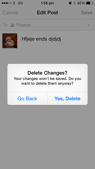
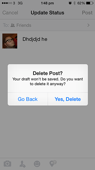
Facebook for iOS is a great example of how to handle the navigation away from unsaved changes. They prompt users asking them to delete what they've done or go back and save the changes (post the status).

This works better for Facebook because you create something new and post, if you cancel post you delete the post. If you're going down the route where a user may actually be editing something that already exists Facebook's solution may not work for you.

Cancelling newly created data

Facebook cancelling new post

Cancel edited data

Facebook cancelling edited post

The wording on each are slightly different but i think it's the clearest way because you're asking them to retreat or perform a destructive action.

2
  • I'd like to see further responses to my question or this answer - to get a feel for best practice. But thanks this answer was helpful... Commented Sep 30, 2014 at 13:17
  • It might be worth also looking at some of the built in apps (for iOS) and seeing how they handle this sort of action.
    – slaterjohn
    Commented Sep 30, 2014 at 13:19
1

It depends. If this is an email app and the user is trying to compose a message and navigates back to inbox before sending/saving, the message is automatically saved in the draft for the user. User can come back later and continue where he left off. If you think there is no reason to save the form data as draft, it is better to show a popup confirmation.

Also, think about why the user has to go back. May be he wants to go back to get more information to fill the form or simply wants to discard his current action and do something else.

0

If I'm hitting 'cancel' I don't want to save my changes. There's no need (as far as I can see) to ask them to confirm this. It's clear that the button 'cancels' the operation.

If you feel that it is important to have the dialog confirmation, then I'd reconsider some of the terms.

Instead of 'cancel' on the main page, I'd suggest 'back' or 'close' (depending of it is a page or a modal).

Then in the dialog, I'd suggest 'cancel' (to cancel the dialog) or 'Yes, delete'.

1
  • I think typically dialogs are shown to confirm a destructive action. If the user accidently clicks the cancel button and the changes are gone for good they'd feel pretty hard done by. The same reason that if i click the close button on a document it doesn't just delete what i've done, it asks if i want to save.
    – slaterjohn
    Commented Oct 1, 2014 at 8:06

Your Answer

By clicking “Post Your Answer”, you agree to our terms of service and acknowledge you have read our privacy policy.

Not the answer you're looking for? Browse other questions tagged or ask your own question.