3

Consider the application of hotel faceted search. At first the user provides the city and dates, and after that they filter, such as "star ratings". By default, there is no filtering based on stars, so you could say all are selected. The challenge is:

  • How do you represent this "all selected", when really.. the filter is simply inactive?
  • What do you do when the user does click on one of the buttons?

I thought of three options for initial display:

  • Option 1: Show all buttons as selected by default
  • Option 2: Show all buttons as unselected by default
  • Option 3: Show all buttons as inactive by default - neither selected nor unselected state

The problem with Option 2 is that it's not truly representing the state of the filters. Because by default all values are included in the results whereas visually it's showing none selected.

The challenge with Option 3 is that there's no easy way to convey "neither selected nor unselected".

The next choice if using Option 1 is what to do when the user clicks the first button, e.g. 5*

  • Option 1A: Select only 5* and deselect 1,2,3,4*
  • Option 1B: Treat the first click as a deselect, so leave 1,2,3,4* as selected and toggle 5* to unselected

Option 1A is likely what the user most often intends to do. i.e. if they click the 5* button in a hotel search filter they are most likely to be wanting to select 5* hotels rather than say "I want all stars but 5 star". But also I think typically in button groups the common behavior is toggling, i.e. if all are selected and you click on, it toggles only it to deselected.

Last question: What to do the next time the user has all buttons selected and click one? Same behavior as at the start?

Trivago demonstrating Option 1A for stars:

Trivago stars

Trivago confusingly using Option 2 on same page for hotel size:

Trivago size

Kayak using a more traditional approach to stars:
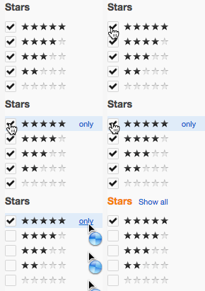
Kayak stars

Summarising the questions again:

  • How do you represent this "all selected", when really.. the filter is simply inactive?
  • What do you do when the user does click on one of the buttons?
1
  • Option 1A has two variants: if the 4* symbol is activated either 4* and 5* are selected or only 4*. I actually believe (read: have not tested) that 1A and 2 work well together if both are used for the right kind of filter (as Triage does). There’s a difference between ‘all options are active’ and ‘none is active’: in the latter case I expect to also see results where this value is not available at all.
    – Crissov
    Commented Nov 3, 2014 at 21:34

2 Answers 2

1

I think there's a slight risk you might be overthinking this, and placing a bit too much importance on representing the "true state" of the filters.

There is a mildly paradoxical aspect to filters that are "turned off" but at the same time show all results, but isn't this just a trick of language? It's generally understood that filters that are "off", have the positive effect of showing more results. For those few users that don't understand, it becomes immediately obvious upon interaction (assuming the list has a conventional default state).

Another confusing aspect of this is that the visible results are the same when all filters are on, as when they are all off.

How do you represent this "all selected", when really.. the filter is simply inactive?

The phrase "all selected" is a point of confusion for me. If all filters are inactive, and, we assume, all results are visible - what exactly is "selected"? Not the filters. And not the results. The results are visible because that's the default state of the list.

What do you do when the user does click on one of the buttons?

You toggle that filter on/off, depending on the starting state. Results associated with that filter either show or hide.

1
  • 1
    I think you've nailed it with this. Since asking this question I have actually decided on the same approach as you suggest - by default, no buttons are "selected" (Option 2). This provides two main benefits: (1) Inactive filters (that the user hasn't selected in any way) can remain colourless/unhighlighted, which makes the filter panel less noisy, and (2) The act of the first click (e.g. on 5*) to enable "only 5 stars" is now perfectly logical (as opposed to if all five buttons were previously "active" and suddenly only the one you clicked is).
    – rgareth
    Commented Nov 4, 2014 at 11:28
0

Amazon has their search presented this way:

enter image description here

Even though they have it initiatively in active, it still provides a way of showing everything (1 star and up) or just a specific star rating (4 and up).

As for the "All Selected," it isn't selected at all, it's just showing everything. All selected means a filter has been applied, when in fact it has not, at least according to the user. Having nothing selected is representation enough to the user that they have yet to apply a filter for a more narrow search to help them find something faster or easier.

2
  • 1
    Useful example from Amazon but your answer is based on the incorrect assumption that "bigger is better" and that's not the case, even for hotel stars. (Reviews are one of few exceptions). Once you move away from stars examples and consider something like "hotel size" as I mentioned in my question then it's clear that "& Up" cannot be used as a general solution for button groups.
    – rgareth
    Commented Sep 9, 2014 at 13:26
  • Should also note that the question was about Button Groups and answer does not address this.
    – rgareth
    Commented Sep 9, 2014 at 13:28

Your Answer

By clicking “Post Your Answer”, you agree to our terms of service and acknowledge you have read our privacy policy.

Not the answer you're looking for? Browse other questions tagged or ask your own question.