1

Our users can select a language from a drop-down list and proficiency levels, which are:

  • Speaking

    • Not at all Proficient
    • Slightly Proficient
    • Moderately Proficient
    • Very Proficient
    • Extremely Proficient
  • Reading

    • Not at all Proficient
    • Slightly Proficient
    • Moderately Proficient
    • Very Proficient
    • Extremely Proficient
  • Writing

    • Not at all Proficient
    • Slightly Proficient
    • Moderately Proficient
    • Very Proficient
    • Extremely Proficient

and add it to their profile (same as in LinkedIn).

This is currently how we designed the layout for that section: language list

To me this layout is confusing a bit. Is there a better way to show each language and its proficiency?

----- Clarification ------

Thanks 3nafish!

Good questions and sorry for being vague.

  1. Yes, this profile will be visible to other users.
  2. Once this panel is created it will probably NOT be updated repeatedly.
  3. For each language they must have the proficiency selected.
  4. The language panel is informational only for HR users.
1
  • Welcome to the site, @MorVimmer! Can you clarify your constraints? What specifically do you find problematic about the layout you show here? Will this profile be made visible to other users? Is there a default? or is it important for users manually to select an option? Is the form likely to be set up once? or updated repeatedly? Commented Sep 2, 2014 at 19:09

2 Answers 2

2

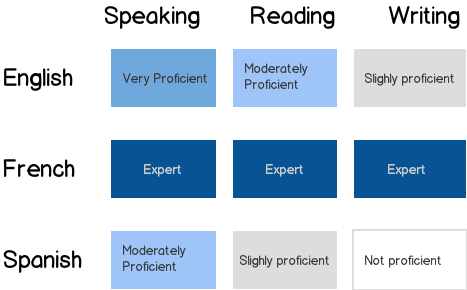
Similar to @DesignerAnalyst but using a colour / intensity gradient approach allows space for explanatory text, an aesthetically simpler UI (which according to Nielsen heuristics does matter). Appropriate scale will avoid color blindness issues.

Also the larger and simpler features are easier to scan. Which is probably valuable in supporting the likely user goals (e.g. Does this person have specific weaknesses in a language? They Native speaker of which language(s)? )

mockup

download bmml source – Wireframes created with Balsamiq Mockups

1
  • I like both solutions, especially Jayfang's. I agree with Jayfang. The user's goals is to quickly evaluate the skills of that person. I will give it a try. Thanks!
    – MorVimmer
    Commented Sep 3, 2014 at 12:24
1

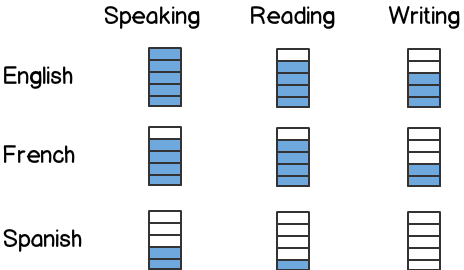
I have a suggestion that uses less words. This solution reduces clutter and makes comparison much more easy. You can use a tooltip to show the description of each symbol.

mockup

download bmml source – Wireframes created with Balsamiq Mockups

Your Answer

By clicking “Post Your Answer”, you agree to our terms of service and acknowledge you have read our privacy policy.

Not the answer you're looking for? Browse other questions tagged or ask your own question.