0

I've got a responsive web app that displays a multi-step.
There are 4 steps: What?, Where?, When?, With?, that are indicated on each step to let user know the progress.

For instance, here's what it looks like in a desktop (the background is blue):
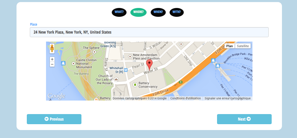
enter image description here

On a mobile device, it becomes like this:
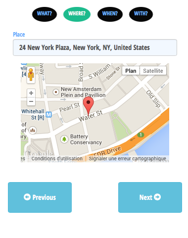
enter image description here

I voluntary increase the padding of the buttons in order to fit all fingers.

In many native apps, the previous and next button are displayed on the top navbar.

The benefit of my layout is that it requires no touchy adaptation from desktop to mobile.

Is it acceptable? Or what could I improve to increase UX?

1 Answer 1

1

Placing buttons at the bottom are better as the thumbs or fingers could reach them easily - supports one hand operation too..

10
  • So like I did? No need to evolve the layout?
    – Mik378
    Commented Aug 31, 2014 at 14:39
  • yes, Absolutely! Commented Aug 31, 2014 at 14:41
  • 2
    The only drawback I can see with my solution is that mobile's virtual keyboard may hide the buttons => user has to close it in order to click. In the contrary, when on top, user can clicks without needing to close the keyboard.
    – Mik378
    Commented Aug 31, 2014 at 14:43
  • I don't see any text box..what launches a mobile keyboard here? Even so, the buttons must be co-located to the control that launches keyboard so that it will be visible. Also, hitting enter on keyboard should hide the board but I see it's not an ideal experience Commented Aug 31, 2014 at 14:53
  • In the screenshot, the textbox has the text: "24 New York ...". As soon as I typed "2", it launched the keyboard.
    – Mik378
    Commented Aug 31, 2014 at 14:57

Your Answer

By clicking “Post Your Answer”, you agree to our terms of service and acknowledge you have read our privacy policy.

Not the answer you're looking for? Browse other questions tagged or ask your own question.