2

I am developing a web directory app whereby users main action will be to search for business addresses right from the home page.

Currently, I have a search box centered on the homepage. Like this: enter image description here
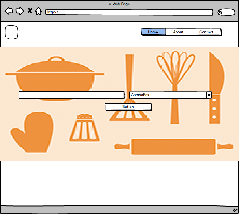
While on subsequent pages, there will be a search bar underneath the menu bar, so that users can search anywhere they are on the website.

The issues am having is that, will it be bad for user experience if I add another search field on the homepage, just like I have it on other pages. Such as:
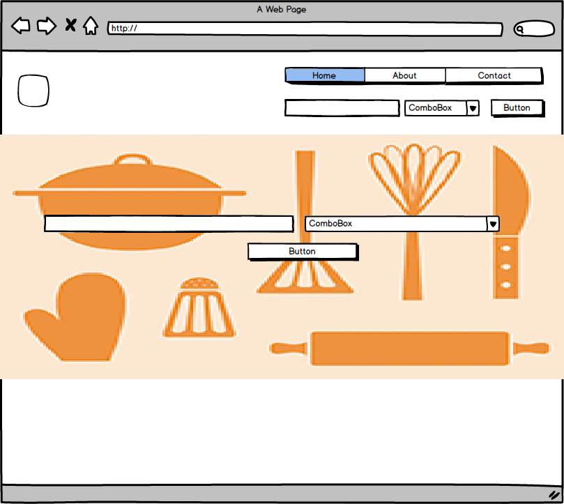
enter image description here

Or should I just leave the homepage as it is and then implement the search bar underneath the menu bar on other pages?

0

4 Answers 4

4

When designing any UI, consider that each element that you place on screen should have a clear purpose and function. That said, displaying 2 different search fields will result into confused users expecting those fields to perform different actions.

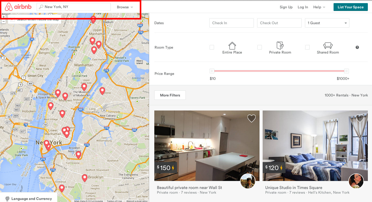
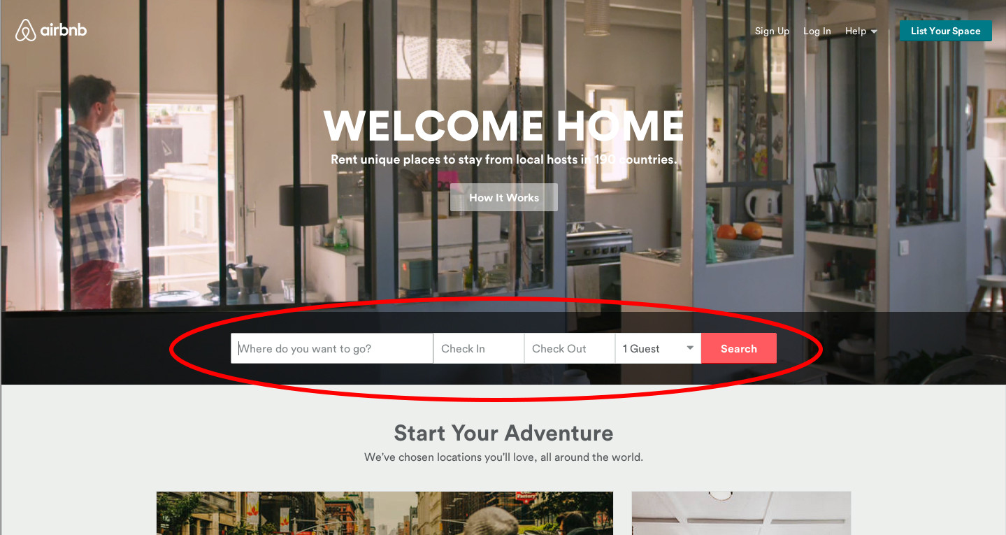
It looks that your main CTA is search, so you your challenge seems very similar to the one Airbnb faces. Their main CTA is search for places, so on their home page they display a big central search field:

Airbnb homepage

Then, on any other page, they modify the navigation bar so it includes the search bar:

Airbnb navigation bar

This is a very good way of always having your main CTA present across the entire user-flow, giving it more or less relevance depending on the screen the user is visiting.

4

Two search boxes in the home page will confuse users; they will wonder if there are two types of search. Also, by adding a second search you will make the design more complex. You should have as few elements as possible in your design.

If you want to emphasize the search in the home page you can use white space just like Google does.

2

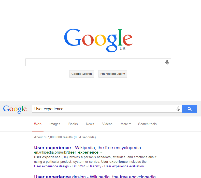
I agree with DesignerAnalyst. Two search boxes will simply confuse the user and as such could be considered redundant as they result in the same goal. Google themselves have the search in the centre of the page, but once you begin to type, the search moves to the top left.

Google search, initially in the centre, moves to the top on entering text

1

There's a reason minimalist design has taken over the Internet... it's easier.

The fewer available actions available to the user, the less confusion. Duplication of any action is completely unnecessary as long as the available actions are obvious and intuitive.

You, out of anyone should know what the user is trying to achieve, it is your goal to present that as quickly as possible as easy as possible.

Your Answer

By clicking “Post Your Answer”, you agree to our terms of service and acknowledge you have read our privacy policy.

Not the answer you're looking for? Browse other questions tagged or ask your own question.