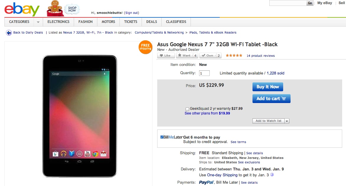
Had a meeting with our Product Manager yesterday and he's requested that we put content above our site design's main navigation.
Specifically, his request was to put the end-clients logo in the top right-hand corner and the last sync date of their file in the top left.

I tend disagree with this layout, but I can put my finger on why.
Is there any established convention for where the logo is positioned in the user interface AND/OR where the software status information should be positioned?
This will provide some ideas on how I can persuade our Product Manager to reconsider this design idea.

