0

I have a basic Commerce Layout (sketch layout below). I want to integrate an option where the user can specify a budget limit for Quantity, Cost or both.

Question: Would I need to spell out the explicit CTA "edit" to show that it's editable? (Reference mockup 1) Or have the user discover it based on it being styled as an interactive element? (Reference mockup 2) Is it obvious enough because there aren't any distractions around this area?

Or is there a better way to do this?
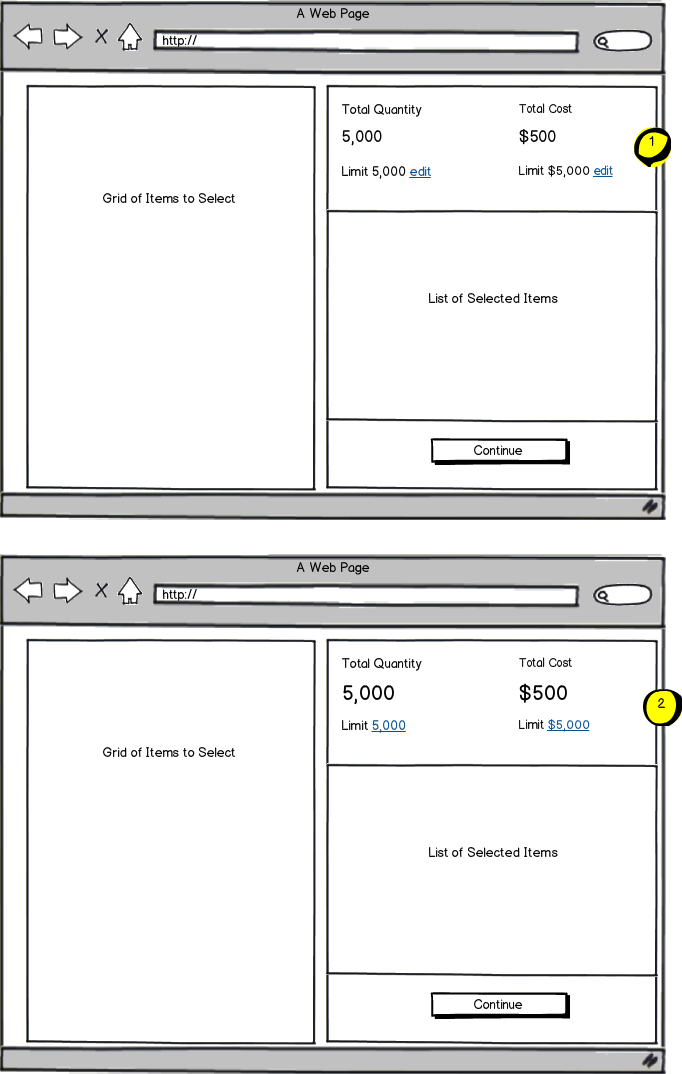
mockup

download bmml source – Wireframes created with Balsamiq Mockups

Note: We have a set default for cost and quantity as base minimum that the user will start with so they won't need to enter this information first.


2
  • Is there any particular reason you need to have separate View/Update states? Can't the fields have an editable (shown as an inline edit field perhaps) state that you just maintain?
    – Michael Lai
    Commented Jul 24, 2014 at 23:21
  • Great question. The intention is to simplify the experience. I feel that adding anything more than an edit or underlined link may clutter the area and therefore confuse the user. It's also not something that will change often.
    – Pdxd
    Commented Jul 25, 2014 at 1:19

1 Answer 1

1

Option 1 is more explicit at informing user the limit is editable and option 2 is not as explicit as option 1 but it's still clear enough for user to understand the limit field is editable.

Option 2's UI is cleaner and looks better but the difference is minor.

Both would work but if I have to pick one, I would pick option 2 for your particular scenario.

Here's how Google does it:

enter image description here

Your Answer

By clicking “Post Your Answer”, you agree to our terms of service and acknowledge you have read our privacy policy.

Not the answer you're looking for? Browse other questions tagged or ask your own question.