0

Let's imagine an application that allows users to create some meetings, waiting for participants and also allowing to search for other meetings (created by others) in order to participate in.

My focus is the search filters. I expect two kind of searchs:

  • Filters filtering new meetings where I don't participate yet (not including the past meetings)
  • Filters filtering MY meetings, which I already created or participated in (even including the past meetings).

I don't want to blend those two filters.

I thought about something conceptually like this (very light for the sample):
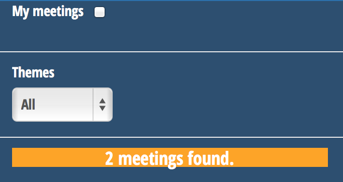
enter image description here

The two group of filters "My Meetings" (the checkbox) and "New Meetings to participate in" (the Theme filter for instance) are separated by a poor line.

When user selects My Meetings, all his meetings (created or participated in) will be displayed.
The other part of filters (concerning the search of new meetings like Theme fields) will be "disabled", so that user understands that there are two kinds of filters. (mine or current others).
There will be many other filters regarding "New Meetings to search" like "Theme, Location, Number of Participants expected, etc..)

When users disables "My Meetings", he can use the search filters for new meetings, like Themes in the sample.

What is a good practice to make user understand this kind of conditional filters? Some texts? Some smart components?

4 Answers 4

1

Edit
Answer deleted. See discussion in comments

mockup

download bmml source – Wireframes created with Balsamiq Mockups

7
  • Actually I want to use a common list, that dynamically adapts according to the filters. If I click on "My Meetings", it shows me only my meetings. If I use detailed filters (like Theme), it would show me New Meetings, but not mine. The hardest thing is to make the user understand that the detailed filters (like Theme) does not act when "My Meetings" is selected. Indeed, "My Meetings" does not consider any filters, it just displays the whole including past ones.
    – Mik378
    Commented Jul 15, 2014 at 13:06
  • 1
    Ah I think I misunderstood. So your question is: is the meaning of 'my meetings' filter clear enough? That all depends on the context it will be placed in. If you place the filter left or above the common list it should be clear enough. But I would keep filters consistent and turn the dropdown select box into multiple checkboxes. Select boxes are the bane of user experience and should only exist when there are dozens of options (like country selection). Commented Jul 15, 2014 at 13:11
  • Is it hard to transform your schema with the solution you explained just above? If it's boring, no matter :) As I explained in another comment, the thing that I would like to avoid is this typical user's thought: "I'm clicking on the "Engineer Job" Theme in the dropdown (or checkboxes ;)), but when I click on 'My Meetings', it doesn't filter on it !" (Indeed, my meetings display the whole)
    – Mik378
    Commented Jul 15, 2014 at 13:15
  • 1
    I've updated my answer and the mockup. I would recommend to let the my meetings checkbox visually stand out. This way it will be clear it's still a filter, but it's a different filter than the rest. Commented Jul 15, 2014 at 13:26
  • Many thanks ! :) In the last screen, You have selected "My Meetings" AND a detailed filter, filtering My Meetings regarding the filter. That's what I did some times ago, when a user told me: "I don't want to clear manually any detailed filters when I click on "My Meetings". I want to show them all, no matter detailed filters are selected!" I hesitate about which way I should choose. IMO, it does make sense to filter "My Meetings" with other filters (like in your mockup).
    – Mik378
    Commented Jul 15, 2014 at 13:38
2

I feel inclined to ask why you must make this distinction at all. If they want to see just their meetings with the Theme "Chocolate," why not allow that? I think forcing them to do one or the other will only serve to confuse them.

If you can, I would remove the separation between the two and make it so you can do them all at once. They're all filtering actions and they don't conflict with one another. Making them disparate actions will only serve as a source of confusion even if you put text describing exactly how it works plainly on the screen.

4
  • I agree with you. That was my first thought before those users asking me why "My Meetings" are based on filters... and not show ALWAYS ALL my meetings. Totally agree with you –
    – Mik378
    Commented Jul 15, 2014 at 14:34
  • @Mik378 Hmmm... That's strange that they would be confused by that. Perhaps it would warrant splitting out "My Meetings" into a completely separate view/page and have it so that the search page searches all meetings regardless of who owns them. That way they could always see all of their meetings on that view. Is that a possibility for you? It sounds like it would make a lot of sense to your stakeholders. Commented Jul 15, 2014 at 15:28
  • That would make sense but I really prefer to have one page for the whole. I thought about making a new menu called "My Meetings" in order to prevent confusion, but what about another filter called "Meetings Of John" (John being my colleague) => involving a new menu called "Meetings of my Colleague"? Would be redundant... IMHO, the best way is the one you wrote: "removing the separation".
    – Mik378
    Commented Jul 15, 2014 at 15:52
  • Sounds good to me. Hope that was helpful. :-) Commented Jul 15, 2014 at 17:53
1

The "My meetings" caption at the top could be misleading because it can be seen as a title, falsely meaning that this sections allows to search in your meetings only.

A suggestion could be to remove the checkbox and have :

  • one button saying "show all my meetings"
  • another one, next to the dropdown, saying "search new meetings by theme".
5
  • "Also, "new meetings" could probably be reworded as, per your definition, they also include meetings created long ago" => sorry this was a typo, I updated the question :)
    – Mik378
    Commented Jul 15, 2014 at 13:02
  • 1
    @Mik378 Ok. Updated my answer.
    – Pierre
    Commented Jul 15, 2014 at 13:03
  • Thanks. So do you agree about the fact that there is always one type of filter active?
    – Mik378
    Commented Jul 15, 2014 at 13:04
  • @Mik378 Actually, with the suggested layout, you have two buttons. The filter, i.e. the drop down, is relevant for the second action button only so I do not see any need to make it inactive in any case. It would always remain active but the layout would make it clear to the user that it is not used when they click the first button "show all my meetings".
    – Pierre
    Commented Jul 15, 2014 at 13:08
  • I'm figuring out what you mean :) That's an idea, thanks.
    – Mik378
    Commented Jul 15, 2014 at 13:10
1

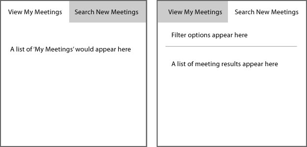
Perhaps placing 'View My Meetings' and 'Search New Meetings' (or some other variation to include the suggestions by @Pierre) in two distinct columns rather than a single column would help to differentiate them as well. A single column may suggest the two options work in tandem. Could the two titles appear as tabs above the meeting list?

enter image description here

1
  • nice idea :) It would prevent any confusion.
    – Mik378
    Commented Jul 15, 2014 at 20:06

Your Answer

By clicking “Post Your Answer”, you agree to our terms of service and acknowledge you have read our privacy policy.

Not the answer you're looking for? Browse other questions tagged or ask your own question.