5

I'm starting to make a Flash puzzle game, and I started thinking about how to implement a color-blind mode. (I know there's a game development SE, but this is a user experience question.) To keep it simple, the whole game would be converted to just a black-and-white color scheme.

Some of the entities in the game are color-coded between four basic colors: red, green, blue, and yellow. So if you take a graphic like this:

enter image description here

you should be able to just use things like hatching, cross-hatching, polka dots, etc. to differentiate between the four colors. The problem? Take this picture for example:

enter image description here

There's no way you're going to be able to fit such things on an image like that. There's just not enough space along both axes.

So how do you deal with that? One idea might be to redesign the drawings themselves, but that sounds like a bad idea. Another idea would be to put numbers or letters either on or close to the images, but that looks kind of awkward (and distracting) in and of itself.

How should a color-blind mode be implemented so that it avoids these sorts of issues?

2
  • 4
    Use a key with a different number of 'teeth' for each of the four modes. Use them in both the colour and the black & white versions. 1,2,3 or 4 teeth, (with the four teeth being two either side) should be easily distinguishable if designed well. Commented Jun 30, 2014 at 9:02
  • Great to see people working on an inclusive design approach to applications. I think the best approach is to use symbols in addition to colours to indicate the four different things represented by the colours (which is usually the visual design strategy). In the case of the key you would create different shaped keys.
    – Michael Lai
    Commented Jul 4, 2014 at 3:56

2 Answers 2

6

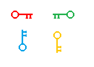
Having a distinct outline helps a lot with icons. You could change the orientation of the key to represent the 4 different colours (i.e. change colour and orientation). Something like this should be distinct enough:

enter image description here

0

Re-designing the graphics is a GOOD idea, from a UX standpoint, though it may be problematic if you're trying to bolt color-blind support onto an existing game.

The important thing is going to be making the keys somehow LOOK like they match the doors. I think the easiest way is to do something with the orientation of the key, and the orientation of the lock to make them appear to match.

Your Answer

By clicking “Post Your Answer”, you agree to our terms of service and acknowledge you have read our privacy policy.

Not the answer you're looking for? Browse other questions tagged or ask your own question.