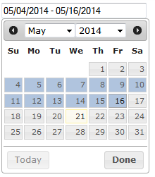
The reason why the two calendar approach has been adopted so widely and is so convenient to use is because it is in sync with the users' thinking process i.e. when people go for booking a ticket, they know the dates for departure and return of their travel but are not often consciously aware of the duration of their stay. Making them state the duration (and hence, mentally calculate it first) increases the short-term cognition load. Also, say I'm departing on the 10th and returning on the 17th, I'm going to pause for a moment and think whether I type in 7 days or 8 days as the duration^
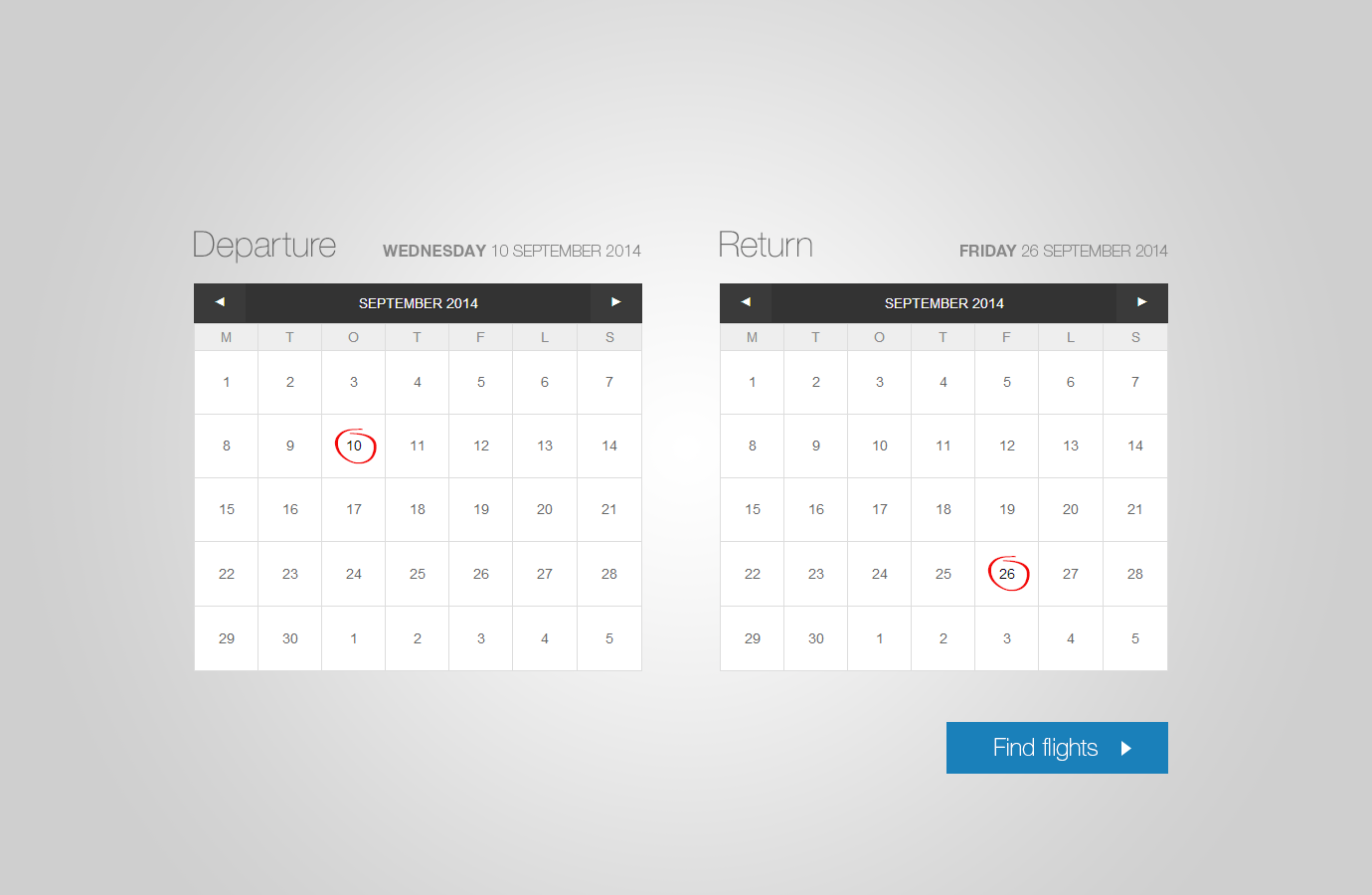
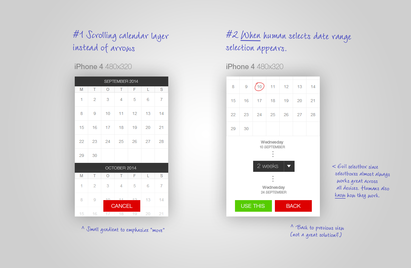
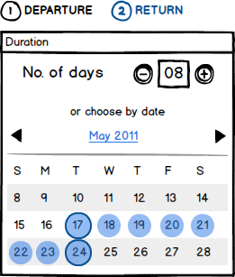
If you're still insistent on changing the interface (yes, the current version is boring) you may want to go with the approach which @user43251 stated but by giving it a more intuitive feel by implementing the below detailed approach

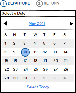
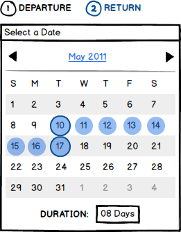
It is clearly stated which date (departure or return) the user is choosing. While selecting the departure date, the return button is disabled. After selecting a date, the user proceeds to selecting the return date

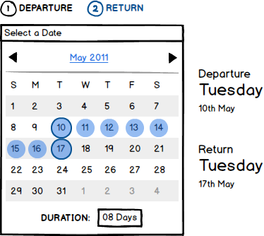
I have specifically selected this approach because there is no confusion as to what a click will do (after selecting both dates once). In this approach one can easily edit the return date easily if there was a mistake in initially selecting it*. Also, there is a field at the bottom indicating the duration where the user can also manually enter the duration (if you feel so, you can highlight this area more using colours and type)
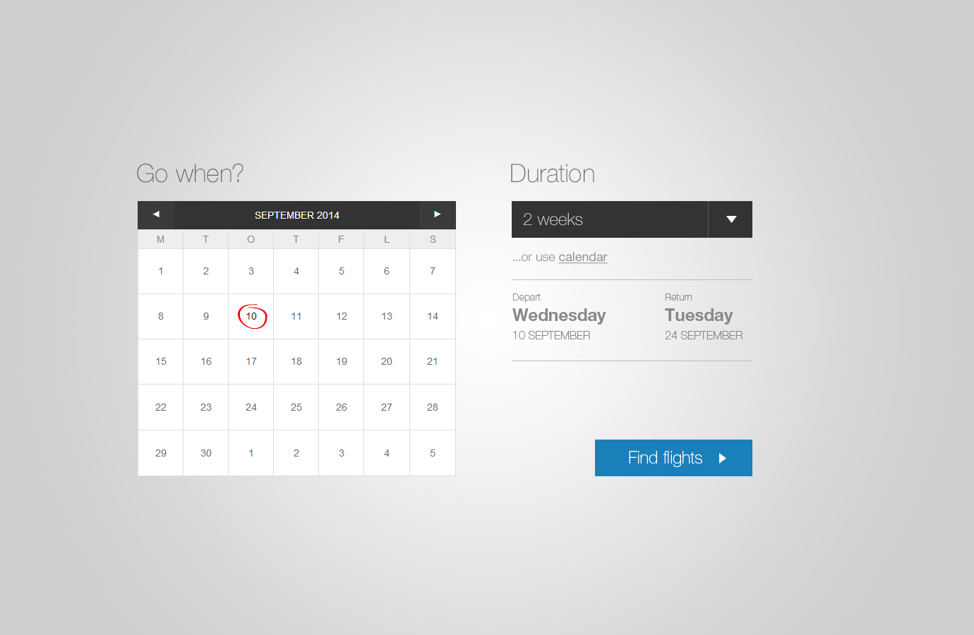
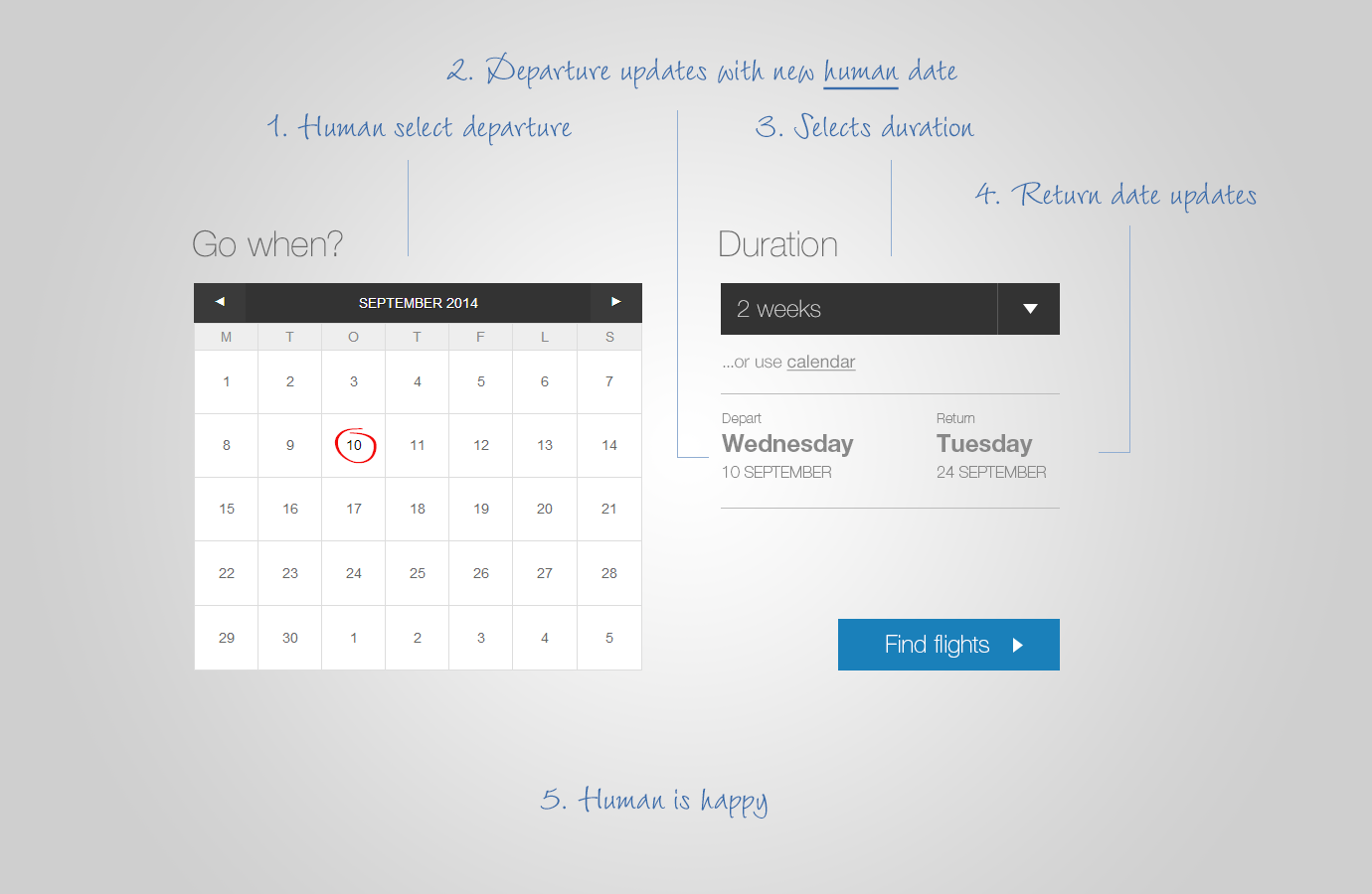
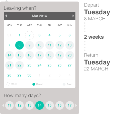
To make the UI more interesting / visually appealing, you can implement the bold/large text details and mess around with the typography as you've done in your mockup. Something like this probably:

^you may say "I'll depart 10th of october and be gone for 2 weeks" but that is not very specific since it usually implies a tolerance of 1-2 days
*unlike the one at http://jsfiddle.net/IrvinDominin/LALED/ where the journey period is the one between the last two clicks (discards previous clicks and thus punishes a user for entering the wrong information by making him enter it again. And even worse, this is not obviously apparent and can be gleaned only after a few clicks)
edit after OP's comment
in that case, the duration field can be highlighted more (colour, typography etc.) so that they fill that in first. the layout can also be slightly changed.
the objective of reducing the short-term cognitive load remains the same. knowing the users' mental process and designing a solution for it changes with the user base you take into account. in case you are sure about your user research, the solution suggested by
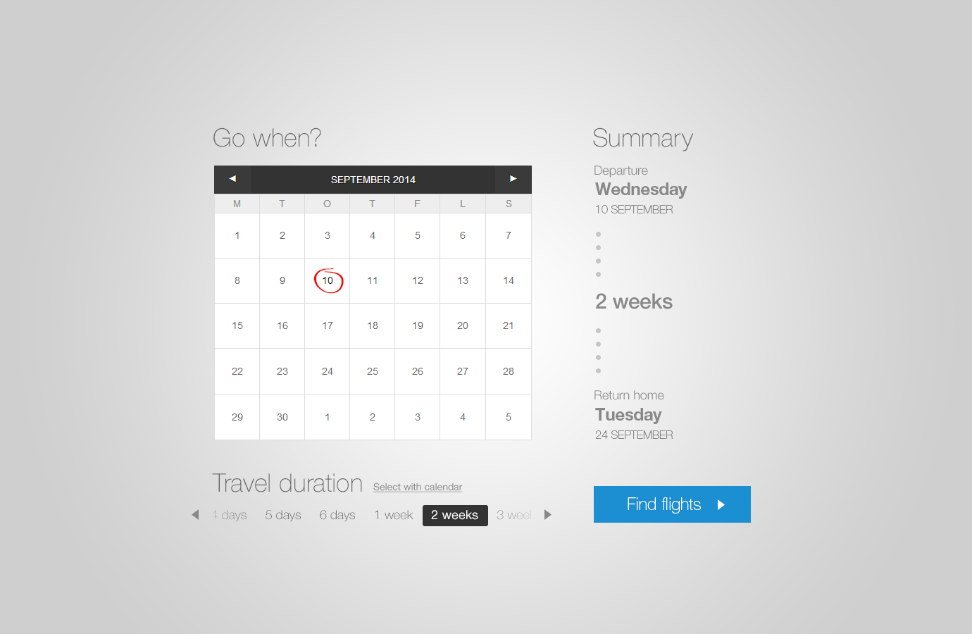
@Izhaki is a pretty good one. i have done slight modifications to it according to what i personally think would be most effective.

Obviously the visual design has to be improved, but the pros of this interface vs Izhaki's one are that a user can enter much a larger or smaller number without having to scroll a lot. Also the when the number of days are listed in a row they might be confusing with the numbers of the calender. (note that i've reduced the number of dates listed in the calender so that the week before departure is not shown and the next two weeks after departure are only shown. this compresses the size of the interaction element so the user does not feel overwhelmed by an unnecessarily large interface)
p.s. this interface is for the booking return part. for booking the departure part, the earlier design stands. thus, the entire flow is like: user clicks on field -> calender pops out for booking departure date -> user clicks on departure date -> same calender transitions to now indicate return booking and accommodate the field for number of days

