17

I have a table with large (25+) amount of columns in it. Right now it looks very complex and has a horizontal scroll. I want to make it more useful for the users.

enter image description here

One solution is to group columns by area (e.g. People, Time, etc.). This breaks the scanability of the table, which is basically table's main purpose:

enter image description here

Second solution is to have a column toggle functionality, because obviously no one works with all 25 or so columns at the same time, so letting user decide which columns he needs somewhere near the columns themselves sounds like a good practice. In this case, what is the best location for the button? Below are two solutions I came up with and I don't particularly like any.

Above the table, inline with search:

enter image description here

Or inline with column headers (seems weird, but has more context):

enter image description here

It can be also enhanced with something like "column priority index" in order to hide the ones with low priority on smaller screens.

Third one is to conduct a user research on how people actually use the table, and maybe present it's contents in a totally different way.

I would really appreciate any ideas, suggestions, or any other feedback on this.

Thanks

EDIT

So here's the solution I'm currently happy with and going to user test:

enter image description here

I decomposed all columns into four groups using simple card sorting, plus an extra one for the user to create his own.

1
  • What about a drop-down of common views, for instance "Release dates" would obviously have "Release Date" and maybe just a few other columns, "Overview" might have others.
    – TruthOf42
    Commented Apr 17, 2014 at 13:18

5 Answers 5

4

The absolute best solution I've come across is a column chooser where each user gets to choose the columns that they want to see.

Large grids like this tend to come about when lots of different people with lots of different data requirements all use the same data grid for different purposes. In my experience, implementing a column chooser allowed me to hide 75% of the columns be default, and had the added bonus of significantly reducing the grid's loading time.

1

25 columns is just to much yes. I'm liking the second solution where you give the user control of the columns.

I had a similar situation where I thought some columns were irrelevant. A quick survey told me however that most users looked at different columns effectively making every column relevant. My solution was a quick test where I let users pick the bare minimum of columns needed to make sense of the row and then just eliminate the rest of the columns. It was a quite forceful approach, but it cleaned up the design and I haven't received any complaints yet about the users missing certain columns (knock on wood).

But I was dealing with 13 columns and specific amount of users that I could contact easily. You might be dealing with a different type of audience, an audience from all the corners of the world/country, an audience you can't just walk up to and ask to do a card sorting test with you. Giving the user control of the columns might be the right solution in your situation.

The problem however is how do you know with which columns and how many do you start? And how do you make clear the user can manage the columns? Perhaps a small card sorting test? There are tools out there which allow you to do remote card sorting. And perhaps changing the copy from just columns to manage columns?

3
  • Paul, you get my point perfectly. Every column is relevant. Also, I am dealing not only with the different types of audience, but also different types of customers that are using the table in a different ways. So what may work for one not necessarily will work for another. All this leads to the idea of users choosing their own config of the columns, which will eventually lead to predefined set of presets to choose from. Or maybe allow them to save their layouts in order to have more than one and switching between them according to the current task? Commented Apr 16, 2014 at 14:34
  • 1
    It's all possible, but will it remain simple? Easy to use? I think we're moving into a gray area and the only thing left to do is testing, iterating, testing and iterating. Commented Apr 16, 2014 at 14:38
  • Yes, increasing complexity is what bugging me in the first place. I mean, I wanted to make it more useful, right? Need to test... Commented Apr 16, 2014 at 14:41
1

And yet there are times when ALL the columns are necessary - and there are too many to fit the available space. I've faced that problem. Hiding columns doesn't work as the data is necessary.

In one example I partially solved the problem by reducing the text in some of the columns. For example the user scans the columns to know which competitor (8 competitors == 8 columns) is selling the product at a higher or lower price than the previous period. I removed the price and changed the background-color of the table cell: red for lower, green for higher.

The result was that it was more scanable and less space was necessary then before (the user could get more detail as needed).

However, in that case, I was fortunate in that they didn't, on first glance, need to know the exact price of the competitor - only whether the price had gone up or down.

1

I like the idea of the column filter/chooser, but there could be even more mechanics involved for example. But above all, the user should always have control of what columns are hidden/shown

  • prioritize (based on research/analytics) and hide less frequently used columns
  • reveal columns based on persona / role / access level
  • reveal columns to match to specific tasks ("Task A" reveals related columns)
  • let user create their own custom presets of revealed columns
  • create collapsable groupings of columns

Of course the exact mechanics that make sense will vary depending on the exact context.

1

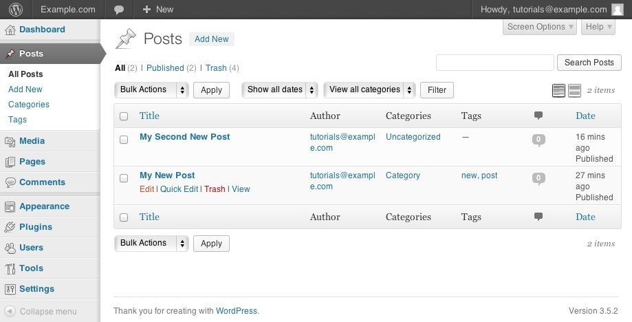
Speaking personally, I find the Posts management screen of WordPress to be pretty well organized in this respect, and considering its market share one could argue it's reasonably battle-tested:

WordPress Posts list
(source: bluehost.com)

Schematically in case they ever change it:

                                                  [Screen Options] [Help]

Screen title [Add New]

[Status Filters]                                  [Search Field][Button]
[Bulk Actions] [Filtering Tools]                  [Short vs Detailed Switch]

List Header (with sort toggle where appropriate)
...
List items
...
List Header (with sort toggle where appropriate)
[Bulk Actions]

Turning columns on or off can be done over in the screen options. That opens up a panel with the list of available columns. Or more specifically, sets thereof: some fields, for instance created/modified/status, are grouped together instead of shown as separate columns.

The only nitpick I'd have about their screen is the absence of the ID column. In most apps, the ID is undesirable clutter, so I think WordPress is correct to not list it at all. In some applications (e.g. an accounting app), however, showing the ID of a row is highly desirable.

0

Your Answer

By clicking “Post Your Answer”, you agree to our terms of service and acknowledge you have read our privacy policy.

Not the answer you're looking for? Browse other questions tagged or ask your own question.