0

I have a simple form that the user fills out, and I want the user to read a simple 5-step set of instructions on how to fill out the form and what happens after they hit "submit." I'd love to know if anyone has real test data on this that could be shared.

EDIT! Let me clarify, the instructions aren't just how to fill out the form (e.g., enter address [stuff like this is embedded in the form already]), but talks about the process and next steps after user hits submit. That's why I'd like them to be read.

I think there are two dimensions to answering this question. For each I've tried to list what I think are the main options and the pros/cons for each (though additional ones welcome!)

1) HOW the instructions are displayed

Option A - text format: PRO - takes up less space on the page

Option B - graphic images: PRO - may be more appealing visual

2) WHERE the instructions are displayed

Option A - on the same page as the form

PRO - because the instructions are so short, if this is the case, everything fits neatly on one page (i.e., user sees the entire page all at once) and the user only has to click one button to submit the form

CON - user may not read the instructions

Option B - before the form loads (i.e., user first has to click some kind of button acknowledging the instructions before the form page will load):

PRO - forces user to read instructions

CON - not everything is on one page, and user now has to click an additional button/ go through an additional step before submitting the form

2
  • Concerning the visual instructions, have you seen this? ux.stackexchange.com/questions/54161/help-videos-effectiveness hope it helps!
    – xBill
    Commented Apr 8, 2014 at 11:13
  • If they have to read instructions to fill out the form, it most likely indicates that the UX of the form itself is not user friendly. Consider guiding your Users through the required steps, one at a time, presenting each step as atomically intuitively as possible, and providing clear feedback about their current location in the process (eg. step 5/25). A side benefit to this "hand-holding" is that you will also gain crystal clear metrics on which steps Users are having problems with, and where your cutoff point lies with regards to abandonment.
    – Richard D
    Commented Apr 8, 2014 at 20:43

3 Answers 3

3

Don't rely on the instructions, the better option is to develop self-documented form. These kind of forms are obvious for users and error-proofed. The means for developing such forms are:

  • Right label names to support user's mental model
  • Right controls. HTML5 supports a variety of shaped controls for emails, numbers, date, etc.
  • Use placeholders for the controls for instructional purposes
  • Use in-place error-checking and instructions
  • Perform user testing to disclose pain points and refine the form

Of course, it's time-consuming activity, but outcome will compensate spent time.

UPDATE

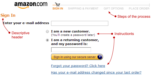
Please pay attention to how they make sense of form filling via context and instructions:

enter image description here

2
  • Thanks that's helpful! I actually realized my question wasn't super clear. I do have all of these in place. The instructions section though also talks about next steps and the process after the user hits submit, that's why I'd like them to be read. Any specific thoughts there?
    – james
    Commented Apr 8, 2014 at 18:35
  • @james I've updeted the answer, please look at the picture to get some insights. Commented Apr 8, 2014 at 19:31
2

On option B you say

PRO - forces user to read instructions

Not it doesn't. The customer doesn't want to read the instructions ;-) They want to get whatever filling out the form gets them. My experience of usability testing things like option B is that the behaviour you see is the user looks around for the buttons to press and the checkboxes to select to make progress. Reading the instructions is way down the list. It also has the disadvantage that, once they get to the form, the instructions aren't there any more.

Without knowing what the instructions are and why they're needed it's hard to give specific advice. Things I would be trying to do:

  • Express the instructions as clearly and concisely as possible

  • Trying to remove instructions and make them part of the form functionality (so rather than saying "enter CC details without spaces" just get the computer to remove 'em).

  • Inline the instructions with the form fields so that they're next to the form field(s) they relate to

If you've not got 'em already I'd recommend getting both of:

  • Forms That Work: Designing Web Forms for Usability, by Caroline Jarrett

  • Web Form Design, by Luke Wroblewski

Both of which have a stack of useful advice for situations exactly like this.

(On the text vs graphics front - I'd say text. If we're talking web apps then there's really not a lot visually that you can't do with CSS when it comes to presenting text well.)

1
  • That was helpful thanks! I actually added a clarification note, it's not just instructions, it's the overview of what happens next after user hits submit. That's why I'd like them to be read (and why they're not really part of the form)
    – james
    Commented Apr 8, 2014 at 18:36
0

Do you read documentation/instruction before filling the form? Form should be simple,concise, well designed as Alexey Kolchenko pointed out above.

You can also have a look on how big brands from eCommerce to Tech companies are structuring their forms.

Some help: http://www.smashingmagazine.com/web-form-design-showcases-and-solutions/

http://www.lukew.com/resources/web_form_design.asp

Your Answer

By clicking “Post Your Answer”, you agree to our terms of service and acknowledge you have read our privacy policy.

Not the answer you're looking for? Browse other questions tagged or ask your own question.