4

A standard slider, such as an html5 <input type ="range"/> or its many javascript-enhanced brethren, works by providing a handle that you slide between two endpoints, typically with your mouse or with your finger on a touch device. This controls a value by moving that value between the range of values defined by the endpoints. Importantly, the handle you slide is visually proportional to the numeric value it controls: If the handle is visually centered between the enpoints, the value it controls will also be exactly halfway between them.

A Problem With Standard Sliders

One problem with these sliders is adjusting the value to a precise number. Consider a 0 to 100 slider on a typical iphone. It's pretty easy to move it to within plus or minus 3 of your target value, but getting it exactly right is tricky, and you'll often over or undershoot by a couple points. Even if you do nudge the slider to your exact target value, it will often shift a tiny bit when you lift your finger from the screen. One solution to this problem is to add "+1" and "-1" buttons under your slider, so that the slider can be used to get close to the target value, and the buttons can be used to finish off the job exactly, as pictured here:
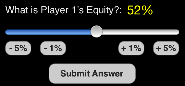
slider with buttons

But this feels clunky both visually and experientially.

An alternative: The Joystick Slider

I am imagining a slider control that looks similar to a normal slider, but operates differently. The principle I'm imagining would be analagous to a remote control airplane joystick:
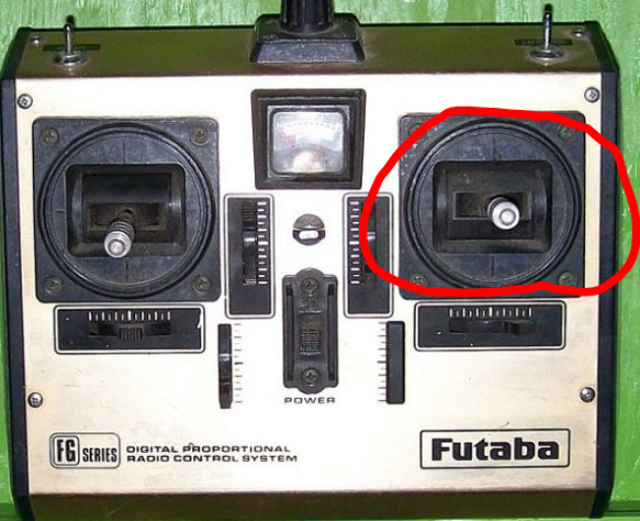
airplane remote

When centered, the joystick has no effect. When moved to the right or left, it would increase or decrease your target value. The farther right or left it get pushed, the faster this increase or decrease will be. Like this:
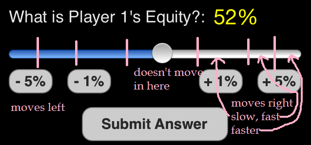
Questions

  1. Do you think this is a good solution to the problem presented above? If not, what are other alternatives?
  2. Have you ever seen such a UI element used on a website or mobile app? Can you link to any examples?
  3. What would be a good way to visually indicate how such a control worked? Eg, to distinguish it from a standard slider.
1
  • 1
    I think what makes it different from the regular slider is that the changes it makes are gradual and probably not finite. In case of a volume slider, you can jump to 100% or 10% right away, but with a joystick, you'll have to go all the way, you can't skip. Reminds me of the rewind or fastforward controls on the good old VHS players:) Commented Apr 2, 2014 at 11:35

3 Answers 3

2

I think sliders are bad practice in general when it comes to selecting a precise number.

A slider is a good choice when you know that users think of the value as a relative quantity, not a numeric value. For example, users think about setting their audio volume to low or medium—not about setting the value to 2 or 5. — Microsoft

Sliders are functional when it comes to something like volume, where the exact number doesn't really matter. I know I like the volume on my TV somewhere between 10 and 15, it doesn't really matter.
But when selecting a quantitiy, it becomes a different matter entirely. I once came across a concept app for grocery shopping. The user could select the quantity with a slider. You normally want to buy an exact number of certain item, not somewhere between 10 and 15 items, no, you want exactly 12 eggs.
The problem with that particular case was that a slider was easy in use with a low range of numbers. If the range was from 0 to 10, you could easily make the steps in grids so the number would be easily to select. But when selecting an amount of items, where should the max be? Some people buy their groceries in bulk, other don't.

You mentioned some people add +1 en -1 buttons to sliders. That just gives me the shivers. It's like tying a ribbon around a pig to try to make it more pretty. You shouldn't go adding stuff to something that is already broken trying to fix it. You'll just make a bulky mess.

Therefor I kind of like your idea. The alternatives to sliders are normal input field or numeric input field with the arrow up and down to increase or decrease the number. But the first can be considered cumbersome and the second doesn't work on touch devices.

My only concern is it's sensitivity. Holding something down on a touch device can be difficult. I don't know how difficult it is on a technical level to detect the touch-and-hold event. But on a practical level it could be difficult for the user to use. People aren't always sitting in a chair when using their phones. They're walking or they're in the bus. Keeping connection with your screen can be difficult when you're on a bumpy road.

A similar concept without the need of having to hold your finger down would be a slider you control by making long or short swiping gestures.
A long swipe gesture (over X amount of pixels) will move the sliders faster and further depending on the speed of the swipe. Short swipes will move the slider by +1 or -1.

4
  • Good comments, Paul. The swiping is an interesting alternative, although from my own experience maintaining contact with the screen is not a problem on touch gestures. One thing to keep in mind from the screenshots in the OP, the slider is from a "quiz" game, and I think having an input that was just a single control you hold down, then select your target number, then release to submit would be nice -- imagine playing one-handed on the subway, etc. Then again, your idea could be "swipe anywhere on the screen back and forth to select your target" and one submit button. Nice also.
    – Jonah
    Commented Apr 2, 2014 at 7:44
  • 1
    Just another thought occured to me: For selecting between 0-100 specifically, the quickest, most usable control on a touch device might actually be two rows of numbers "0 10 20 30 ... 90" on top of "0 1 2 3 ... 9". Pretty ugly visually, but two taps and you're done.
    – Jonah
    Commented Apr 2, 2014 at 7:53
  • So when releasing the trigger you submit the answer? I wouldn't recommend that. Chances are people do release on accident which will result in frustration if their answer is already submitted. It's a strain on your thumb if you swipe one direction, overshoot your target number by a bit and have to swipe back just a little. Allowing people to lift and readjust their thumb would allow for a more casual interaction. // The two (or more) level slider for number selection could work and look good in a vertical matter. Like the idea. Commented Apr 2, 2014 at 7:55
  • 1
    I'm thinking there's a potentially more interesting question buried here: What is the best UI for selecting a number between 0 and 100 on a touch device? Any other ideas? Agree with criticism of release to submit, btw. EDIT: yet one more brainstorm before bed: a number line that worked similar to the mac docker, where running your finger over it magnifies a certain section, making it simple to select a large number while still being able to quickly scan across the whole line, not to mention starting at approximately the right place by eye.
    – Jonah
    Commented Apr 2, 2014 at 7:57
1

If I recall correctly the YouTube app for the iPhone (when it was still developed by Apple) had a similar concept for its time slider: Swiping horizontally would move the slider and dragging vertically would control its sensitivity.

For example when you grab the sliders thumb and drag it 20px to the right it will move by 20px (like every other slider). If, however, you grab the thumb move up by 20px (the thumb won't move) and then to the right by 20px it would move the slider by only a few pixels.

You'd need to explain this feature to the users somehow as it is an unusual concept at first but once you got familiar with it it's pretty convenient.

0

First off, I have to say that the slider wasn't meant for fine granularity. They are best used when there are only a few values to choose from, a slider between 1 and 5 for instance. Granularity will kill a widget like a slider. Like you said, the solution to this is to add a +/- button to afford the user that granularity but that's just an experiment in making things more complicated than it has to be.

Video editing apps use a concept like the one you suggested when scrubbing video. It's great for getting to the general area you want to get to but not useful when you want to be exact. that's why video editors scrub to the general area then use a second control to get to the exact spot in time. Also, not very good with granularity.

Sliders do not offer much in terms of good user experience. You spend so much time fiddling with the controls to get to an exact value that you end up frustrating quite a few users who can't get that level of granularity because of a lack of dexterity. Section 508 will puke on this as well.

My question is this: Why not just use a text input box? It seems to be far simpler and quicker to just type 51% into that box. It's easier to design, easier to implement, and easier to make 508 compliant.

An alternative to a text box, if you feel the need for some visual sexiness, is a mobile ready widget like mobiscroll. It allows the quick flicking to get to the general area and the drag control to get to the exact value.

Here's an example of the mobiscroll widget I was referencing: http://demo.mobiscroll.com/temperature/temperature/#

Your Answer

By clicking “Post Your Answer”, you agree to our terms of service and acknowledge you have read our privacy policy.

Not the answer you're looking for? Browse other questions tagged or ask your own question.