6

In my particular use case, the user's cart is composed of items (which are physical objects in the real world) that usually come in multiple quantities.

Screenshot of an item in a cart

Therefore, I give them the option of decrementing the quantity of a particular item by one, or completely removing it, and I'm having a tough time finding the right verbs to describe the actions that is immediately understandable. I added the red emphasis to the "Remove all" to signal that it's a more drastic action, but I'm not sure it's understandable.

Is there a better verb like "clear"? Or perhaps different phrasing? Different colors?

1
  • But what if the user wants to add more? Would be better if the user can adjust the quantity either way (in a textbox or spinner) or delete/remove all of it. Instead of only being able to decrease the quantity by "remove one".
    – ADTC
    Commented Dec 30, 2016 at 14:58

9 Answers 9

7

Firstly don't rely on colour only, a surprisingly large number of people have difficulty interpreting colours. Position would be a better way of differentiating, or using contrast or borders.

As far as the wording goes: ask yourself this question: when a person is in the supermarket, do they delete or clear an item from their trolley ?

If you asked 100 shoppers I'd hypothesise almost all of them would say they 'remove' or 'take out' an item, and none would say they 'delete' items. Some might say they 'cleared' a trolley if they emptied it completely.

The metaphor of the shopping cart is very well established and closely matches a real world interaction with which people are very familiar, so I think remove is as good a word as any for getting rid of something that you don't want to buy.

Think of the human experience you are modelling and choose words that reflect that.

3

First point:

Remove is a real word in common English use. Delete is a 'made up computer word' which (correct me if I'm wrong) doesn't exist much in common English.

Choose a word which lets the user make a metaphoric relationship with the task they're doing: "I know what remove means in the real world, so I guess I know what it will do in this webpage"

Second point:

Don't get too distracted with exact words, think about the overall message. 'remove item' is good. 'remove [name of item]' is better, and more intuitive to the users context. In the above example it wouldn't matter if you used delete or remove, since the result is conveyed by the supporting word (item or whatever).

5
  • 2
    "Delete" is a perfectly reasonable English word that's been around a very long time - it's not a "made up computer word" at all, just a word that's been co-opted into other uses. Here's a challenge for you: try looking up the original (pre 1940) meanings of "File", "Folder" and "Computer".
    – Bevan
    Commented Jan 27, 2014 at 5:27
  • @Bevan "just a word that's been co-opted into other uses" - you prove my point then no?
    – S..
    Commented Jan 27, 2014 at 7:46
  • 2
    I don't think so. SCSI, PCMCIA and COM are "made up computer words" that didn't exist before being coined. "Delete", "File", "Folder" and "Computer" are all English words that existed long before the computer revolution - words that had - and still have - specific meanings in specialist fields. Try talking to a copy editor about the meaning of "delete", or an archivist about the meaning of "file".
    – Bevan
    Commented Jan 27, 2014 at 8:04
  • @Bevan, I think you're missing the point. Is every user of the OPs website a copy editor? Read ColinSharpe answer of this question, he phrases my point quite well.
    – S..
    Commented Jan 27, 2014 at 8:08
  • 3
    Oh, I agree with using "Remove", it is a far better choice than "Delete" for a general audience - but you did write "correct me if I'm wrong". :-)
    – Bevan
    Commented Jan 27, 2014 at 8:11
2

You don't need to use text at all - instead have a pair of buttons to increment/decrement the quantity, and a button to remove the row completely:

mockup

download bmml source – Wireframes created with Balsamiq Mockups

If you're targetting a touch based system, show the buttons when the row is selected, otherwise shown them on hover.

4
  • While I totally acknowledge the elegancy of this solution, like others, I think text would be clearer - but maybe I've seen too many weird things in user testing. Anyhow, I'm willing to bet: take 1000 people, split them into 2 groups, and present each group with a different version - one with an X icon, and another with a control saying 'delete item'. To the question 'what do you think this will do?' you'll get faster and a higher rate of correctness for the text version.
    – Izhaki
    Commented Jan 28, 2014 at 0:37
  • An X can be interpreted as remove but also hide. It's proximity to the number means some will suspect it brings the count to 0. And so on and forth. A label saying 'delete item' is as clear as it gets - if you can make it clear at low-cost (eg, visual noise), why make it cryptic for some?
    – Izhaki
    Commented Jan 28, 2014 at 0:39
  • There is a limit to how much can be understood from looking - at some point, users will start interacting with the system; consistent, predictable and safe behaviour at that point is critical. Users will quickly work out what the X does. Also, keep in mind that while the average reading speed is around 220 words per minute, the normal range for native English speakers extends from less than 60wpm to over 800wpm. I'd conjecture lower speeds are common for those just learning English as a second language. For someone with a slower reading rate, icon recognition can be faster and more reliable.
    – Bevan
    Commented Jan 28, 2014 at 0:50
  • You present valid points. The X replaces clarity with learnability; no doubt once learnt, the X is a better solution - the question is the technical expertise of the target audience, which if made of a diverse user group, could promote clarity (experts suffer less from design for novices than novices suffer from design for experts). As for reading speed - I don't think this is something to consider as research has shown that 3-word labels comprehension speed is greater than the relative speed of reading these in a long sentence.
    – Izhaki
    Commented Jan 28, 2014 at 1:10
1

There are many functional examples of this that can be easily researched. Look at the Amazon shopping cart for a successful model. Successful e-commerce companies are the true experts in the field. Analyzing what they do is the best way to learn.

In response to your specific request:

Reduce Quantity and Remove would be the appropriate wording, assuming you only intend to provide the option of decrementing. If they should also have the option of incrementing, I would recommend Change Quantity instead.

That being said, having a form field with the currently selected quantity with Update and Remove controls allows the user to increment/decrement the quantity or remove it entirely by either setting the value to zero or clicking Remove.

1

Don't say anything just put a small red cross next to the item description. Even better, make the cross appear only on mouse-over (sorry if this was a mobile app)!

enter image description here

3
  • 2
    Icons can be confusing. Also Icon without text is not a good design practice. Does the cross mean "remove" or "hide" or what. Such interactions might be prevalent in Social apps but during a monetary action, there should be clear messages and call to actions.
    – Sumi
    Commented Jan 27, 2014 at 4:24
  • 3
    I disagree - some symbols (tick, cross, plus, minus, floppy disk, trashcan, refresh, star etc) are so commonly used that they can be used without further annotation.
    – Bevan
    Commented Jan 27, 2014 at 5:35
  • I think in this case, the red cross has been so used that it became a convention for delete/remove item. However I'm not sure if it's a great idea to make the icon visible only on hover and I'd add a "Remove all" link below the list.
    – Gabin
    Commented Jan 27, 2014 at 8:21
1

Am I the only one who feels that remove and delete are 2 different things?

Delete = Erase, eradicate, obliterate,... I.e. an irreversible action where data seizes to exist. Example: "Delete file" makes sure the file does no longer exist.

Remove = dismiss, hide, clear,... Suggests that the item will no longer be visible. It does not imply that the underlying data is deleted.

Delete = remove from harddrive.

Remove = remove from my sight.

It all depend on context of course, so take great care in where you use the word "remove". Is it possible to specify from what you are removing? E.g. "Remove from shopping cart" is a lot more clear than just "remove". It implies that I will still be able to find the item again and put it back into the cart later.

1

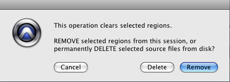
There is some convention in how these words are used, where:

  • Remove - means non-destructive/recoverable operation (the data will still exist somewhere).
  • Delete - gone forever, a destructive/permanent operation.

A screngrab showing a dialog with both Remove and Delete buttons

However, this convention is usually only followed when the two options exist. When there is only one option - it is often called delete (and it can be undone).

Given Amazon uses delete for their basket, I reckon you are safe to follow the same term:

A screen grab of Amazon Basket with a button labelled delete

Also consider using Empty Basket instead of 'Remove all items' - many e-commerce sites use this label.

0

Why not use the mental model of a trashbin-icon and for increase or decrease umount of items use up- and down-arrow within an input along with a subtotal. Is the price for one or two items?

1
  • It's the price for two items. Your suggestion was actually my first design, but began to break down when I realized the view was getting cluttered with too many controls.
    – Mark
    Commented Jan 27, 2014 at 2:46
0

There isn't strong evidence that one dominates the other. Most people readily understand the meaning of both. Sites don't consistently use one or the other. Neither word introduces ambiguity or confusion that the other does not also. Neither is harder or easier to understand in the context of the cart metaphor.

It seems the only complexity you face is communicating whether (A) an item is being removed, i.e. you are reducing the quantity in the "cart" or (B) whether you are removing the line item, and therefore removing more than a single object from a cart (like taking out all pencils, not just one pencil). Both "remove" and "delete" are unclear, and neither makes it easier or harder to clarify this ambiguity to the user.

Sometimes in design, more than one answer is equally acceptable. Using an alternative like "update" or "change quantity" might help. Amazon allows the user to change the quantity and then specifies that a "0" quantity will "delete" the line item. BestBuy gives "update" and "remove" options.

More variations are readily available, providing strong evidence of the interchangeability of these and similar terms.

Your Answer

By clicking “Post Your Answer”, you agree to our terms of service and acknowledge you have read our privacy policy.

Not the answer you're looking for? Browse other questions tagged or ask your own question.