2

I'm currently implementing a responsive design on an intranet, which has the following view in desktop width equal to or greater than 1024 px. The tablet view is anything less than 1024 px width. Technically this isn't a problem.

But I'm curious if one can, and should, reorder elements currently positioned on the desktop (asserting right-to-left reading order):

  1. Group News
  2. My Organization News
  3. People Search
  4. Environmental News
  5. My Organization Shortcuts
  6. Announcements

to the ordering in tablet view

  1. My Organization News
  2. Group News
  3. Environmental News
  4. My Organization Shortcuts

Does it have effect on users' mental model finding elements, or does it have no effect at all? It's different devices, and user may find their way anyway eventually.

I got the question from my customer, and I couldn't answer. So I would hope that the community could guide me in this matter.

Does element order matter to users on different devices?
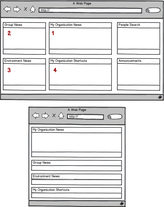
mockup

download bmml source – Wireframes created with Balsamiq Mockups

2
  • 1
    I'd find 1-4-2-3(right top - right bottom) more logical. It puts emphasis on the centre, left and then right column and "processes" each from top to bottom. And puttung the shortcuts in a more prominent position would probably be a good thing, or they wouldn't be short cuts :-) Commented Dec 22, 2013 at 18:52
  • @MarjanVenema I know! This is why this seems so odd! There is no reasoning behind it. (And I'm thrown in this project now without knowing previous choices) Commented Dec 22, 2013 at 18:56

2 Answers 2

2

Reordering content on narrower screen sizes is a valid and useful approach when done right. I guess a key factor here is to maintain the hierarchy (flow) used in the wide layout. Simply stacking columns under each other without changing the order could easily bury/push down potentially important content in narrow, single-column layouts.

The way you've rearranged the boxes in the narrow layout reminds me of Content choreography as described by Trent Walton:

Another approach could be to interdigitate content by folding elements into each other as the view narrows.

By alternating blocks from the primary and secondary columns, you're probably making the flow of content in the narrow layout correspond more to that in the wide layout.

Looking back at your example, here are my thoughts:

  • "My Organization News" is the first block in the primary content column. It makes sense for that block to be #1.

  • In the wide layout, "Group New" appears higher than "My Organization Shortcuts" and "Environment News" (which are probably going to be under the fold). It makes sense for it to be #2 if we wanted to maintain that hierarchy.

  • Now, I would use the next block from the primary content column, "My Organization Shortcuts", as #3, since it seems to be (judging by the fact that it's in the primary column) more important than "Environment News" (which is in the secondary content column).

  • "Environment News" would be #4.

Another thought on "My Organization Shortcuts" is that I would consider putting it in an off-canvas column (a sliding box with an open/close button) that is accessible regardless of scroll position. It seems that this block would contain navigational links that the user would want accessible at any point in time.

Hope this helps.

1

Taking "Mobile First" paradigm, you could think in a reverse way.

You create stacking layout for mobile according to some principle. Probably, the order of the blocks reflects relevance, or usage frequency, or usefulness of the content. So the arguments for the ordering is the base of your layout decision.

Designing the desktop layout, apply the same arguments, as it brings consistency in both layouts. The consistency of the goals of the pages.

Should the both layout be the same? Definitely no, the responsiveness is the tool for making different layouts, best for each world. Still, the goal of the both layouts remains the same.

I don't think mobile and desktop versions form different mental models, as it seats on a higher level than visual perception (layout matters). So the different layouts could represent the same mental model.

Assuming the ordering is the tool, I'd say yes, ordering do matters to users on different devices, if it is used with some goal in a desinger mind (e.g. to provide better experience for mobile users).

Your Answer

By clicking “Post Your Answer”, you agree to our terms of service and acknowledge you have read our privacy policy.

Not the answer you're looking for? Browse other questions tagged or ask your own question.