7

I am currently designing a single page checkout form. I would appreciate some feedback on the lengths of my input fields.

In the Billing and Shipping sections, I have staggered the length of the fields, trying to keep the size of the input field relative to the size of the expected input.

However, in the Payment section, all the input fields are of the same length. Do you think this breaks the consistency of the form since the Billing and Shipping sections have staggered lengths for input fields? Should I try to vary the lengths of the inputs in the payment section so that it looks more like the other sections?
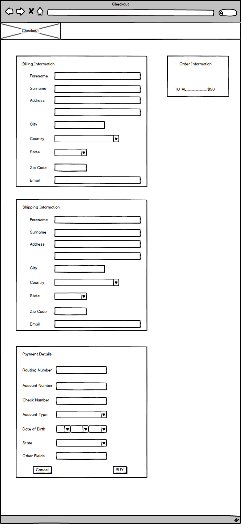
Single Page Checkout

4
  • 1
    Why is the payment section different at the moment?
    – Matt Obee
    Commented Oct 29, 2013 at 15:36
  • The Payment section is different at the minute as there are no fields which I feel are large enough to occupy the full width of the screen. All of the fields are 'medium' sized fields.
    – Pete
    Commented Oct 29, 2013 at 16:35
  • So the fields in the payment section are in fact already appropriate for their expected input, and they just happen to all be the same length? If so that seems fine - I don't see any value in changing the lengths.
    – Matt Obee
    Commented Oct 29, 2013 at 17:02
  • Correct. My worry is that the Payment section in not consistent with the look and feel of the other sections.
    – Pete
    Commented Oct 29, 2013 at 17:04

3 Answers 3

7

As Luke Wroblewski points out in "Web Form Design", the size of of an input field can help provide your form fields with affordance. The way you've adjusted the field lengths in the billing and shipping sections are good because they provide the user with an idea of what they're expected to enter. It would be a good idea to be consistent and have the input fields in the payment details section also have field lengths that closely match the space needed for the user to enter the appropriate data.

As an aside, you might find the article "The Ultimate UX Design of: the Credit Card Payment Form" useful while working on the payment details section. Good luck on your project!

1
  • 2
    I agree with the answer here. Moreover, don't put Cancel and Buy on each side of this screen. If you are worried the user might confuse the two buttons, make the Cancel a "link" instead of a button to put more focus on the action. Also you can help the end user by defaulting shipping information to be the same as billing information, with an option allowing the user to choose otherwise; since most of the time they would be the same.
    – Rasha
    Commented Oct 30, 2013 at 9:05
3

The more consistent you can be the better. In my opinion keeping the fields justified like you have in the billing section feels cleaner. A couple quick wins would be extending the city and country field widths to match the others, then put the state and zip on the same line.

Bonus: In a previous life I worked on a one-page checkout option that floated the three sections from left to right. That was fun, but looking back, the flow of the version you have might be easier on the user. Seeing all three sections floated left to right could potentially be overwhelming.

Good luck!

2
  • Thanks for the suggestion, Although I was worried about extending fields throughout the form to match the justified look of the Payment section as I feel it may look like a mass of input fields. I seem to like how the different length of input fields breaks the form up and makes it easier to line the input field and the label with your eye.
    – Pete
    Commented Oct 29, 2013 at 16:57
  • Oh and with regard to your comment about the 3 floating sections. I did consider this but I agree that it could be potentially overwhelming. I like the idea of my above version in that it may be easier for a user on a mobile device, they can simply scroll down through the form with ease.
    – Pete
    Commented Oct 29, 2013 at 17:02
1

Aesthetically, input elements look better if they're equal widths, but on the other hand input elements that are only as wide as they each need to be will hint what they're for, as mentioned.

As an aside, I would put the Cancel and Buy buttons beside each other (ie, flush-right with Buy on the right) because doing so ensures that the user will see both and reinforces the fact that they're siblings (ie, they affect the same form in different ways).

Your Answer

By clicking “Post Your Answer”, you agree to our terms of service and acknowledge you have read our privacy policy.

Not the answer you're looking for? Browse other questions tagged or ask your own question.