33

Let's say there are two button's with icons, for example a typical "Grid View" and "List View" buttons, and I don't want to use bevels to create a "pushed" effect. Let's say I'm doing it in a simple design so they are just simple icons with colored backgrounds to fit the overall style:

Grid view and list view

Is there any good way to differentiate which one is selected ?

Of course in this situation the user could just know it by the content displayed, but this is just an example, lets pretend they couldn't know which one is selected by the content.

Even if I grey out the non-selected one, or give a brighter/different color that would work in a bigger buttons group by indentifying the the button that is different to the rest, but that won't work when there are only 2.

What would you guys think that would be the most elegant solution?

3
  • 1
    Checkmark overlay? Commented Oct 22, 2013 at 16:19
  • 2
    YouTube has this problem with its viewer size selector. Commented Oct 22, 2013 at 18:04
  • @MatthewPiziak The grey out option seems to work, (at least for me) on YouTube
    – ThaSaleni
    Commented Oct 25, 2013 at 14:07

6 Answers 6

47

As you correctly point out, this is a typical problem you encounter when you have a set of only two elements: it's never quite clear which element is selected. It seems to be difficult to highlight or otherwise emphasize the currently selected element. In my experience, stemming mostly from user research we did, what works for one user, doesn't work for others. You can't imagine how many discussions I had and how much advice I got on how to make this clear. Even using a highlight color (e.g. blue) wasn't always working.

In the end, what worked best for us was to connect the buttons with the view they toggle and to indicate the currently selected view with an arrow. That's the solution we've found that reliably ended all discussions.

An arrow indicates the currently selected view

1
  • 2
    As you and @BoppreH suggested, yes, I think in the end having a mark outside the boundaries is the best way, it can fit any situation and is not restricting the styling. Thanks!
    – aleation
    Commented Oct 23, 2013 at 7:53
27

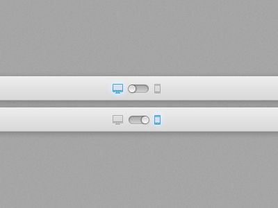
If there are two options, you could consider using a switch/toggle instead of an arrow as well.

Took this from Dribbble:

enter image description here

4
  • 1
    You'll end up with the same problem I bemoaned in my question Commented Oct 22, 2013 at 20:28
  • 2
    @MikeBrown: I don't think your question is as relevant with this design. In the above example it's extremely clear what is selected and what can be selected.
    – alc
    Commented Oct 22, 2013 at 20:55
  • 1
    That solution seems nice and elegant, but personally I think it's too specific, relying on switches that are elements more common in mobiles, I think switches are nice if you are on an mobile or tablet but I think they are not a good solution on desktops, Users tend to think that they have to drag, adding a bit of friction in their experience.
    – aleation
    Commented Oct 23, 2013 at 7:49
  • You know what...I didn't realize there was a picture attached...corporate network blocks pictures on the internet. Or at least on S.Ex Commented Oct 23, 2013 at 12:31
9

You want to indicate that a button a pressed, a setting is active. What do you have to work with? Colour, placement, additional visual elements. And size.

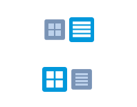
I personally think that Andreas Weder suggests a good solution. But if you feel that a tab-like pattern wouldn't fit in your design I have another suggestion. In addition of indicating with colour you can also indicate with size:

enter image description here

You can let an icon/button have a pressed state without beveling it up. Just make the active state slightly larger, and in a more vibrant colour, and the inactive state slightly smaller and bleak. It would in essence follow the same behavior of buttons which are indented with no light when inactive and bulging and lighten up when active.

3
  • 2
    More vibrant v.s. more bleak colour looks good, but for me, intuitively it's definitely the larger that is selected (because smaller might be pressed, but larger is highlighted).
    – Jan Hudec
    Commented Oct 23, 2013 at 7:14
  • Yes, @Jan Hudec has the point, at first, I thouth the bigger one was selected as well, I guess the size comes before the color at least on my brain xD
    – aleation
    Commented Oct 23, 2013 at 7:43
  • @JanHudec I actually did compose it that way at first. My initial thought was however that a pressed button should be indented and an unpressed button should be bulging. However, there are of course buttons which handles this the other way around, being indented and dark when inactive and bulging with light when active. I think your reasoning is good either way, the active one should be more prominent with size and color. Commented Oct 23, 2013 at 8:26
8

border​​​​​​​​​​​​​​​​​​​​​​​​​​​​​​

1
  • 2
    So, is the blue one or the white one that is currently selected?
    – Alex A.
    Commented Oct 23, 2013 at 4:13
6

Make a mark outside the boundaries of the buttons. This way it's clear the highlighting is not part of the button itself, but a state of the interface.

This example lacks affordability, but I think it shows very clearly which one is selected.

1

Do you need to show the selected one?

A solution could be to not show the icon for the current layout and just show the alternative layout icon. The page layout itself tells the user which layout they have selected and you would have fewer artifacts (clutter) on the page.

6
  • from the question: "Of course in this situation the user could just know it by the content displayed, but this is just an example, lets pretend they couldn't know which one is selected by the content." ;-)
    – Lovis
    Commented Oct 22, 2013 at 15:59
  • 1
    Oops. Read that and forgot it by the time I was answering. Oh well...
    – edeverett
    Commented Oct 22, 2013 at 16:24
  • 1
    Your point is still valid, though
    – Lovis
    Commented Oct 22, 2013 at 16:43
  • 3
    I always have this problem with those play/pause buttons if I don't hear any sound: Does the triangle mean it's playing now, or that I need to push it to play? Commented Oct 22, 2013 at 19:56
  • This is also very troublesome: does icon represent current state, or it represents the state it will change to? Commented Oct 23, 2013 at 6:32

Your Answer

By clicking “Post Your Answer”, you agree to our terms of service and acknowledge you have read our privacy policy.

Not the answer you're looking for? Browse other questions tagged or ask your own question.