1

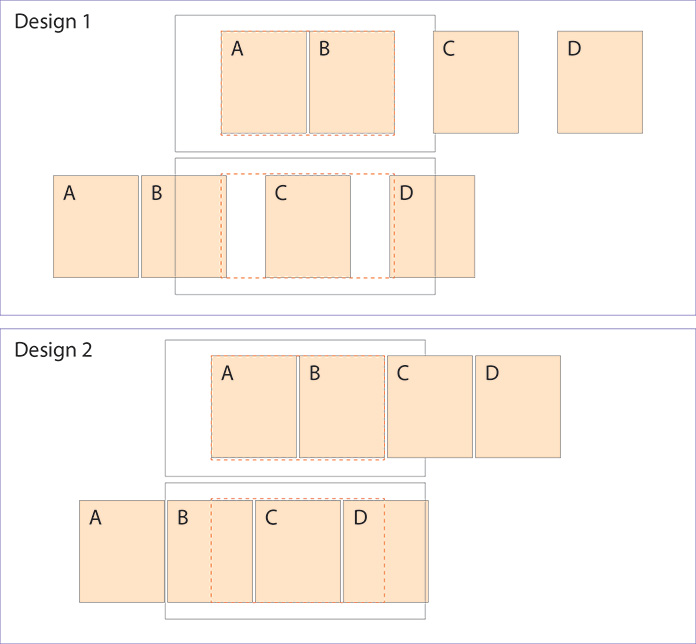
I am designing a web app with a modal popup that has 3 steps. The first step contains two panes and occupies the full extent of the modal space (delineated by red dotted line) while the other two each occupy half or slightly more than half. Upon completion of each step, it slides to the left. It's not possible to make panes C and D fill the whole space because there just isn't enough content for that. I want a little bit of the previous and/or next panes visible.

Design 1 pros: Because each pane affects the next, you really should be able to see the next pane until you've confirmed your choices.

Design 1 cons: Not sure if that big spacing looks right.

Design 2 pros: Potentially looks better.

Design 2 cons: You'll have to see pane D while still editing C even though D is heavily dependent upon what you enter on C.
enter image description here

1 Answer 1

2

Large empty space in Design 1 makes feel of dialos's incompleteness and viasually not appealing. While Design 2 has risk of misperception, as user could try to scroll to the right to get full view of both C and D panes. Also panes on the sides create visual noise and gap at final step, see image.
enter image description here

I think nothing wrong in resizing the dialog to fit the content. Resizing eliminates the problems. Also size is not only feature which supports consistency across the steps. Just use other features to support dialog consistency, see image.
enter image description here

Your Answer

By clicking “Post Your Answer”, you agree to our terms of service and acknowledge you have read our privacy policy.

Not the answer you're looking for? Browse other questions tagged or ask your own question.