3

I am currently working on a site in which the main goal is to provide a very easy and fast workflow to review an item, make some notes, and submit it. All the fields included in the below image are the minimum fields needed to accomplish this task.

Currently, the thought is that the user would select an item from the right side menu and the application will populate the fields with data. The user would make some comments, change the status, and then submit the changes, after which the application will automatically advance to the next item in the list.

Obviously hiding any of the information to make a cleaner interface is not an option as it would obstruct the end-user from completing the task in as short amount of time possible.

With those concepts in mind, looking at the current structure makes me cringe and I want to improve it to make a more enjoyable experience.
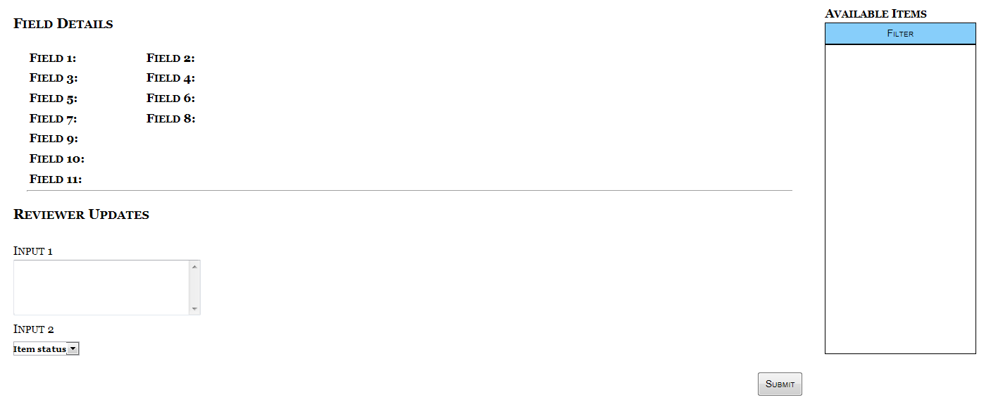
It makes me cry

Ignore the lack of a background color/image for the time being.

NOTE: Field 11 is the most important field and is often a paragraph in length.

5
  • How many (average) reviews typically a user should make in one session? Do items have some classification for grouping purposes? Commented Jul 16, 2013 at 14:17
  • @AlexeyKolchenko No, all the items are of the same category and the purpose of the application is to be one continuous session, reviewing anywhere from 10 - 100+ items.
    – Justin
    Commented Jul 16, 2013 at 14:21
  • Hi Justin, your question is quite broad at the moment, improving it's focus makes it better fit the site and should lead to better answers.
    – Pesikar
    Commented Jul 16, 2013 at 14:31
  • @Pesikar Do you have suggestions on how I could improve it? Do to certain regulations and restrictions, I don't have a whole lot of leway on the information I can provide.
    – Justin
    Commented Jul 16, 2013 at 14:33
  • @Justin You could try to elaborate why the current layout makes you cringe, what is the problem with it?
    – Pesikar
    Commented Jul 17, 2013 at 6:54

4 Answers 4

3

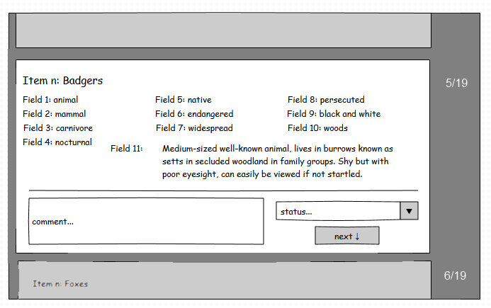
Here's a mockup which includes a few suggestions to make this fast:

  1. Show only one review item at a time, to focus the reviewer's concentration.
  2. But show a small part of the next item below, to show that it's part of a production line. Make it slightly blurred or greyed out, so as not to attract too much attention.
  3. Automatically put focus in the first field (comment), let them enter their text easily then tab to the status field, choose a status and tap enter or space to complete the review. Make it all easy to do with just the keyboard.
  4. When the user completes the review, scroll it upwards to let the next item scroll into view.
  5. To one side, show how many items the user has got through and how many are in the list total; this lets them see their progress without much distraction.

mockup

I've made a few assumptions:

  • The users are competent technically; willing and able to find the fastest way to do the processing e.g. use keyboard shortcuts.
  • Each reviewer has their own list, which isn't so large as to make the numbers discouraging (e.g. 5/1109).
  • Each review item can fit on screen.
3

To organize fast workflow, you could:

  • Divide all the task on a chunks of, say, 10 items. It's hard to keep high performance on 100+ items without breaks. The work is too monotony.
  • Don't let choose an item from the list. This leads to decision which item to take or to skip. This is time! So auto-populate next item, but let user has Skip function if he can not comment it for some reason.
  • Display the progress of chunk completion. This lets visualize and estimate completion process.
  • Organize data for easily decision making. Place the most important fields at the top or group the fields in some meaningfull logical order. I think 11 fields are too much, can't you reduce amount?
  • Make the pleasant pause after chunk is completed. It will give a rest for a user as well break the monotony.
  • Use elements of gamification to create competition between team members. It will motivate them.
2
  • Thank you for your response. Sadly, 11 fields are the minimum that can be displayed in order to make the needed comments.
    – Justin
    Commented Jul 16, 2013 at 19:30
  • How about showing all 11 fields but spacing them out more so that they are easier to focus on? You could use frames to keep the review box visible and allow scrolling through the fields. Commented Jul 17, 2013 at 17:22
2

There are several option that i can suggest.. it all depends on the amount of data that you need to display.

You have mentioned that the main requirement is to review and comment on each item fast and easy, so here are the options:

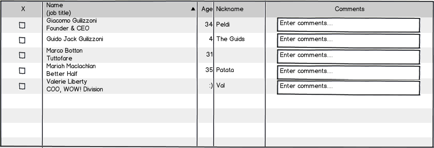
Create a table that will list all items with a text area and allow submission of all items at once or one by one:

mockup

download bmml source – Wireframes created with Balsamiq Mockups

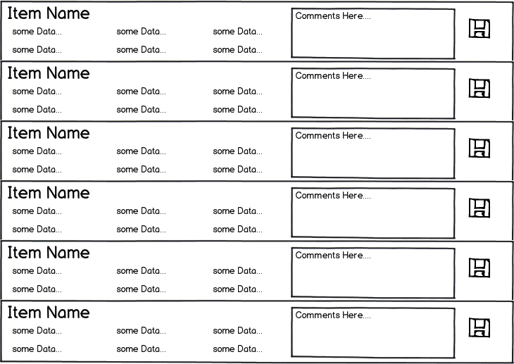
Create a list view if you have slightly more data or action to accomplish for each item.

mockup

download bmml source

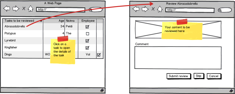
improve your initial idea by adding previous and next buttons on each details page that will help to submit and move to the next item.

1
  • While I like the designs, I should mention that several of the fields, particular Field 11 could be up to a paragraph in length.
    – Justin
    Commented Jul 16, 2013 at 14:22
2

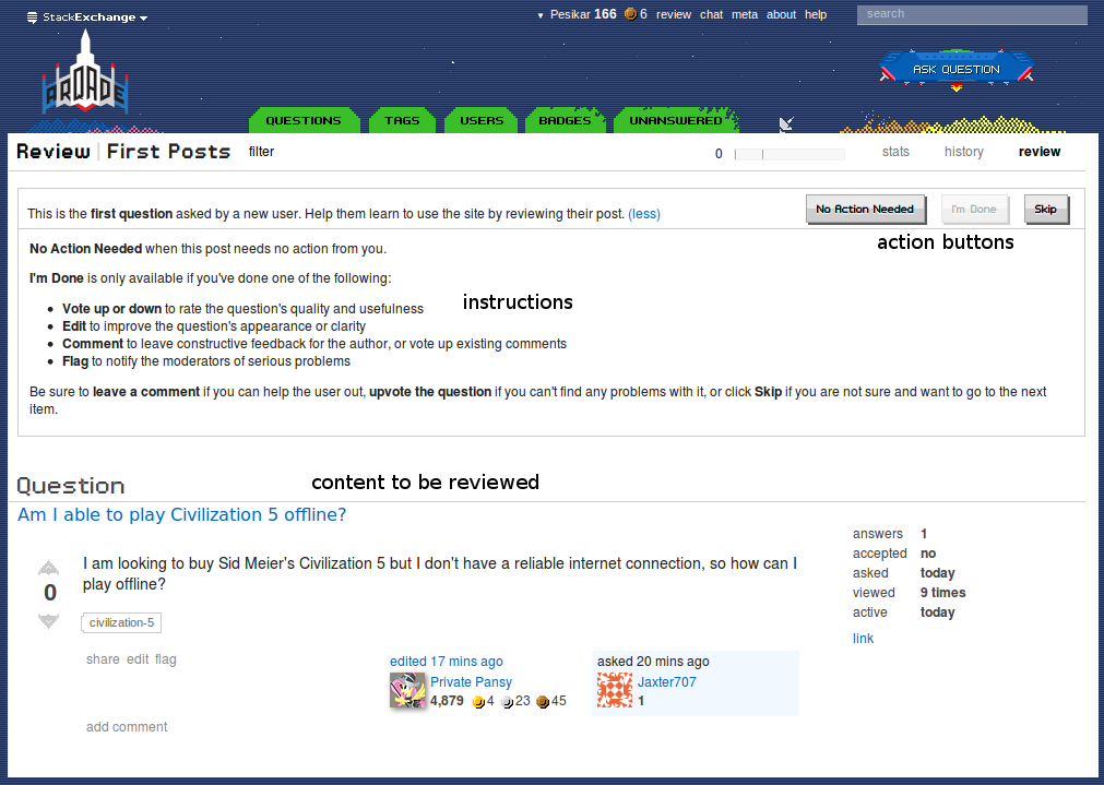
You could try the same format as the review queues on stack exchange. Here the focus lies on the current task:

review on stack exchange

When the context of the other items is not important you could use a list of items to be reviewed:

mockup

download bmml source – Wireframes created with Balsamiq Mockups

Or skip that altogether when the other items are not relevant (like in the stack exchange model) and jump directly to the first task.

A skip button is useful to skip the current task and continue to the next.

Your Answer

By clicking “Post Your Answer”, you agree to our terms of service and acknowledge you have read our privacy policy.

Not the answer you're looking for? Browse other questions tagged or ask your own question.