4

We have a website where users can book a room and our payment gateway is Paypal.

On the payment page, we have a form requiring customer information and at the bottom, we have a button called "Make Payment". Clicking this should redirect them to Paypal.

However, before they proceed, we like the users to know that they don't need a Paypal account to make payment through Paypal.

We have 2 solutions so far:

One: To show the said note and a "Proceed to Paypal" button on a Modal Box. Meaning:

Click "Make Payment" -> Show Modal Box with note and "Proceed" button -> Click "Proceed" -> Goes to Paypal Page

Two: Just put the note near the "Make Payment" button and emphasize it (in some way) and put a tooltip with a more thorough explanation when they hover their mouse on the note. This way, they no longer need the modal box and the additional "Proceed" button.

Which of the two is a better solution to show an important message?

5
  • Do users fill payment info on your site or on some other paypal site?
    – Nash Vail
    Commented Jul 10, 2013 at 13:01
  • @nashmaniac We only get the customer general info but no credit card details whatsoever. That happens on Paypal site. Commented Jul 10, 2013 at 14:45
  • If the users are clicking Make payment button to be redirected to the paypal site, they should be seeing the standard paypal payment page (non-user payment form and sign-in form for users). Which stage is the confusion arising in the users?
    – rk.
    Commented Jul 10, 2013 at 14:50
  • @rk The default landing page for Paypal payment shows the sign-in form for users which may be confusing for non-Paypal users. They might not see that they can click a button below to show the form for credit card payments. Commented Jul 10, 2013 at 16:49
  • @rk Although I just now discovered that PayPal shows that as default if it cannot detect its cookie on your browser. In any case, we still need to show the note. Commented Jul 10, 2013 at 16:54

4 Answers 4

3
  1. Not all people know what Paypal really is. You have all kind of users booking rooms and you need to think that only some of them will know about it (tech-savvy).
  2. "Proceed to payment" sounds better because it informs the user that is about to be directed to the "paying system"
  3. Paypal note should be near the button or just above it with the tooltip explaining for the users at point 1. that this is a secured paying system and it does not require an account.
  4. The modal box adds one more step to the process (-1) so no.

Version 2 would be the natural choice with info.

5

You should make it part of the main label and not a separate note. Also, use the absolute minimum amount of text that can convey the message.

Pay through Paypal (account not needed)

or, even

Paypal (no account needed)

Cut down text ruthlessly, people's tendency to not read stuff appears to rise exponentially as the amount of text increases.

1
  • As @Ciprian Pălici said, "Not all people know what Paypal really is. You have all kind of users booking rooms and you need to think that only some of them will know about it". Just saying "PayPal (no account needed)" may confuse these users. I do like your comment about making the message about "no account needed" part of the main label.
    – AlannaRose
    Commented Jul 10, 2015 at 21:25
3

There are already some excellent answers but I just want to add a few things you need to keep in mind:

  • People will ignore big colorful warnings. The more visible you think you are making it, the more readily it will be ignored.
  • People will easily click through legalese or modal notes. A long text followed by a mandatory checkbox is less likely to be read than a short sentence.
  • People will stop heeding things they have been exposed to repeatedly. If they use your system regularly and have to click the warning away every time they post/order/whatever, they will eventually stop reading it and you can't rely on it to convey new or changing information.

This might be a problem for you or not (e.g. if there are some serious consequences – for you or for the user – down the line you might want to be very careful with the effectiveness of repeated warnings but if it's to “cover your ass” legally you might in fact cynically count on users not actually reading the thing).

2

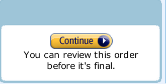
If you just want to show the notice, I like how amazon show's such things during their check out process.

Make the button be "Pay via Paypal" and in plain text write 'You can pay without creating a paypal account.'

The reason I say 'Pay via Paypal' and not 'Make Payment' is, if you use a generic 'Pay' label, then the text below does not make sense; why am I being told about paypal when I am just try to pay here?

enter image description here

Your Answer

By clicking “Post Your Answer”, you agree to our terms of service and acknowledge you have read our privacy policy.

Not the answer you're looking for? Browse other questions tagged or ask your own question.