I'm helping someone improve a website where they are currently using a JQuery UI accordion to display a long list of commands, revealing what they do when clicked. http://stats.neurobots.net/botstats.php?id=1 But accordions don't scale well, even though much of the content areas only contain a single line. What would be a better way to display this?
-
1I would remove the accordion altogether, and expose all the content so users don't have to click just for one line of content. Sure the pages will look rather lonely and bland, but your users will thank you.– Jung LeeCommented Jun 30, 2013 at 22:38
-
Agreed; how about a table for this content? It would be very scannable; your users could find what they're looking for at a glance.– LindaCamilloCommented Jul 1, 2013 at 0:09
3 Answers
I'm pretty much in agreement with the two comments above. Often, the best alternative to an accordion is to simply not use an accordion.
Scrolling a page is often much easier than having to purposefully expand/collapse panels in an accordion.
The exception to the rule would be if each accordion has a LOT of content, and a user is likely to only be interested in one panel. However, at that point, I'd argue that's a sign that the content should perhaps be broken out into separate pages in that situation.
A good solution to an overly long accordion list is to have a single page website with the floating side navigation.
Not so good example: http://blackestate.co.nz/
Basically, you list all the titles on a floating navigation and using that to take the reader to the location on the page. Scrolling animation always makes this interaction pleasant.
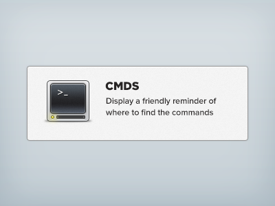
Since the contents are just single lined, having an accordion is a bad idea. Here is something you can do, Let's consider the cmd tab.
Use an icon to help user quickly spot what he needs
I mocked this up in photoshop

You can use a grid of such views .
