1

I'm looking for some examples for ways to deal with having a user select an item from a list when that list:

  • may have large amounts of text (perhaps a term + a definition so a paragraph or two)
  • is touch-friendly (radio buttons aren't always intuitive that you don't have to click the actual radio button which is a small target via mouse or touch)

The latter criteria has been resolved on mobile fairly well with select lists.

Is that a suitable solution for a UI that will also be used on the desktop? Are select list UI's intuitively 'selectable' via a mouse?

10
  • Sounds a lot like card view, no? Commented Jun 24, 2013 at 5:41
  • I think card view is certainly an option!
    – DA01
    Commented Jun 24, 2013 at 5:55
  • @DA01 Can you give some sample of the data your list will contain? Is it just paragraphs of text, or are there media (image and video) items too? Also, how much of it should be visible in the single view (if there is any such restriction)?
    – rk.
    Commented Jun 24, 2013 at 13:37
  • @rk in this case, it'll be a term, plus that term's definition (typically 1 paragraph of text)
    – DA01
    Commented Jun 24, 2013 at 15:03
  • @DA01 Is searching for the term possible (from user's point of view)?
    – rk.
    Commented Jun 24, 2013 at 15:07

2 Answers 2

3

I think Card View is an option, but it is not the best for text rich data items.

To reach efficient text browsing task (beyond search tools), designer could provide and suggest means, that minimize user cognitive and mental load. Among them are:

  • comfortable font size and line width for easy text reading
  • simplified layout that has no distracting elements
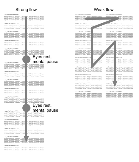
  • narrowed flow that leads user through items and prevents accidental items missing
  • flow pitstops for user to take rest as text-processing task is tedious
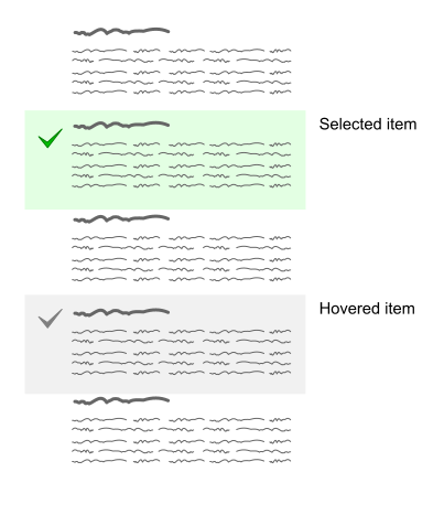
  • easy checking by making the whole area clickable

Also I think checkbox behavior is better option than radio. In text browsing task user can not be sure he selected right item until he reached the end of the list. So checkboxes allow to mark suited items along the way and finally pick the most appropriate among them. It is like breaking the task to rough tuning and then fine tuning.

So my suggestions are on the pictures.

Flow organization
enter image description here
Layout and interaction
enter image description here

Hope it helps.

0

Indeed, a Card view as mentioned by Vitaly Mijiritsky sounds like the best route to go. However, I think you should consider not putting too much text on the cards. Two paragraphs of text on every card will quickly amount to a wall of text. Would it be an option to limit the amount you show directly, and only show the full text when selecting the item or something along those lines? The card could expand to accommodate the full text.

Doing this will also prevent layout issues where you might need to show big cards for all items only because one item has a lot of content, resulting in lots of empty space on the other cards.

Your Answer

By clicking “Post Your Answer”, you agree to our terms of service and acknowledge you have read our privacy policy.

Not the answer you're looking for? Browse other questions tagged or ask your own question.