4

We are implementing a communication preferences page, where our users can select to opt-in to different topics of email marketing or choose to unsubscribe from all.

If the user un-ticks all options or selects 'unsubscribe all', the requirement is to display some more options and a comments box to gather information on why they are choosing to unsubscribe.

There are two options currently in debate and I would like to find out which is best from a communications angle and ux view point of view.

Which is the optimum experience?
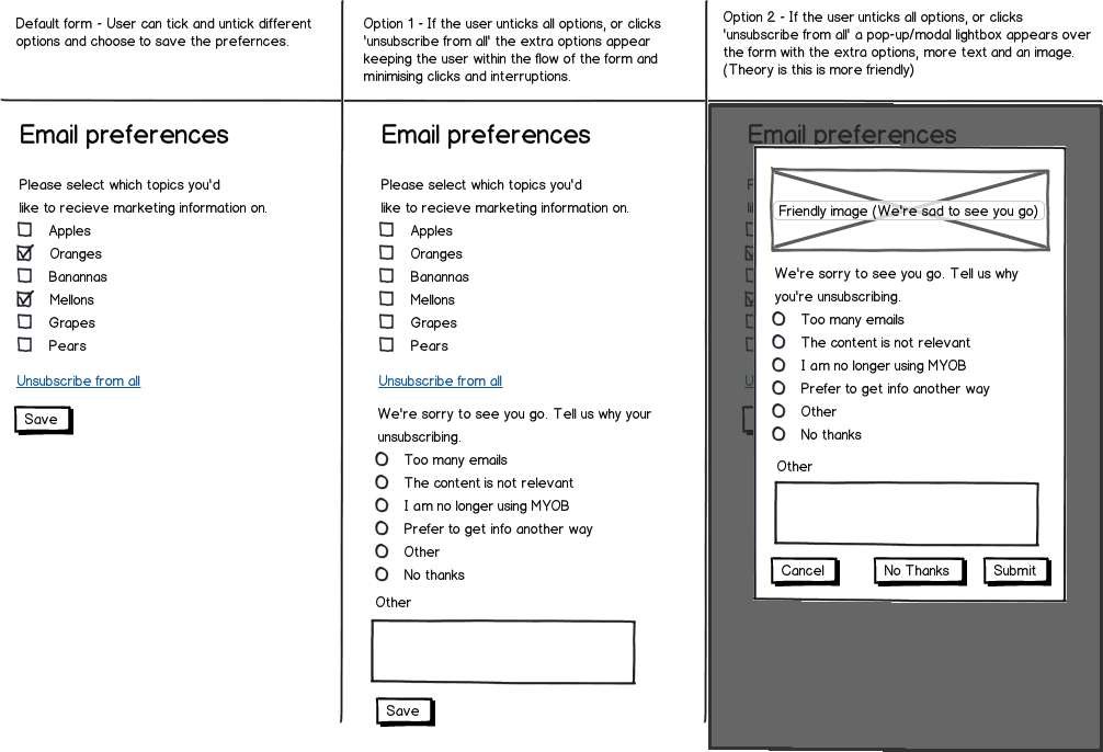
mockup

download bmml source – Wireframes created with Balsamiq Mockups

5 Answers 5

2

I'd say you've implemented some weird behavior.

If is possible case when user unchecks all the checked options and next wants to check some others. At the moment all options are unchecked user will see "We are sorry to see you go". But he doesn't want to go, he just wants to check some options!

Again, link "Unsubscribe from all" doesn't really unsubscribes, it just deselects all the options! So it's better to label it "Uncheck all".

One more problem is location of option "Other" and input field "Other". They are separated by another item. It is confusing.

Your popup just flooded with buttons at the bottom, you make user think a lot!

So, you have at least four usability problems in both of your options.

Solution is to redesign the taskflow. Let user works with options and only after he makes final decision and presses Save button, a) save changes, b) show "We are sorry to see you go" dialog with only one button and the first default item "No thanks".

2

Proposal : Do NOT propose to unsubscribe

If the user wants to unsubscribe she can do it in the corresponding mail. The main reason of it is you have no reason to unsubscribe if you do not know the content.

So make appealing descriptions for the subscription and an easy way to unsubscribe in the mail.

It is so annoying to unsuscribe in the application when its the email that bothers the user.

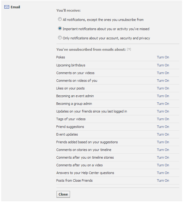
Example in the real world : Facebook

enter image description here

Once the user clicked on Turn on, the line disappears and she can unsubscribe into the next relevant email.


There is no such thing as users that want to receive emails and those who do not. Everyone wants to receive relevant email (for some people, every mail is irrelevant but that cannot be your target market).

1

According to me, I think the best UX option here would be Option 1. This is because the information is shown upfront to the user.

Option 2 contains a popup which I suppose is more intrusive to the user. Using this option user is more likely get frustrated because the popup surprisingly shows one more step towards completing the unsubscribe process. Also, popups are getting replaced on the web more and more.

1

I like the Option 2 — except the errors in the texts. However, its three buttons need rethinking.

The Option 1 is inconsistent. There is the “bye bye” part, but there are still oranges and melons. That does not make sense.

If you do something in the way of the Option 1, then divide it in 2 parts, with 2 big radio buttons. The “bye bye” part would be in the big radio button “Unsubscribe from all”, and the first part would be in the big radio button “Subscriptions”.

But I prefer the Option 2.

1

If your user is unsubscribing---ie. he's received an email that was unwelcome---you are already dealing with a major UX problem. Not only have you annoyed your user, you've annoyed him to the extent that he's halting his workflow and taking action to avoid this situation in the future. From a UX perspective, this is a major issue.

Of course, the possibility always exists, but everything leading up to this point should be set up to stop this situation from happening. A user should never sign up accidentally for something he doesn't want. If "marketing" disagrees, they don't understand their job.

If your user does end up in this situation, the only fitting response is damage control. Show them that you understand their situation and give them what they want. One big button saying "Don't send me anymore emails". Don't pop up a survey, don't put anything in their way, give them what they want and pray that you haven't squandered all your good will.

The secondary use case here is fine-tuning your subscriptions, but that isn't nearly as important as the one big button.

Your Answer

By clicking “Post Your Answer”, you agree to our terms of service and acknowledge you have read our privacy policy.

Not the answer you're looking for? Browse other questions tagged or ask your own question.