6

I'm running a survey on students to collect their feedback of the courses of study they've undertaken in a college.

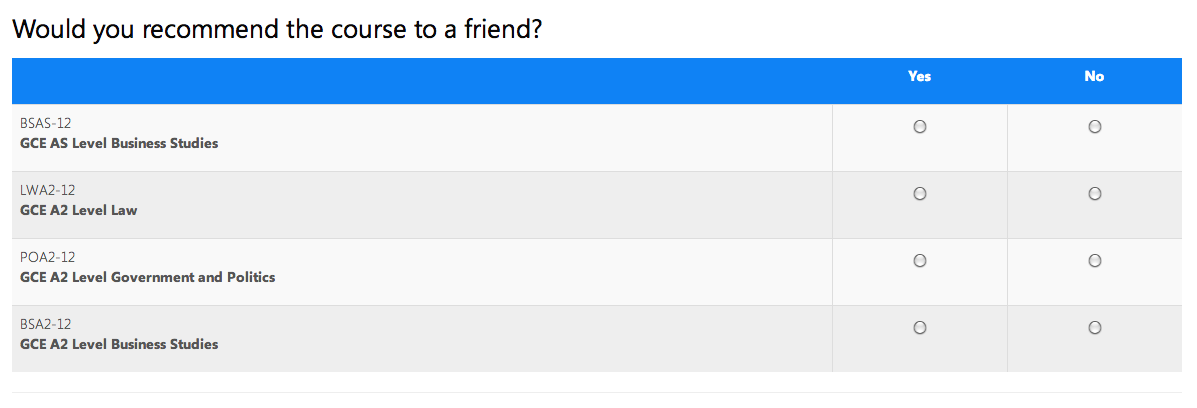
They have to answer the same question for every course they study. There are some multiple choice (radio buttons) questions and some qualitative (textarea) questions.

We've experienced an unusually high number of people indicating their dissatisfaction in the multiple choice questions and then going on to praise the course in the written answers.

We want to find a way of making more explicit the choice the user has made but without it being obtrusive (e.g. a modal: Are you sure you're dissatisfied??!).

What are some ways this could be achieved?

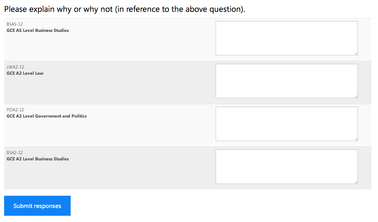
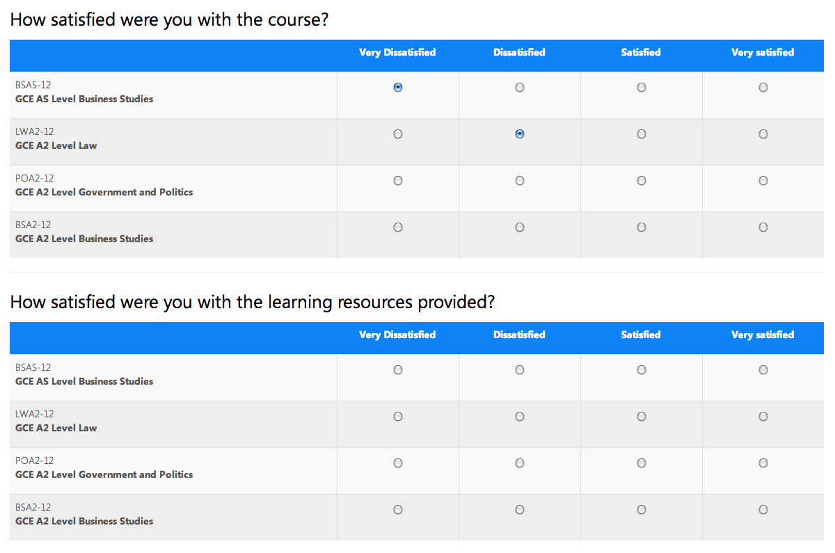
See screenshot below:

Screenshot of the front end survey

Screenshot of the front end survey

Screenshot of the front end survey

4
  • 1
    Hmmm...I wonder if people are reading the question Please explain why...in the above question. and seeing the above question as Would you recommend the course to a friend. And therefore answering the question: Please explain why would you recommend the course to a friend. Do you have evidence from talking to people taking the survey, to suggest whether this is or is not happening. If it is happening, then this is an XY problem Commented May 3, 2013 at 8:49
  • 8
    The order of the answer option is possibly to blame. You are asking how satisfied people are and starting your answer options with dissatisfied ... Commented May 3, 2013 at 8:59
  • @MarjanVenema That's a very good point. Commented May 3, 2013 at 9:07
  • @RogerAttrill From the actual answers being given, I don't think thats what is happening. Commented May 3, 2013 at 9:08

4 Answers 4

6

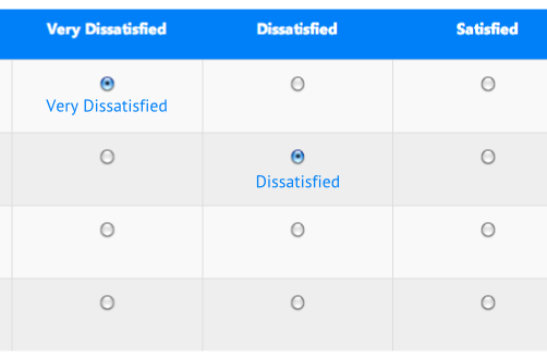
You could indicate under the selected response the actual value - as in the image below, so that users get immediate (but non blocking) feedback in-place for the response they just selected.

If users meant to be very Satisfied they will likely spot the mistake and correct it

enter image description here

Also you might try not putting the header in inverse colours as that slightly hides the content as the user moves from the question to the response, and as the header shows the response values, it's a key element that should be as clear as possible.

Another option is not to mention the word 'satisfied' in the question as it's slightly leading - but instead to ask something like How did you feel about the following courses as that will force the user to read the response options in the header rather than jumping straight into an assumption that the values range from one end of a scale to the other in a particular order.

Add in Marjans's idea of putting Satisfied first and you get the following result

enter image description here

1
  • 2
    +1 Nice idea, I recommended a graphical approach to help answering and I forgot that the best graphical approach was text ! Commented May 3, 2013 at 10:42
2

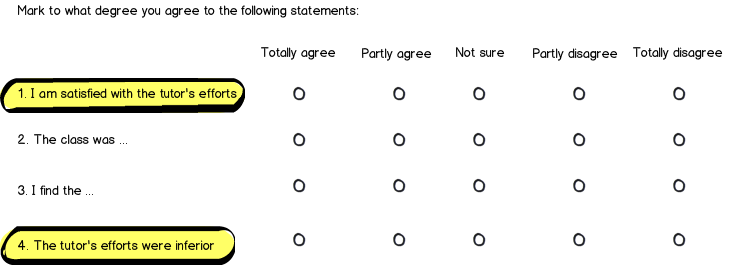
To confirm sensible results, I have taken surveys that use anti-questions:

mockup

download bmml source – Wireframes created with Balsamiq Mockups

Number 1 and 4 are "anti-questions". If a survey taker answers in a corresponding way (more or less the same meaning) on those two questions, it is more likely that he or she has read the questions carefully and has thought the answers through; than if the meaning of the answers do not match at all.

Also, a "Not sure" or "Don't know" alternative, helps to avoid false data from all those situations where a taker is not able to answer in a both well-reasoned and honest way. As a silly, but easy example, some people that are forced to answer "Would you recommend it to friend?" could perhaps be thinking "Hmm would I? Do I know anyone interested in this fine art? Nope, not among my friends. It's a No". Providing "Don't know" is an easy fall back for handling the risk of dubious questions or survey takers.

5
  • You do not want to have an odd number of answers. Most people will choose the middle one so they do not have to think. Commented May 3, 2013 at 10:40
  • Valid point, but it would be worse if people who don't want to think selects any other alternative, while still not thinking.
    – JOG
    Commented May 3, 2013 at 11:21
  • I have done some research and it seems we are both right since it depends on the context. Consequences of the use of neutral question beeing not predictable. So... reader you can ignore my previous comment. Commented May 3, 2013 at 11:50
  • Good to hear! :)
    – JOG
    Commented May 3, 2013 at 11:53
  • Agreed. If you force me to lie and express an positive or negative opinion on something I didn't notice/couldn't care less about you're not going to like my lie. Commented May 3, 2013 at 14:42
1

Maybe the design is not explicit enough before the question is answered and that is why people are confused.

There is enough questions in this form, since we all know answering those surveys are a pain, you do not want to had others by asking for confirmation.

Maybe something like that would help :

mockup

download bmml source – Wireframes created with Balsamiq Mockups

You can also change the order of the answers since most of people are not even going to read and are going to click in the first radio button. I guess disappointed people in the opposite will want to share their feelings and put some effort into the survey.

For another argument, you can read this article about Left-Side Bias.

You should definitely alternate closed and open question, so the student will be able to explain his answer in a row and make some relation between the two questions. Your problem as far as I understood is coherence between answers, I guess it has something to do with the coherence of the survey itself.


  • Help graphically the student to answer well
  • Count on people laziness while answering those questionnaires and change the order of the answers
  • Be sure angry people are going to tell you
  • Put the open question and its corresponding closed answer together
0

Rather than group by question, you should try grouping by course.

Since, in the current view, the flow is like:

Question 1 -> think about course 1 in context of question -> think about course 2 in context of question -> think about course 3 in context of question -> think about course 4 in context of question.

Question 2 -> think about course 1 in context of question -> think about course 2 in context of question -> think about course 3 in context of question -> think about course 4 in context of question.

Question 3 -> think about course 1 in context of question -> think about course 2 in context of question -> think about course 3 in context of question -> think about course 4 in context of question.

Question 4 -> think about course 1 in context of question -> think about course 2 in context of question -> think about course 3 in context of question -> think about course 4 in context of question.

Now, if you arrange in context of course, you get the flow to be like:

Course 1 -> Question 1 -> Question 2 -> Question 3 -> Question 4

Course 2 -> Question 1 -> Question 2 -> Question 3 -> Question 4

Course 3 -> Question 1 -> Question 2 -> Question 3 -> Question 4

Course 4 -> Question 1 -> Question 2 -> Question 3 -> Question 4

What you are essential doing, is reducing the number of contextual jumps the student has to make while answering the questions. Granted it get's repetitive, but, it should be faster to fill up the form.


Some usability suggestions from NN/g:

  • Layout the answers vertically (I would ignore this in case of likert scale if need be)
  • There should be a default selection in radio buttons : now selection of default is a bit tricky, if you select extremes you end up messing the the results, might go with the neutral option as the default selection.
Your Answer

By clicking “Post Your Answer”, you agree to our terms of service and acknowledge you have read our privacy policy.

Not the answer you're looking for? Browse other questions tagged or ask your own question.