17

I am working on a UI design. I have good CSS/HTML knowledge. But not good in UX.

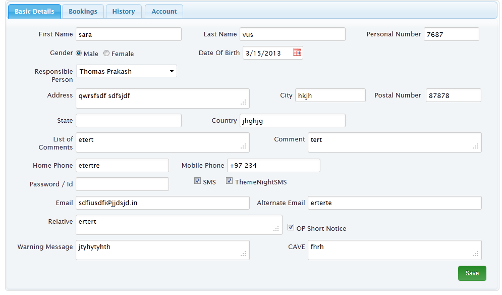
Attached image is the UI I created for one page.

enter image description here

I tried alter it nearly 10 ways, still my customer says it looks weird.

I can make fields one by one, problem is it will show a scroll bar.

How can I improve this form's UX?

Any sample or https://gomockingbird.com/ kind of wire frame / suggestions are all welcome

The form has a fixed, 960 pixel width.

1
  • In this case you're customer is right, however, they're rarely the expert and it's worth being cautious before you accept such an argument. Sometimes people say it looks weird because it isn't the same as whatever crappy design they're used to.
    – Toni Leigh
    Commented Oct 16, 2015 at 21:57

2 Answers 2

37

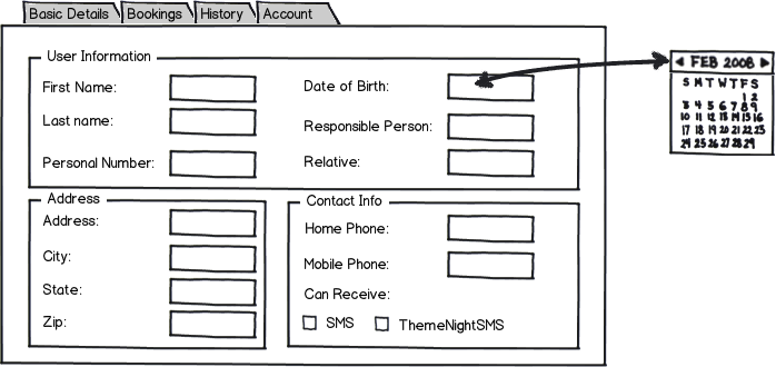
You have a lot of information in that form - it isn't organized very well. Consider subdividing the form fields into logical groups that will help orient and guide the user (the HTML fieldset and legend tags work well here). Also, present a uniform visual style - right now your inputs are all over the place. Line up your form fields so that the user's eye can easily scan the form. See a sample interface below (I didn't include all of your fields because I wasn't sure how to categorize them):

mockup

download bmml source – Wireframes created with Balsamiq Mockups

2
  • Well done Joshua! Concise and elegant solution and explenation. Commented Apr 7, 2013 at 13:06
  • Nailed it. Grouping / alignment are the biggest issues with the original, great answer.
    – Simwill
    Commented Dec 8, 2014 at 12:20
11

The problem is your page is without structure, making it hard for the user to know where to start, where to go next etc.

There is plenty of evidence that having all your fields in vertical alignment will improve usability and minimise time, burden and errors.

Sure, it is nice to avoid scrolling if possible, but users work quite happily with them. Furthermore, even if you present the fields the way you have here, there's no guarantee you'll avoid a scrollbar thanks to different screen and window sizes, screen resolutions, level of zoom etc.

Joshua's suggestion to group fields into sections could also improve the experience, however there is also evidence that people sometimes base their decisions about which fields must be filled out on the relevance of the section headings.

I would keep your field labels flush right (i.e. butting up against the field) rather than flush left as Joshua has them in his mockup. This makes it easier for the user to associate labels with fields.

All in all, alignment is very important to the forms user experience. If you want to read more about it, I wrote a detailed post on my website, which talks about the four different places alignment come into play in a form.
1
  • Good points - there is a lot of work that goes into excellent form design. Commented Apr 7, 2013 at 16:48

Your Answer

By clicking “Post Your Answer”, you agree to our terms of service and acknowledge you have read our privacy policy.

Not the answer you're looking for? Browse other questions tagged or ask your own question.