25

I'm trying to build a visual web interface where users can distribute a budget over some (varying) number of items. For example, if the budget is 100 points, I might allocate:

50 points to 'Apples'
50 points to 'Oranges' 

or:

75 points to 'Apples'
25 points to 'Oranges' 

If the user wants to add a new category, something like this should happen:

30 points to 'Pears' 
60 points to 'Apples'
10 points to 'Oranges'

but without the 'jump' the allocation above would give if the points where just represented as a bar chart. I'm imagining a kind of audio equalizer interface where users can just move sliders around for each item, but I can't get the "math" right and feel like I'm missing something important. Here are the constraints:

  • I want all numbers to be between 0 and 100
  • I want the budget to always be satisfied (i.e, sums to 100)
  • I want users to be able to add/delete items to their 'cart'
  • I don't want the user to have to do any math
  • I'd strongly prefer that all slider movements are continuous (i.e., no "jumps")

Update: I have some prototypes for people to try out / vote on:

http://buger.github.com/skill_weight_ui/#

4
  • 5
    This is an awesome question: it's interesting, on topic, detailed, and clear -- and the answers are fascinating. I changed the title to something a little more concise in hopes that more people will click through. Commented Feb 25, 2011 at 14:06
  • +1 I've worked for a company that exposed a system like this to the user, and it was hopelessly basic. As a developer of the system it still confounded me. I'd love to see a truly usable, innovative answer to this question.
    – Nicole
    Commented Mar 17, 2011 at 22:11
  • I just noticed your prototypes. Awesome work. Obviously the relative assignment method works well for just two items. But with 3 or more items it becomes painful when the user feels like they must get their numbers exactly right. I do think I like the "Standard" version best for what you're trying to do. Commented Jun 16, 2011 at 13:18
  • Please provide an updated link to the prototypes, if it still exists. Looking for ideas to solve this problem. Specifically, any ideas not covered by this and linked questions ( ux.stackexchange.com/questions/6063/… ux.stackexchange.com/questions/7297/… softwareengineering.stackexchange.com/questions/261017/… ).
    – shannon
    Commented Oct 22, 2017 at 8:10

15 Answers 15

15

One problem I think you should avoid is auto-adjusting the other variables to maintain the 100% total. It can become extremely annoying to have to deal with that whenever there are more than 2 variables at play. And if you relax your restrictions a bit I think you can create a more user-friendly interface out of it.

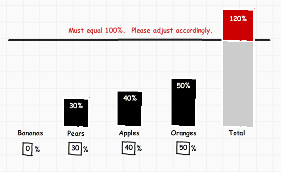
I came up with a solution that's part text input / part visual representation that I think will work well... enter image description here

Intuitively people can enter percentages directly into the text boxes. But to take it a step further you could even create a handle on each column and make them draggable. For example, you could grab the "Oranges" column and drag it down to 30% to satisfy the 100% total requirement.

6
  • 2
    I like this. You could even rotate the entire thing 90% and use sliders for the actual bars.
    – DA01
    Commented Feb 25, 2011 at 21:21
  • @DA01 - I thought about rotating this 90 degrees like you said. It might make more sense depending on the page layout. Commented Feb 25, 2011 at 23:36
  • Thanks Steve - I think this is really intuitive---I like how you offset the "total" bar both in space and color & gave users two easy ways of altering allocations. I'm going to build a mock-up of this & post the code back here---any preferences/ideas on implementation? I like ProtoVis but I'm open to suggestions. Commented Feb 26, 2011 at 14:20
  • 1
    I'd recommend a stacked bar for that (i.e. a single bar with sections representing the individual components). The overshoot indication is good, but it's not easy to relate the components to that.
    – peterchen
    Commented Mar 1, 2011 at 10:42
  • @peter - I don't know, I think it'll be pretty obvious if the total grows as you enter numbers. Commented Mar 1, 2011 at 15:45
10

(edit) The other replies have made me consider that there are indeed two different cases: making a relative assignment, and filling up a limited container.

Relative Assignment


A relative assignment would be creating a fruit punch recipe, with an yet-unknown amount of fruit punch to be created from it.

I haven't yet found a multi-tap-slider that feels "good". Typical operations, such as "squeezing out 5 percent of each to make room for a new one" are a mess to do with it.

Provided your target audience can enter numbers, here's my suggestion:

1. remove the "sums to 100%" constraint from user input

What you want is a relative allocation.

You can let the user enter any number, and then map the sum to 100:

total = sum(input[1..N])
if (total == 0) 
  ShockUser();
percent[1..N] = 100* input[1..N] / total 

Right now you force the user to follow a constraint that is not strictly necessary for valid input, just for presentation. You would need to reject or modify user input just to preserve this constraint, but the constraint does not affect the data itself.

2. provide instant feedback
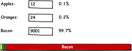
Update a A pie, ring, or summed bar chart instantly with the input. Example sketch:

enter image description here

The instant feedback is important for the user to see the effects.

3. don't use a 3d Pie chart (emphasizes front piece), allow fractionals (makes scientists happy)


The only weakness here is that some people might think e.g. doubling all values will somehow increase their allocation - especially if their allocation is "competing" with someone elses.

The idea is:

  • I want less bacon in the mix. I reduce the number for "Bacon". Half the number = half the amount of bacon.
  • I throw in some lemons. "24 Lemons" means as many lemons as oranges, and twice as many as apples.
  • I can always enter percentages, and make sure myself everything adds up nicely to 100. I don't have to, though
  • What is more tricky in that interface (e.g. compared to multi-tap sliders) is distributing between two items without affecting the rest. It's not more complicated than with percentage inputs, though.

Limited Container


in the limited container scenario, you have room for exactly Max fruits, and the absolute number of apples matters. (each fruit taking the same size, of course...)

For that case, Steve Wortham's suggestion would indeed work better. You could extend it with the following:

  • a "Fill up" button for each type, visible when the Total < Max. It fills up the remaining space with one type of fruit.

  • a "Reduce" button for each type, visible when Total > Max. It reduces the selected type to bring the Total down to Max (or sets the type to zero if there isn't enough in this type).

  • a "Fill up / Reduce proportional" button. (I'm not sure about the label). That would work similar to the relative assignment recommend above.


In both cases, the relative calculation might lead to strange numbers - e.g. reducing from 50% to 41.666...% depending on the application, you might allow some rounding off to a more friendly granularity.

3
  • it seems to me that in this concept adding a new category might be very confusing. If I now add Lemons, and assign a number, then the absolute values of all the other categories will remain the same, but their relative values will change in a way that I can't understand easily. The problematic "automatic distribution" issue receives here another level of complexity, since now it's non-linear and is much more difficult to understand I think. Commented Feb 25, 2011 at 15:50
  • @Vitaly: I have no end user experience with this input, but with any other method, I've wished they'd just do that. I've added some rationale under 1. and at the end. In the end I can't say
    – peterchen
    Commented Feb 25, 2011 at 16:33
  • I Like this way, it seems very clear. @Vitaly, I think the complexity is reduced when adding a new category, because it just adds to the total. If you want all categories to have the same amount, just set them all to 1. Whereas with percentages, you have to readjust from 3*33 to 4*25. But, as the amount is not fixed, anyone who likes percentages would still be able to use them.
    – Inca
    Commented Feb 26, 2011 at 17:02
7

John,

I think that what you're looking for is a range slider (aka dual slider), like this one here.

The user will have a button saying "new category" which will ask for the name of the new category and require the user to select a point on the bar. On the selected point a new handle will appear, taking the appropriate number of points from the category on which you placed it.

There's also a "remove category" button, requiring the user to select one of the handles, and distributing its points equally between its neighbors.

It will probably work best with a vertical bar, where it's a bit easier to display category names next to their handles.

Looks like it satisfies all your conditions, and the logic of the redistribution of points is very clear and graphic.

Basically it's identical to creating gradients with this control:

enter image description here

5

If you want to model your UI after an audio equalizer, the key is to let each slider's position represent that category's allocation relative to all the other categories. Don't try to map the slider's position to an absolute numeric value. Instead, just change the numeric scale of each slider dynamically so that the numbers always add up to 100. That way a slider's position never has to change unless the user touches it. For example:

1) User adds first category:

Apples  ---------------+--------------- 100%

2) User adds second category:

Apples  ---------------+--------------- 50%
Oranges ---------------+--------------- 50%

3) User adjusts Oranges slider to be approximately 1/2 Apples:

Apples  ---------------+--------------- 67%
Oranges -------+----------------------- 33%

4) User adds third category:

Apples  ---------------+--------------- 40%
Oranges -------+----------------------- 20%
Pears   ---------------+--------------- 40%

To calculate the allocation value for a given slider, you would do:

100 * slider_position / sum_of_all_slider_positions

1
  • That is an interesting idea, but I know a lot of users that would not get that fact that even though the slider is in the middle the label says 40% Commented Feb 27, 2011 at 22:37
4

It seems to me that you're talking about balancing between different resources or traits, much like some role playing games.

What if you just displayed the allocations visually, without any sense of scale, and allowing the user to drag values around?

You could do the math yourself, in the background.

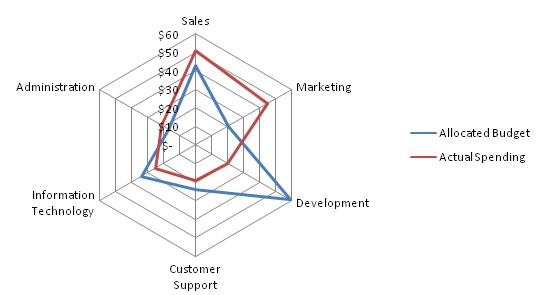
For example, you could display the weightings as a Spider Chart:

Spider Chart

With the enhancement that users could drag values along the axis to make them more or less important. (Note that you'd not want to use a visible numeric scale, as it's the visual balance the user would be working with.)

To illustrate, consider we have five categories (intelligence, charisma, strength, stamina, dexterity) to show on the spider chart. To begin, all five have a "mid-level" setting of 25 (out of possible 50): (25, 25, 25, 25, 25). Scaling these to fit a total of 100 gives: (20, 20, 20, 20, 20)

Then, the user starts configuring the balance, dragging intelligence and dexterity to full, and stamina down to 10. The values for the five categories are now: (50, 20, 20, 10, 50). Scaling these to fit a total of 100 gives (33.3, 13.3, 13.3, 6.7, 33.4)

Note, though, that you would only use those scaled values as the output of the screen, calculated once.

Dragging one value up automatically decreases the allocation to all other attributes, in proportion - and because the calculation is done at the end of the process, rounding errors don't cause a feedback loop in the values shown.

2
  • 1
    how do you keep the "total" fixed in this model? If I now move the Actual Spending on Customer Support from 10 to 40, what will happen to the other egdes of the red graph - how do I control which categories carry the expense? Commented Feb 25, 2011 at 15:56
  • I've added an example to illustrate. Hope this helps.
    – Bevan
    Commented Feb 27, 2011 at 22:10
3

Just a shot in the dark, but I might suggest taking a look at the Project Success Sliders Tool offered by Mountain Goat Software (Mike Cohn's Company). This tool operates under different constraints, but I like the ui and ux it offers.

http://www.mountaingoatsoftware.com/tools/project-success

2

Maybe you could add the “what's left” as an element as well. It would show what's left over, but be read-only. Adding an element could grab the left-over. As long as the left-over is not 0, you can't continue/save/...

apples:  [ 20 ]
oranges: [ 30 ]

budget:    50 !!

or visually as peterchen showed, but with the red part being the left-over.

2

I worked on something similar to this. The advantage we had was that there'd be a default category. If you can leverage that, then you can start with something like this:

  [100] Default
------------------
  + new

You could then add additional categories. Entering a that would subtract from the default:

  [60 ] Default
------------------
- [20 ] food
- [20 ] rent
+ new

Removing a category or blanking out the category value field will put that amount back into the default.

If they use up all of the allotment with new categories, the data is saved without the default.

What is different with this solution, however, is that you'd need some sort of default category that would be acceptable to be saved with data.

2

I think the best solution may be a combination of the peterchen's and Peter Fring's.

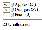
Can you keep a count of "unallocated" points? The sum of points of each item plus the number of unallocated points must always equal 100.

mockup

In the above example, if you bumped the number pears up to 15, the number in the unallocated bucket would drop to 5. When you submit the form, any left-over unallocated points will be distributed according to the relative values of each item. The number of points assigned to each item, including the ones that will be assigned automatically from the "unallocated" bucket, are shown in parentheses.

This idea could also be applied to a range slider.

|=========================+===============++----------|
                          A               OP            

The unallocated points are represented by empty space at the end the slider. If you move any of the controls for (A)pples, (O)ranges, or (P)eaches, it will shift everything to the right and change the length of the unallocated portion.

2

I don't think you can approach the problem exactly the way that you seem to want to. You really can't adjust other categories to compensate for the category that the user is currently assigning points to.

If you did, the user would have a hard time getting the exact assignments they wanted because each adjustment would also shift the points in all other categories, altering the points they already assigned (I hope that makes sense).

What you should probably do is allow all sliders to move between 0 and 100, give a clear visualization to the user of how many points they are over or under 100, as well as clearly indicating when they are at 100 (everything is green), and when they are not at 100 (everything is red).

If necessary, block them from "saving" unless they have used exactly 100 points.

1

John,

I don't think that adding in a new category and having some of the points automatically added to it and subtracted from the others is the best way to go. If the user has deliberately selected 75% against the oranges s/he wouldn't expect that figure to then automatically change at a later date by adding in a new category. (Just the fact that you yourself cannot get the right 'feeling' as to how the maths would work is an indication that the same would be the case for your users).

IMO a better option would be to provide a visual indication of some sort when they add in a new category that this new category needs to have some resource allocated to it to proceed. For accessibility we can't really use colour here so I would suggest ticks and crosses against each category. If all resource is allocated then all the categories are 'ticked', but if one category is missing then it will have a 'cross' against it.

OK, that leaves another dilemma about how you select '0' as the resource amount for the item, but that is an issue to explore seperately if you feel that this approach is what you are after.

1

This is an interesting question and there are a lot of good solutions in this thread already. I think though you left one important piece of information out of your description. The actual nature of the task that is being performed. When the user edits the numbers and categories what are they actually interested in, assigning absolute numbers to the categories or coming up with a good distribution, across the numbers.

Is the task like filling a truck, i.e. (to stick with your examples) there is room for 100 pieces of fruit how many of each category do you want in the truck. The user generally might want to get rid of all pieces of one kind first and then fill in the the rest. If this is the case I think your best bet is an interface where the input is constraint to the total number and cannot be exceeded, when the user tries to increase one element above that they need to reduce another.

If on the other hand the ratio between your items is more important e.g. tweaking the mix of industrial fruit pie, we always make it in 100 pound batches, what is the best allocation, then I think a more dynamic interface where all the sliders move when something changes would be more appropriate.

1

One simple technique is to calculate percentages of slider values relative to sum of slider values and then reassign the slider values to respective calculated percentages. this way slider values will be readjusted e.g

slider1.value = (slider1.value / sumOfSliderValues) * 100 ;
slider2.value = (slider2.value / sumOfSliderValues) * 100 ;
slider3.value = (slider3.value / sumOfSliderValues) * 100 ;

There is a small round off error but it can be handled in case we need the sliders values to exactly and always sum up to 100.

I have setup a fiddle to demonstrate this using angularjs. Please visit demo

0

How would I have done it. I will ask what strategy of distribution does user want to use (proportional, cut from first..., cut from biggest...). For example:

Adding the first one ('Apples'): 100%

100 points to 'Apples'

Adding the second one('Oranges') -> user input: 30%

70 points to 'Apples'
30 points to 'Oranges'

Adding the third one('Pears') -> user input: 20% ([x]proportional)

20 points to 'Pears'
56 points to 'Apples'
24 points to 'Oranges'

ADDED:

I would like to add [x] lock option to hold some values

0

There is a personal finance website, Buxfer.

It has an IOU component. There is a basic implementation of what you require. There are multiple people, sharing and expense. If we need to split it unevenly, it provides a simple UI with text boxes to provide the different amounts.
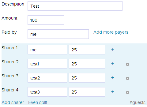
enter image description here

It starts with equal split and as you make changes the yet untouched fields are automatically updated.
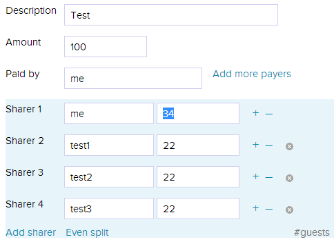
enter image description here

Notice that when you make a manual edit in any field, it will not programatically alter its contents.
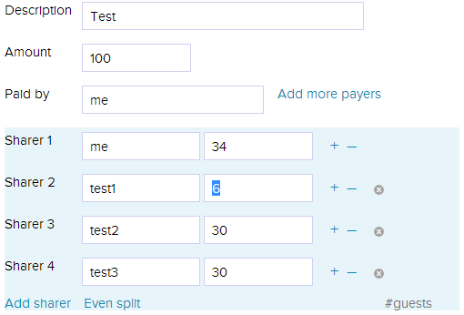
enter image description here

If you edit all and if it does not total up to amount, the system does not allow you to save. I liked some aspect of this UI.

  • It allows you to dynamically add a sharer.
  • It makes sure the amount always totals to the transaction amount.
  • System only updates the fields which are not yet touched by the user. It does not override user's inputs.
  • You can further enhance by giving a different border or something to fields user has explicitly edited.
  • At all times, it provides users options to reset by an equal split.

You can probably augment it with a graph which is reflected as soon as user makes changes on the fields. You can have actual values at the base of each bar and give gradients based on percentage of your total budget consumed by each bar. You could probably add overlay on each bar showing the percentage.

It is essential part of your algorithm how to handle the balancing, but I would be weary of touching any amounts user has explicitly entered. This leaves you with less control. While users are manipulating the graphs, you could turn individual bars red, or whole graph red if you perceive system can't make decisions based on user state.

Basically, the math part is going to be complicated. When you are trying to adjust some figure, you'd probably consider historical values, trending values, etc. User's reaction of you making decisions for him also makes a lot of difference.

Buxfer goes a neutral way, it equally splits remaining amount, and if it can not it disables the save/submit action and tells user that things don't add up. If you do not want that route, you'd need more information on user behavior based on profiles, what and how they use the system, and still you run a risk of annoying a bunch who would not like unequal splits patronizingly made by system for them.

There is a issue of how dynamically adding a category when some calculations are taking place. What effect should it have on the math till now? I'd suggest equal splits only if user has not touched any amounts, or equal splits between amounts which are not yet touched by the user.

In any case, there remains a choice between being heavy handed and restricting user operations heavily, or being liberal and force user to correct wrong inputs before he saves. This choice can be made considering the context of your application, the kind of data being budgeted, the amount of meta information the system has.

I'd also suggest considering the operation time. A power user will expect a way of inputting data which does not involve graph manipulation.

Also, I know your explicit requirement said about no jumps, but that is going to result in having amounts like 63, 41, 39 etc. Call it a personal pet peeve but I can't stand such amounts on sliders, I try to round it up to nearest multiple of 5, 2 or 10, based on the kind of data I am dealing with. This is more time consuming and annoying. (Discount this as it is a personal opinion and not backed by any search). When I am trying to put budgets on something, I am more inclined towards ballparks than specifics like mentioned above.

Let me know if I need to add something more.

Your Answer

By clicking “Post Your Answer”, you agree to our terms of service and acknowledge you have read our privacy policy.

Not the answer you're looking for? Browse other questions tagged or ask your own question.