5

I'm currently helping various corporate clients get their existing print resources online. Many of these clients are quite conservative and/or new to digital, so it's often a big information dump from PDF into html — but some have money to spend on making one or two bits of the html more interactive. Most clients don't have the budget for serious whizz-bang — just something that will elevate very flat content and make it less like a document that just happens to be online.

A trend I've noticed among info-dense sites that are trying to be more interactive is to get users to click on an icon or image hotspot to interact with it, thereby revealing a nugget of information. Examples of this are clickable maps, click-to-expand accordion menus, or diagrams/visuals with hot-zones that expand out. These treatments are superficially more interesting than flat text and images, but users seem to tire of them pretty quickly, clicking on a couple of icons to see what happens, then once they learn how that works, getting bored and going somewhere else. A couple of clicks would be okay if there were only a few such informational nuggets to reveal, but the sort of interactives we're building are quite info-dense, and the goal is to get users to learn about every aspect, not just the one or two bits they happen to click at random. Whatever we build probably needs some structure or narrative to it, because we know that people given too many choices find it hard to choose anything (PDF). However, if the interactive experience feels too much like it's on rails, it basically just becomes a glorified version of interactive page-turn documents, which are bad for all the reasons given in the top answer to that post. I don't have a problem with imposing structure if one already exists, but sometimes there just isn't much narrative inherent in the client's content, and we don't really have the resources to create one.

Question: has anyone seen (or built) good examples of sites where the content itself is quite 'flat' and immutable, where the goal is to get users to read every piece of information, and where users can just kind of wander around and graze on interactive content without feeling too much like they're on rails? Thanks.

Edit in light of responses as of 10:00 UCT, Feb 22, 2013:

Thanks, all. To clarify: in these sorts of projects, our scope to rework the print document as a site that reflects online user needs is generally restricted, as (i) we need to architect the site in line with the structure of the print document, and (ii) there is a legal requirement to make certain information available, even if it's the last thing you'd want as a webpage. Clients want us to help them make the documentation (a) as slick as the print version, but for web, and (b) as interesting to engage with online as possible, within the constraint that the site content is largely pre-determined.

It's (ii) that's the real killer here — some of that mandatory content is interminably long and wordy. Thankfully, there is usually some leeway to use good UCD and IA principles in prioritising page structure/content, especially landing pages — and whenever we can, we use user insight data from the client to to help with this. But let me stress, which I don't think I did first time around, how much of an afterthought "getting the print stuff online" is, not just to the client, but to the business. We're doing what we can to advocate for much earlier digital involvement, but it is going to take time.

4
  • 1
    If this is dense information designed for a printed document, that might be where it should stay--as downloadable PDFs. I think your problem here is one of copywriting rather than one of interactivity.
    – DA01
    Commented Feb 21, 2013 at 17:52
  • You've kind of nailed it there :) In the field we're in, the extent to which a web presence for this content requires html at all, or should be PDF download only, is an ongoing debate. In general, clients want at least some html presence, in part so they have a bigger digital footprint, but in part because I think they just find a wholly PDF download-focused site rather unsatisfying. Re 'copywriting', clients write and supply all copy; we design and publish in print and for the web. Commented Feb 22, 2013 at 12:17
  • 1
    Perhaps one solution would be to have web-centric summary content written for each PDF. That way there's web content, but in a succinct/digestible form with a PDF available for those that want to peruse the full content.
    – DA01
    Commented Feb 22, 2013 at 17:52
  • Yup, that's one of the patterns we're trying to persuade some clients to go for. Not all have the stomach or budget for a rewrite, but as I see it, it's one of the best ways forward. Commented Mar 4, 2013 at 10:30

3 Answers 3

6

Two options are Prezi (grapical, zoom navigation) and Metablob (textual, with graphics, expand/collapse navigation). Metablob is currently in alpha, and private beta is expected soon.

Of the two, I think that Metablob strikes the better balance between encouraging complete exploration and not feeling as if it's "on rails". Prezi can have a specifically defined path, creating a story, and allows free exploration. Metablob does not have a specifically defined path, but at its core it is a story. The story clearly shows where the reader can drill in deeper, so there are some set completion motivations at work for the reader.

Examples:

4
  • I would agree with both of these options to add some life to something. Perhaps it's a quarterly financial or something like that -- you could definitely liven it up with Prezi or Metablob. Do take a step back as @benny skogberg suggests before you get too deep.
    – drawtheweb
    Commented Feb 21, 2013 at 21:11
  • I really like Metablob, thank you. I had wondered about a wiki, which Metablob essentially is (well, wiki meets accordion menu ;) but I couldn't envisage how it would be, y'know, <em>nice</em>. This is a really cute implementation which goes a long way to solving that wiki-trawling issue of feeling like you never close all the loops that you've opened, because it's all there in front of you, all loops can be closed, and you can see where you've been. Super. Prezi has its uses, but IMO mainly when the spatial layout/position of information is directly relevant to the topic at hand. Commented Feb 22, 2013 at 12:26
  • I can't make heads or tails of that Metablob example. It seems to be a maze of vague inter-linked terms. I may be missing the point of it. ;)
    – DA01
    Commented Feb 22, 2013 at 17:56
  • @DA01 AFAICT it's basically a core text with some bits expanding (like link text on Wikipedia, but in-page). But it's interesting that it doesn't work for you; I have to consider the possibility that site users will be similarly nonplussed. Thanks for the useful feedback! Commented Feb 22, 2013 at 18:01
4

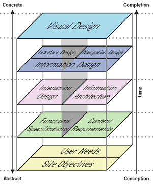
From the looks of it you're missing the two major steps describing your issue. The very first thing you need to do is to define Site Objective and User Needs. From your (wordy) description none of that is present at the time being.

My advice is that you take a few steps back, rethink the strategy and discuss with the stakeholders what problems you're trying to solve, and for whom. We had that very discussion with our customer last month migrating from one old system to a newer one. In that process we found that the current content didn't address any of the user groups the site was intended for. Too light-weight for scientists and practicioners, to heavy for newbies, too boring for casual users and so on. the only thing we found some value too was the mandatory "career" section which was well hidden. Boom!

Let me tell you that the project took a turn we didn't expect, but it is joyful to finally do something that matters both for customers and their users. I think you need to do the same in your case.

Figure out site objectives and user needs first.

enter image description here

Image by Jesse James Garret

3
  • Thank you for this considered and very UCD response, which as a dyed-in-the-wool UCD person, I appreciate! So yes, ordinarily I would be right there with you, but I think perhaps I didn't explain my situation very well, so I'm editing my original post to clarify. Commented Feb 22, 2013 at 10:08
  • @finiteattention Thanks! Looking forward to your edit! Commented Feb 22, 2013 at 10:10
  • Done! (finally). See also my other comments elsethread. Commented Feb 22, 2013 at 12:17
1

Reactive documents are relatively easy to create and can add a touch of interactivity to number and graph-oriented documents. WorryDream has a nice example of this. Many chunks of content within that page are interactive.

3
  • I like where this is going, although it keeps breaking (and I'm using Chrome in OS X, admittedly Snow Leopard, but still), so I can only view some of the interactive components. It also doesn't work at all on an iPad (I can only see the text segments of the page and none of the link/hover text is viewable). But I admire the principles at work, so thanks :) Commented Feb 22, 2013 at 12:39
  • @finiteattention: The framework being demonstrated by that page is not a particularly great framework; there are better, more sophisticated frameworks for creating reactive documents. I think the author of that content created his reactive libraries to promote design ideas (as opposed to demonstrating design ideas in order to promote a reactive library). Further, I don't think the author paid much attention to mobile devices.
    – Brian
    Commented Feb 22, 2013 at 14:36
  • Agree with your assessment! It's still cool though :) Commented Feb 22, 2013 at 17:13

Your Answer

By clicking “Post Your Answer”, you agree to our terms of service and acknowledge you have read our privacy policy.

Not the answer you're looking for? Browse other questions tagged or ask your own question.