7

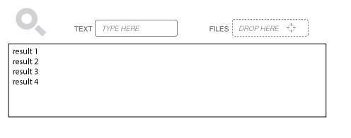
I am designing a filter function for a software application (not a web site) which contains multiple input controllers. A text input is used in combination with a drop zone for files (for drag and drop).

Google Image search supports image drag and drop, but not in combination with text - and they don't give the users any clues that drag and drop is supported. I'm thinking of using the dotted line in combination with describing text and a "bulls eye" target icon.

The magnifying glass that is the standard icon for search is often used beside text search fields, but since I use more input controls than the text field, it feels wrong to use that icon to represent the text field itself. My idea is to use the magnifying icon as a general icon for the entire search area.

Drag and drop - text search

Any thoughts on icons to use to explain "text" and "files" instead of text? I am thinking of using a pen icon for text and a standard file icon (paper with folded edge).

I need to add a menu option to the drop zone that enables the user to load a file without drag and drop - would it be better to do it the Google way (show a load file button that turns into a drop zone when a file is dragged)?

Is there anything special I need to take into consideration when using multiple inputs like this?

General thoughts and ideas are also welcome!

ps. does anyone know why a dotted border represents a drop zone?

2
  • In your system, how does drag and drop help filter?
    – kastark
    Commented Jan 30, 2013 at 11:56
  • When dragging in a file, it is analyzed and the result list is updated to show the most similar files as the one dragged in Commented Jan 30, 2013 at 12:10

2 Answers 2

4

Drag and drop is an expert shortcut

I commend you on including drag and drop for this. It’s an underused design element. The problem with drag and drop is it’s discoverabilty, as you’ve surmised. It’s also physically awkward for some users, and had accessibility challenges. You are, of course, aware of these issues, which is why you want a menu item to add files to the search criteria. Thus, think of the menu-based version as the “main” UI and drag and drop as an expert shortcut. Design the menu-based UI to be as fast and easy as possible and it’ll take the pressure off indicating the drag ability.

The Browse button

The conventional way to select files is through a list box with a “Browse…” button beside it (rather than a menu item). That’s has high discoverability and is probably already familiar to your users. It’s not much different than a drop-down button beside a combo box, only it allows selection (and multi-selection) from a tree rather than a list. It’s reasonably fast too: if the user doesn’t have the files already displayed on their desktop, it’s faster than even drag and drop.

Improving discoverability

As for improving the discoverability of drag and drop, some sort of hint text (e.g., “OK to drag files in”) could do it, putting the text either in the list box, like you’re suggesting, or beside it, which would also allow placement of a Help link for users who want more explanation. In some applications (not necessarily yours), the hint can be temporary text that appears when it seems to be helpful (e.g., the app detects the user using a slow non-drag method repeatedly), but in any case eventually disappears to minimize clutter.

There really is no standard static graphic for indicating a droppable capability. Besides, in many cases the bigger problem is to indicate what can dragged, not where it can be dragged to. I’m not aware that a dotted line means “drop area.” I’m not sure it does to most users either. Maybe it’s a convention in the making, not one I’d necessarily favor much (dotted borders are already used to indicate focus).

What about copy and paste?

While you’re doing drag-and-drop you may as well also support copy and pasting files into the list box. That’ll help with the physical and accessibility concerns of drag and drop. Really, if we all used drag and drop along with copy and paste whenever we could, it wouldn’t be such a discoverability issue –users would simply start assuming it’s there.

Icons, eh, whatever

Your proposed icons sound fine as long as they’re there in addition to text labels in order to reinforce them. That includes a caption at the top of the entire Search UI. With a text box, a list, and a couple buttons, this is a relatively space-consuming search feature, and you’re not saving much percentage-wise by going with icons instead of text. My policy is that if you have any doubts on what the right icon is, you can’t rely on an icon alone. Such doubt implies there is no sufficiently standardize icon your users will recognize.

Of course, if you have text labels, then icons are secondary, so it doesn't matter too much what they are. They're best if they add a shade of meaning that the text doesn't have. For example, using the paper icon for files like you suggest makes a mental connection to a file manager, encouraging the user to go there to get files to drag.
1
  • Thanks for the input, I will consider this into my design and see where I end up... "I'll be back" as Arnold said :) Commented Jan 30, 2013 at 15:43
3

There aren't any standard icons for what you have shown. When there aren't any standard icons, you should always use text or icons with text. Otherwise you will definitely confuse some people. The labels that you have now make it very clear, so I would keep them.

However when you are using an icon to mark a section, you should make sure that the section that you are marking looks like a section in the first place. Right now it is not clear that the magnifying glass icon is related to the two search areas. You need to do something design wise to unify them. Possible putting them in a common box, but there are more ways of achieving this.

Overall, I think the idea is good, but how text and files are combined well in a search technically is likely to be your biggest headache. Which factor is weighted more etc, and how do you determine a default results order. You may want to take a look at Whats the best default for search result sorting?

1
  • The result list won't be weighted - instead the results will be sorted from the start so that the user can sort it by different conditions, hence do a custom "weighting" of it. This is because we don't know what the user ranks as the highest, but the default sorting will be done based on the file match. I guess it could be useful to do a research on what the users expects to be the default sorting. The icon to mark the entire section will be changed, maybe to a header text. Commented Jan 30, 2013 at 14:50

Your Answer

By clicking “Post Your Answer”, you agree to our terms of service and acknowledge you have read our privacy policy.

Not the answer you're looking for? Browse other questions tagged or ask your own question.