Ok, so I am tasked with designing the UX for an auction application. First things first, layout of a page representing a single auction.
The question is the optimal arrangement of the layout components. I would love to use eBay or Amazon for inspiration, but have always found their layout to be fairly poor.
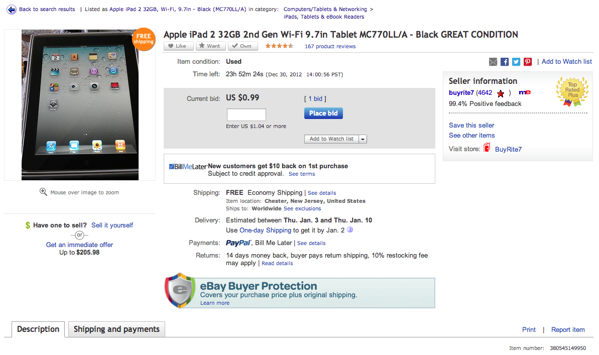
eBay used to have the bid button arbitrarily half way down the right side of the page. Now its in the middle of the top of the page surrounded by disjointed information.

There MUST be some logic to eBay's layout, but it just looks like a jumbled mess to me. Is there any logic here? Why is there promo material scattered around? There is promo material under the product image, in the middle under the bid section and on the bottom. Why is the bid button placed the way it is? It seems that each type of data has its own ui, and is place together, but its very odd.

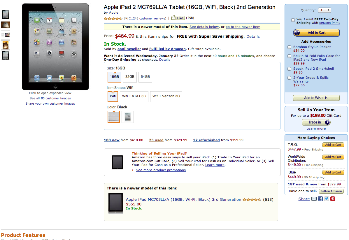
Amazon is not an auction here. But the layout is at-least immediately coherent. The Buy/Bid button is on the upper right, in a distinct ui bar. Product information is in the middle, with buying action-ables in the sidebar. Special offers are all under the product information. But again why this layout? Why are main action buttons on the right? Why is the product picture on the left in both instances?

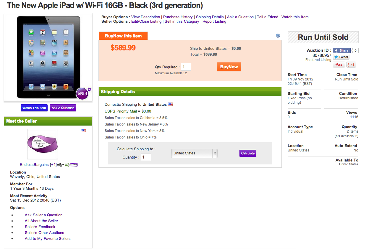
Third example is eBid, which is not as major a site. But still successful and shows real similarities with both eBay and Amazon.
Question
What is the logic behind auction layout online today? And does anyone have any research or rational justifications for the placement of the data and controls? (preferably research).
What is the best practice for auction layout?
