29

Usually, dropdown menus are made as long as their longest value. However, that works well only for dropdowns with a predefined set of values. How can we deal with a dropdown that receives its values dynamically and displays user-generated values which don't have a reasonable size limit? For example a file name may be extremely long. I'm looking for a way to solve this which would still let me use the dropdown in a reasonable way (e.g. without having to always place it in its own row for fear that it might grow and mess with my layout).

Truncating values at a low cutoff point won't work well since the difference between the values might be at the last characters (again, the file extensions example is a good one). I can use it for the edge cases, but I'd like to get there as late as possible.

4
  • 1
    Just a point of clarification, I believe the first line should be "as wide as the widest value"?
    – jcolebrand
    Commented Dec 20, 2012 at 15:51
  • 2
    @jcolebrand Generally yes :). The problem is that values are long (afaik) and fields are wide, and I didn't feel comfortable writing "as wide as the longest value", so I wrote this instead :). Commented Dec 20, 2012 at 15:59
  • Are you referring to touch input or mouse\keyvboard ?
    – AsafBO
    Commented Dec 20, 2012 at 16:12
  • @AsafBO Mouse&keyboard. Commented Dec 20, 2012 at 16:58

8 Answers 8

16

And what about to make a dropdown popup wider and think about how to show the selected value in the combobox itself?

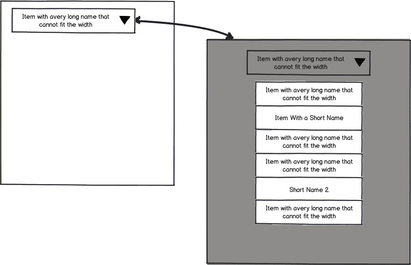
Here is an example of how it may look like:

  1. Dropdown popup contains the whole path to the files and it's wider than the combo
  2. When selected value are modified somehow (cutting off the path, for example) so it will fit into the combobox
  3. A tooltip may show the original value if needed

enter image description here

Unfortunately, there is no obvious way to shorten the names of the files automatically. You may crop them from the beginning or from the end, no matter, but it still will be a meaningless string. The way you may try to do is to ask your users to name files before upload (or after, within some limits), or place a preview icon somewhere (if it's an image) and name files automatically somehow (using today date, or just "1", "2", etc) so their names will fit.

Or you may try to rethink the idea and avoid combo at all if possible.

4
  • 1
    While a good solution, there still is the problem with (theoretically) infinitely long file names. At one length or another, combined with the location of the dropdown box on the view, the screen will run out of space. Your solution leaves that problem unsolved.
    – kontur
    Commented Dec 21, 2012 at 13:25
  • 1
    @kontur and you're wrong if you feel like you can handle a (theoretically) infinite long names. That problem can not be solved. There are a number of options which can help you to minimize that problem and that's it :) Commented Dec 21, 2012 at 15:44
  • That's the direction that I've been exploring as well. Have you seen this implemented anywhere? Commented Dec 22, 2012 at 8:24
  • @VitalyMijiritsky Not exactly, but I've done something like this (a dropdown with long version strings of some library, and combo showing a short variant of the selected version) a couple of years ago for some IDE. Commented Dec 23, 2012 at 18:49
16

The answer is probably different depending on the type of content in the menu. If, as you note, the items represent filenames, Apple recommends inserting an ellipsis in the middle of the items, like so:

The Finder showing filenames clipped in the middle

They mention this explicitly in their Human Interface Guidelines (HIG) too:

An ellipsis character can also show that there is more text than there is room to display in a document title or list item. If, for example, the name of an item is too long to fit in a menu or list box, you should insert an ellipsis character in the middle of the name, preserving the beginning and the end of the name. This ensures that the parts of the name that are most likely to be unique are still visible.

2
  • Really good example that works well for the OP problem of having to differentiate based on the last few characters of the file name.
    – kontur
    Commented Dec 21, 2012 at 13:26
  • Yes, the apple truncation is one of their better notions :). I'm not sure how I feel about truncating values inside a dropdown though. I need to provide some way to see the full name - even if not directly within the dropdown. The immediate answer is using a tooltip but I don't think most users would expect having a tooltip inside a dropdown. Commented Dec 22, 2012 at 8:28
3

There is another idea that is used by mobile phones. Instead of using a drop-down menu you could popup a modal dialog with a list that will prompt for the users choice.

This will let you the freedom to choose the layout of each item, you could even add an icon to distinguish between different types.

Long values will not have to be truncated as you could just add a line break, Still you have to choose how to display the item once it was selected. If it is possible for you to go this way that means that using a drop down field is optional to popup the "Option List Dialog" you could design a custom control that have two lines to fit more text.

something like this..

mockup

download bmml source – Wireframes created with Balsamiq Mockups

1

You could use a multi-line dropdown or a set of multi-line radio buttons. In the case of filenames, "/" is an ideal place to break apart lines (e.g., by inserting a 0-width space).

There may also be system-specific name abbreviations. E.g., /Users/myself is traditionally shortened to ~ .

1

I think the answer is; don't use a dropdown control.

If the content you're trying to display isn't suitable for a particular control that you want to use, that should really be the clue that tells you that the control you want to use isn't the correct one. Don't shoehorn content into something that doesn't suit it.

Reading the question I extrapolate from that the main requirement, being:

...receives its values dynamically and displays user-generated values which don't have a reasonable size limit

You don't state why you need this to be a dropdown, other than this statement:

...without having to always place it in its own row for fear that it might grow and mess with my layout

Taking this into account it appears the main requirements for this project is that:

  • A. You want a way to display a dynamically generated set options that can be of any number of characters.

  • B. You want to keep a fixed constant layout irrespective of the contents of this list.

Therefore you should select a control that can handle such content and will allow you to specify up-front how everything is going to be constantly laid out.

Because of this I suggest the following control:

mockup

download bmml source – Wireframes created with Balsamiq Mockups

It's a standard control, it doesn't require any fancy JavaScript to implement, and it's understood by a large variety of users.

Fit the control to the content, not the other way around.

3
  • 1
    I'm trying to fit the control to the content, that's what the question is about - how do I design the control in a way that fits the content :). If the design problem was how to best display this content, I wouldn't suggest a dropdown. But this is part of a larger design of a complex system, where I'm hard pressed for space, and where many other considerations are also at play. So unfortunately a listbox is not an option. Commented Dec 21, 2012 at 15:46
  • @VitalyMijiritsky well if you're going to have to customize a dropdown in such a way that it can display dynamic content then it is no longer a standard dropdown control, it's a custom control. Once you make that decision to move away from standard controls that thereby causes accessibility issues you're sacrificing the benefits of that control in favour of a custom not-quite-suitable option. I see no reason why this has to be a dropdown; that's not how the content appears to lend itself to.
    – JonW
    Commented Dec 21, 2012 at 16:54
  • 2
    I know it's a custom control, I've tagged the question with it to begin with :). Why do you automatically assume that the custom option is not going to be suitable? The question is aimed at designing a suitable custom control, that's why I asked it. And it seems like you're also automatically against custom controls, which sounds odd to me. Naturally you don't see the reasons for the dropdown, you only see a bit of the design, and it's out of context. If it helps, I can say that it's an infrastructure component, I need to be able to reuse it in different contexts and layouts. Commented Dec 21, 2012 at 17:23
0

For desktop applications you can truncate to maintain your layout and then show the full value as a tooltip.

I'm not sure what the best option for mobile would be. One possibility would be to: select, display fulltext in an overlay, but keep the dropdown open on a single touch; and to select and close the dropdown on a double touch.

0

You could use a list view which is both resizeable and scrollable instead of a drop down, that way you can limit the initial size, but let the user scroll or resize to read/copy longer values.

Tool-tips will enable the user to read longer values, however, if the user wants to see the end of multiple rows (e.g. just the file names in a single directory), then the user will have to move the mouse from value to value in order to read, instead of scrolling right and then up and down.

Alternatively, you could consider showing the beginning and end of the values (with ... in between and show full value in tool-tip) and the the users define how many characters to display from each end (useful for file paths, to show both the global location (e.g. drive and top level folder) and the local location (e.g. file name and immediate parent folder name)).

-1

You can restrict the width of dropdown menus with css

.limit-width{
width:240px;  /*You may specify width here.. */
}

and then can apply it as desired..

<select name="test" id="test" class="limit-width">

The benefit of this approach is that it won't disturb your page layout and will produce output as reflected in alexeypegov's screenshot in this post..So, imho, i feel it would be a good choice if not best..

4
  • 4
    Hi Rishi. While you may be right, this answer is more about how to do it from a technical point of view, whereas the question (and User Experience SE in general) is more about what to do, and whether it is better from a UX point of view to do one route or another.
    – JonW
    Commented Dec 20, 2012 at 10:41
  • i updated my answer..please check if now it's ok or needs to be removed..??
    – 000
    Commented Dec 20, 2012 at 10:48
  • Great, that is fine. There is no problem including code in answers as that may well be of use, provided the code isn't the only thing in the answers. Code should support your reasoning and enhance the answers, which is now the case with your post.
    – JonW
    Commented Dec 20, 2012 at 10:52
  • This doesn't answer the actual question - how to handle long values and still be able to tell them apart. Simple limitation of the width will cause truncation of the displayed values (not of the actual values). Commented Dec 20, 2012 at 14:14

Your Answer

By clicking “Post Your Answer”, you agree to our terms of service and acknowledge you have read our privacy policy.

Not the answer you're looking for? Browse other questions tagged or ask your own question.