26

I'm trying to create a friendly ui that will allow users with little or no computer experience to make pairs from two huge lists (around 2000 items each). Above each lists there will be a search field (not in the picture) which will limit the items shown.

I'm stuck as I think this is not really user friendly. Me, as a programmer, find it easy.

Is there a better way to present those two lists and allow the user to make connections among them?

Simple rules: Once an Item is in a pair, it cannot be selected again. It can also be removed from the list.

This UI is about a windows application in a machine with mouse etc. Not for touch interfaces.

edit: Both lists contain text describing medical examinations, meaning that they would be very lengthy. Also, as Juan Lanus suggests, I've already added search boxes above lists in order to let user filter data.
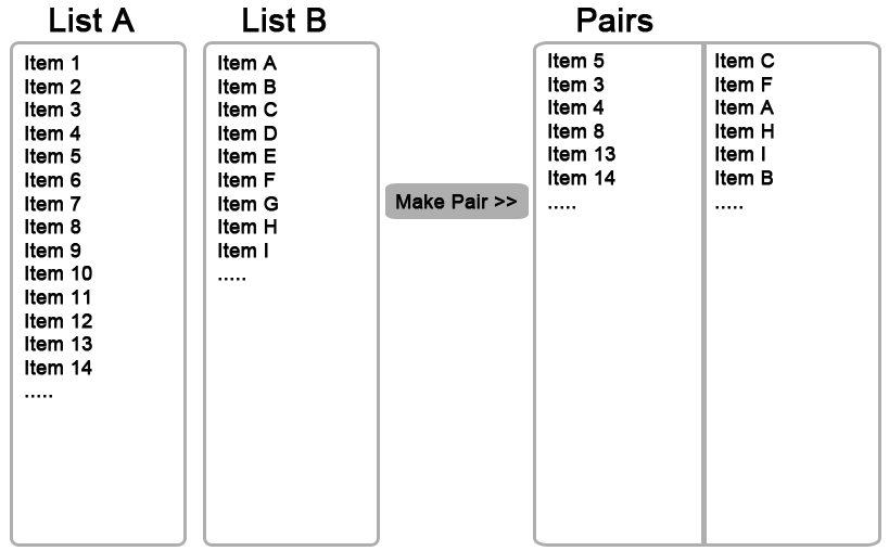
mock design

6
  • Is the user looking for specific items, or are they browsing? In other words, are they more likely to use the search to than they are to browse down the list?
    – Matt Obee
    Commented Sep 13, 2012 at 8:31
  • They might do both. Non experienced users tend to scroll instead of searching
    – Odys
    Commented Sep 13, 2012 at 8:41
  • Is there any way to categories the items so they can be more easily found? Seems like it might be difficult to find a match in a list of 2000 items of just text.
    – Jessica
    Commented Sep 18, 2012 at 17:45
  • Could you give some details on the type of items, and the actual task of the users? There are good comments for fine-tuning the "two lists" approach, but i wonder if that's the best you/we can do.
    – peterchen
    Commented Sep 20, 2012 at 9:52
  • @peterchen I've edited my question
    – Odys
    Commented Sep 20, 2012 at 13:48

6 Answers 6

30

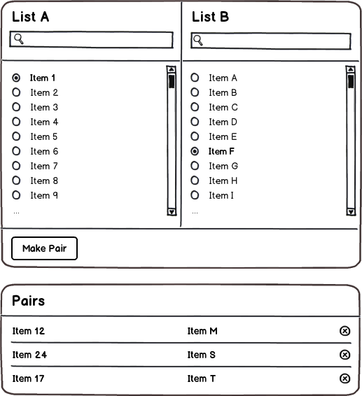
I'd be tempted to tweak the layout slightly to avoid having lots of columns:

mockup

download bmml source – Wireframes created with Balsamiq Mockups

3
  • Would it make sense to remove the "Make Pair" button? This would have the issue of requiring the removal of a pair after the 2nd list selection if a mistake was made (which could be frustrating). It would also mean having to select in the 2nd list even when the selection is unchanged. If 2nd list item reuse (likely with 2K items?) and mistakes are rare—and several pairs are typically selected—, this might be easier to use, though a new, computer-inexperienced user would generally prefer a commit action (sense of control) rather than just an undo.
    – user43012
    Commented Feb 19, 2015 at 13:59
  • By the way, "Remove" would probably be friendly than "x" to "users with little or no computer experience" both in understandability and "scariness", as "x" has a "Kill" connotation. Similarly, such users might not recognize the magnifying glass image as indicating "Search". (I realize such is unrelated to the core of the question.)
    – user43012
    Commented Feb 19, 2015 at 13:59
  • 1
    Hi Paul. I wouldn't want to create a pair immediately after two radio buttons are selected, for the reasons you mention. Your point about replacing the 'x' icon with a word is fair, if perhaps bulky. With regard to the magnifying glass icon for search, that could probably be made clearer simply by adding some placeholder text to the field, such as "Search".
    – Matt Obee
    Commented Feb 19, 2015 at 16:46
11

To my experience, introducing unconventional interaction patterns to inexperienced users can sometimes prove very efficient. Look at the iPhone for example, everything was new with that and it could attract people from all types of focus groups. Even people with no previous interest with cell phones, other than calling, still found the use in it and got spellbound.

Therefore considering these are inexperienced users I would like to suggest to use something that relates more to the real world than what three individual lists with an action button do.

mockup

download bmml source – Wireframes created with Balsamiq Mockups

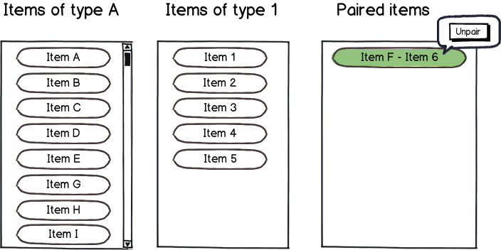
This is a solution that utilizes drag and drop, an interaction pattern which utilizes direct manipulation which is a very well received interactive strategy for users that are not used to virtual representations. The user pulls one item from one of the lists, leaving eg. silhouette behind, the other list lights up (cueing dropability) and the user drops it on an item in the other list. Upon drop the items are combined into one item in the adjacent list that holds the paired items, visually suggesting that they are now paired.

Another feature could be that when a paired item is selected a popup action to release the pairing could be provided, if you'll include that feature that is, which I hope you do.

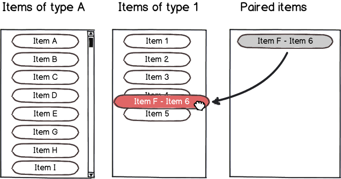
Edit: Another way to Unpair/release pairs could be to use the same action as pairing them, just dragging the pair outside the pair container:

mockup

download bmml source

4
  • Interesting. This is probably better than my initial though, although we still have to use three lists.
    – Odys
    Commented Sep 13, 2012 at 8:50
  • I thought of that. The problem if you want to do it in two lists, one for each type, the pairing will be hard to represent. But, maybe you will have more suggestions coming soon, with other interaction patterns! =) Commented Sep 13, 2012 at 8:52
  • iPhone probably did a lot of user testing. I agree an unconventional pattern might work but I would suggest observing people (from your target audience) how they use this Commented Apr 1, 2021 at 2:26
  • Also, drag and drop patterns always need an alternative for keyboard navigation to be an accessible experience Commented Apr 1, 2021 at 2:27
10

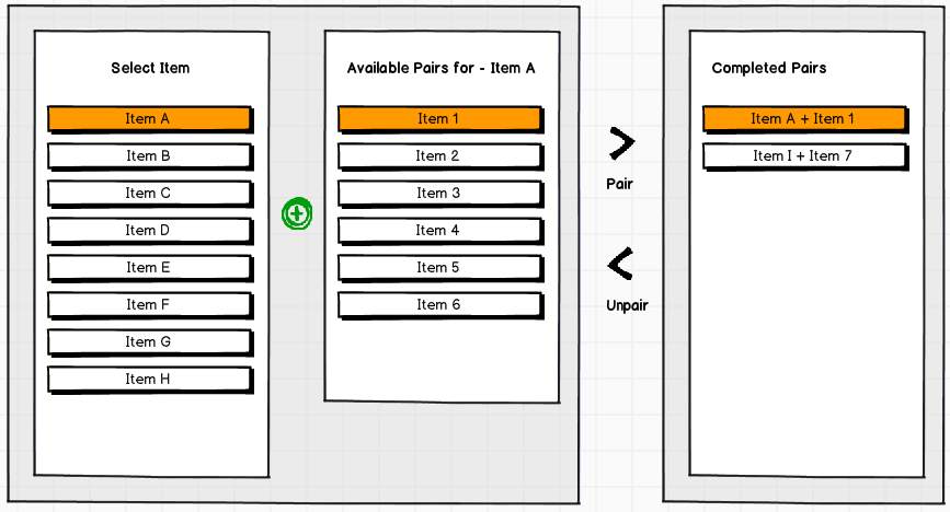
Since you mentioned that users of all age and computer usage competency should be able to use this UI, here is a simple and intuitive approach I've came up with. It utilizes suggestive flow icons, command texts for instructions and it visually separates component items from paired items.

enter image description here

3

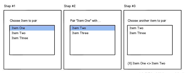
You can achieve the same by only showing one list at a time.

Depending on whether the list's content is the same (I guess it is, but you didn't explicitly specify), the content of the list shown would – of course – have to change. Since the user will most likely always do this in a Step-by-Step way ("locate first item", "locate second item", create pair), there is no advantage of seeing both lists at the same time.

Depending on how likely it is that a user may select an unwanted item, the next step could be invoked either on selection or through a button at the bottom of the list.

here is a rough mockup

0
2

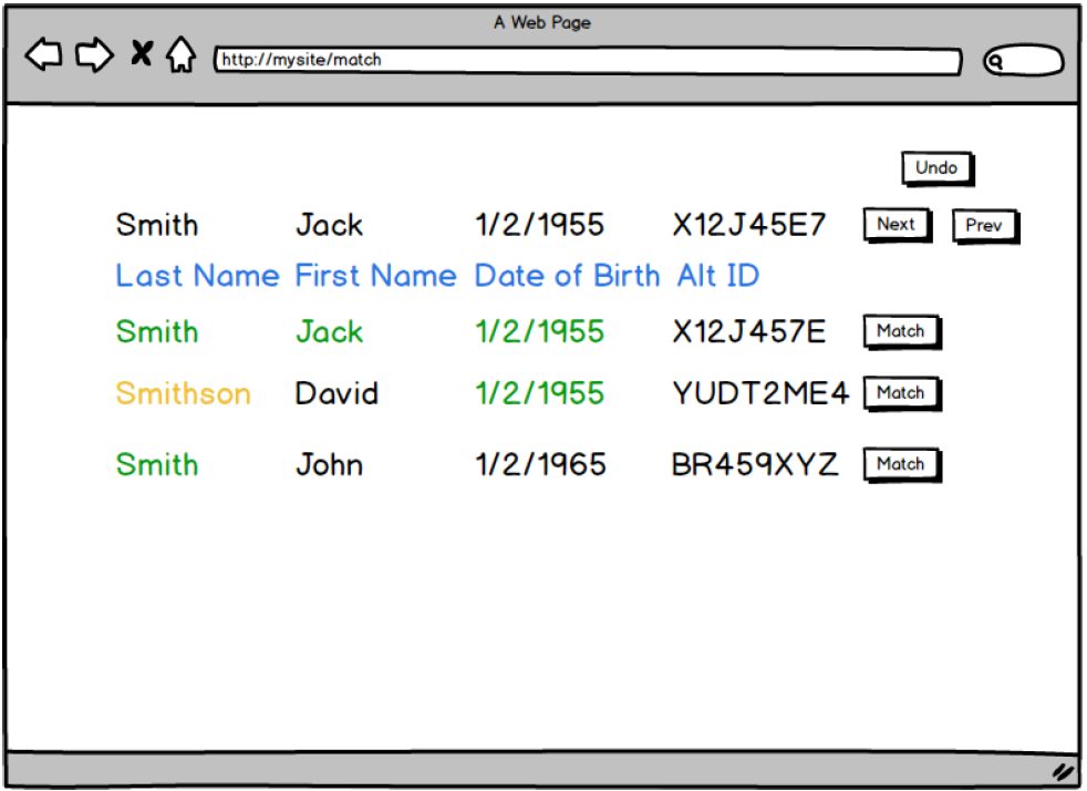
I dealt with the same problem a couple of years ago. I did search after search looking for a good way to do this and then finally decided to watch the people doing this work manually.

They would walk down list A with a ruler one at a time and then scroll through list B with their finger until they found the best match. I tried to duplicate that process with the UI below.

The flyweight at the top is the current item in list A. The items below the header are the top weighted matches from list B. Each column was weighted as 100 for exact match ignoring case, 80 for exact matches ignoring case and removing all whitespace, and 30 for one value being fully contained within the other. Only items with a weight greater than zero where shown.

Hitting one of the match buttons would move you to the next entry in list A and remove both matched entries from list A and list B.

As mentioned above, the undo button was required. I would get going very quickly and then realize I had pushed the top match button when it did not match.

The colors show what type of match each column had. enter image description here

1

All options seem valid, and I would implement (almost) all of them.

1- Two lists with a text filter in each one so the users can shorten them by typing data. IMO the ideal filter finds the typed characters wherever it appears in the list item, as opposed to finding it at the stert of the item text or at the start of the words of the item text. Also, if the user types two words (or partial words) the filter finds all the item that contain both pieces of text. When the user types the filter shortens the list after a short while, that is, no need for the user to click a "find" button. As the lists are long, the text inputs where the user would type the search text should be positioned in fixed locations, as when one freezes a headers row in Excel.

2- The user clicks an item in one list, then clicks an item in the other, and a "make pair" button glows. The user clicks it and a match is made!

3- The user clicks an iten in one list and double-clicks an item in the othar and the pair is made.

4- The user drags an item in one list, sweeps it over an item of the other, and drops the pair in the macthes list. If it's not in sight there would be a "drop here" target, always visible, and if possible always positiones in the same place.

5- Matched item dissapear slowly from the source lists. The amimation would signal the user where was she looking to hel her get back where she left.

As a practical recommendation, don't use jQuery UI Autocomplete. I tried it yesterday with a 1300 items list and it takes too long to display. Last year I used another control, simpler and more responsive, that I don't remember now. Contact me later if you want the information.

Your Answer

By clicking “Post Your Answer”, you agree to our terms of service and acknowledge you have read our privacy policy.

Not the answer you're looking for? Browse other questions tagged or ask your own question.