1

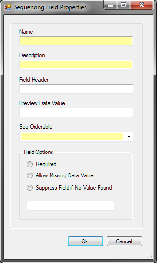
This is my main form:

enter image description here

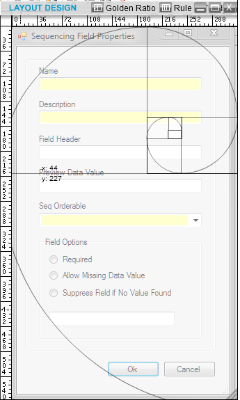
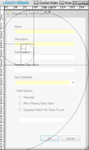
and I wanted to apply a golden ration grid to its layout..so I did that but still I am not sure what does that mean? so from what I see ( below) what should I understand ?! When we apply such a grid, then what is next step? What does it tell you?

enter image description here

enter image description here

5
  • 4
    What are you trying to achieve? It doesn't make sense to just draw lines over an interface and then ask what it means.
    – kastark
    Commented Sep 4, 2012 at 15:32
  • How should I set the controls on my form such that it adjust with the golden ration layout ?
    – Blake
    Commented Sep 4, 2012 at 15:39
  • 6
    Overlaying the golden spiral will lead you absolutely nowhere. Sure you can use the golden ratio as a guide to laying content out such as column widths, or aspect ratio of images or other content, but to be honest it's a mechanism that resonates more with print than with web pages or ui forms. See my answer to another similar question Commented Sep 4, 2012 at 15:58
  • 1
    Usage of the Golden Ratio is mostly arbitrary and often useless. Toss it out. It's not a useful crutch most of the time.
    – DA01
    Commented Sep 4, 2012 at 16:10
  • 4
    "...wanted to apply a golden ratio grid to its layout." One has to ask Why? If the underlying reason were in the question, it might be possible to answer it. But I think @DA01 is right: generally there is no point, and especially in transient dialogs. Commented Sep 4, 2012 at 17:23

3 Answers 3

8

I think you may have gotten mislead somewhere along the way. The golden ratio is an interesting idea, but I've never heard of any reputable designers explicitly using it as a design technique. (The comments seem to agree.)

I would suggest you look into some solid resources on form design and design in general. First, I would suggest Web Form Design. It provides a bunch of really valuable groundwork for designing forms. I'll bet it's just what you're looking for. Second, I would suggest you read Don Norman's The Design of Everyday Things. It's the one book I suggest to any designer. (Pay attention to the parts on 'affordances'.) After that, just read almost any UX / IxD book. A good one is About Face, by Cooper.

Never mind the golden ratio -- there are way more important things to be thinking about.
1

Golden ratio in ui design is very difficult especially if your user interface supports different languages. The length of labels or data content can vary extremely.

1

The golden ratio is a guideline and not a rule. Also, it doesn't just apply to the overall dimension of the window. You can also use it to proportion different components of the interface, or different sections of the window. I think the take home message is to take into account the content you are displaying and provide a consistent and reasonable way of applying proportions and distribution of the content rather than sticking to a formula. In the end, if your user has to scroll because you are sticking to a set ratio and not because you have anticipated the amount of information on the screen then it is definitely setting the priorities in the wrong place.

Your Answer

By clicking “Post Your Answer”, you agree to our terms of service and acknowledge you have read our privacy policy.

Not the answer you're looking for? Browse other questions tagged or ask your own question.