11

I am having a form where I want the user to fill in one text field out of 3. These 3 fields are used to identify other clients in different ways (Phone number, Email or Name). The last text field is a autocomplete field.

Of course this form has other fields to be filled in. I am wondering what is the best and most intuitive way to make the user understand that he/she is only demanded to fill in one of those options and others will be neglected.

4 Answers 4

13

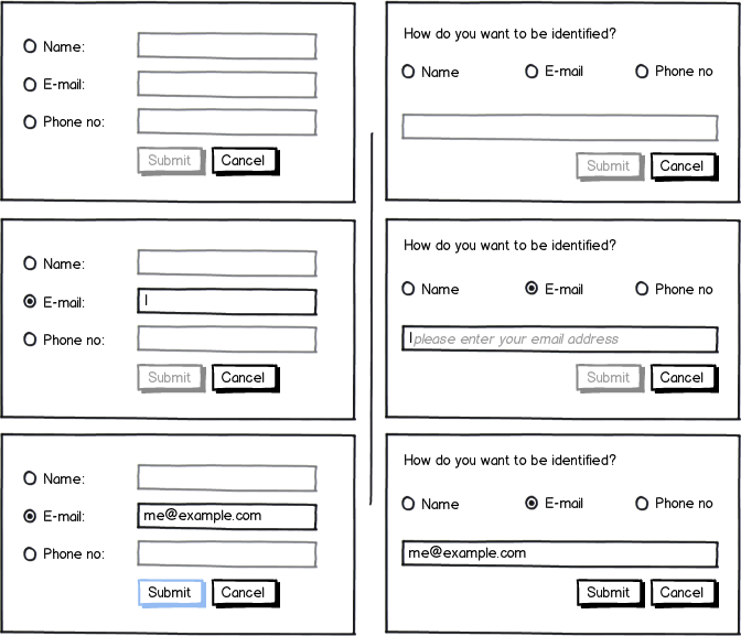
Could you combine all 3 in a singe field with the label "Phone Number, Email or Name". Other than that I can only suggest using text to describe what the user should do - "Please fill in ONE of the following:" for example.

mockup

download bmml source – Wireframes created with Balsamiq Mockups

11
  • 1
    That's a really cool idea (number, mail or name). Makes it harder to validate and process by the system, but a very pleasing way of interacting with the user! Hope it's not completely different from what wael needs :) Commented Aug 28, 2012 at 9:03
  • 1
    Do you think? I don't think so - a simple regex and case statement - could be done purely client side, server side or ajax combination of both
    – TJH
    Commented Aug 28, 2012 at 9:51
  • 3
    Why would you autocomplete a field like that to begin with?
    – DA01
    Commented Aug 28, 2012 at 15:42
  • 2
    While I love the simplicity of the second option, the programmer in me dreads dealing with it.
    – thatuxguy
    Commented Aug 28, 2012 at 16:31
  • 1
    Agree completely. Having come from a dev background and now being a UXer I sometimes feel VERY guilty when I tell the devs how I need things to work. It rarely lasts.
    – TJH
    Commented Aug 28, 2012 at 20:03
9

mockup

download bmml source – Wireframes created with Balsamiq Mockups

If you can have one and only one identification method, then let them select which they want to use via a group of 3 radio buttons and once they select one make the label and input for that identification method visible or have them disabled until selected via a radio button.

The advantage of having the radios with separate inputs over just putting "Name, Email or Phone Number" on label is that you know what you are validating and you can give each input a standard id so that they have appropriate autocomplete behaviour. See these Q&As:

4
  • It is currently implemented this way. But I think there should be more intuitive way.
    – wael34218
    Commented Aug 28, 2012 at 11:15
  • 1
    Would be interesting to see this approach in a usability study. I could imagine some would try to fill out every form field buy clicking on the first radio, typing in, then the next radio, typing in again an so on. And if the text would disappear after changing the radios, they would say "why did it disappear?" Commented Aug 28, 2012 at 11:23
  • @wael34218, you could always arrange the radios horizontally and have one textbox which makes it clear you only want one value.
    – Sam Hasler
    Commented Aug 28, 2012 at 14:10
  • 1
    @AlexejFroehlich it shouldn't forget values. Even with the single input you could have it switch the inputs so if you changed your mind and then went back to the previous choice it would bring back what you'd previously entered.
    – Sam Hasler
    Commented Aug 28, 2012 at 14:13
3

You could use a automatic verification of the entered input to check if its a name (characters), email (at-sign) or phone number (numbers). This way you would need only one input field for this three. After validation it would be good style to highlight the recognized input - if a user entered numbers, you would highlight phone number.

enter image description here

2

Have the required field marked in a way that it stands out of the rest of the controls. Convention on the web often shows a star (*) but other required field options are available. Some uses a light yellow color to highlight the required field(s).

Also right-align the labels to every field, making it easier for the user to read which field is connected to which label.

Use a Submit-button, and a Cancel-button, even if the cancal button isn't really necessary.

mockup

download bmml source – Wireframes created with Balsamiq Mockups

If one out of three is required, have the submit-button disabled until the user fills at least one field with text - and use an explanatory text to highlight what is required.

If there are more fields (as you say), gruop the three fields together in a container, making it easier for the user to find out which fields are in question.

1
  • I'd put the text note above or to the left of the fields to increase the likelyhood the user will read it. I'd also make it as short as possible. "One of"
    – Sam Hasler
    Commented Aug 28, 2012 at 11:03

Your Answer

By clicking “Post Your Answer”, you agree to our terms of service and acknowledge you have read our privacy policy.

Not the answer you're looking for? Browse other questions tagged or ask your own question.