5

In my web app, I have a long list of items on one side of the screen and a shopping basket list on the other.

Here is an example: enter image description here
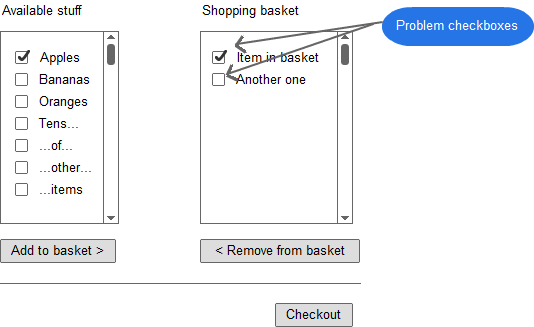
The app works by checking the boxes next to items and then clicking add to basket. This moves them over to the shopping basket list.

(Because of the large amount of items in the list, I think I need to stay using checkboxes by the way. Please don't stress on this point too much.)

Most people get that the checkboxes on the left list are to add things to the basket, but they dont understand the checkboxes on the right. Some people even think that you have to check the boxes in the right hand list if you want to take them to the checkout.

How can I make it clear that the checkboxes on the right are to actually remove items from the basket in bulk?

4 Answers 4

6

Removing items is not a "bulk operation" per se:

At first look, "delete multiple items" would be a bulk operation where the checkbox pattern you chose is widespread and (probably) well accepted by users.

Your case is quite different, though, since there is no other option aside from "delete/remove".

Therefore, you're not dealing with a textbook "select item(s), then apply action to selected ones" scenario.


Reducing complexity:

When looking at the transaction in a non-bulk-edit way, we can significantly reduce complexity for the user:

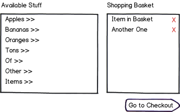
mockup

download bmml source – Wireframes created with Balsamiq Mockups


What's in for the user?

In your current scenario, if the user wants 2 of 3 items in his cart removed, he needs to:

  • Click the checkbox of the first item that he wants removed
  • Click the checkbox of the second item that he wants removed
  • Locate and identify the "remove from basket" button
  • Move his mouse to the target (quite possibly located far away from his current mouse position)
  • Click the target.

In the proposed scenario, for the same task, the user needs to:

  • Identify the purpose of "X"es
  • Click the "X" of the first item that he wants removed
  • Click the "X" of the second item that he wants removed

Not only does the user need to perform 1 "lookup" and one click less – also, the probability of errors (such as the "clicking items I want to check out with" you mentioned in your question) is reduced.

1
  • 1
    +1; very close to my thoughts. The existing checkbox system is a bit of an odd interaction. Commented Aug 23, 2012 at 21:35
1

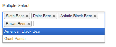
Have you considered looking at the jquery plugin Chosen

enter image description here

The multiselect feature is simple as users can just select what ever they want from a dropdown and if they need to delete an item,click on the X which removes it from the list and returns it to the dropdown. The autocomplete feature will also reduce scrolling as the user can just type in the name of the product and it would be retrieved

Below this dropdown, put a simple checkout button.

0

I know you're confident about the checkboxes, but have you considered just letting users add items with a single click? A common pattern is to place plus icons next to items in the left pane, then crosses next to items on the right. Clicking add puts the item in the cart, clicking cross removes it.

1
  • Dammit, you beat me to it :p
    – vzwick
    Commented Aug 23, 2012 at 19:52
0

Get rid of the shopping basket list, keep the checkboxes

Importantly, I'm assuming that when I check something in available stuff that it stays in that list, but is checked. Given that....

Checked items in available stuff IS the shopping basket in essence. And of course this is why the check boxes in shopping cart are confusing. What I want is checked in available stuff but not checked in shopping cart. And checked or not, "checkout" gets everything in shopping cart. The confusion is understandable.

With only one list, it's very clear what a check means - of course along with a nice hint above it, lets say, "check what you want to buy."

Along with this you should have all the checked items sort to the top of the list.

Get rid of the check boxes, keep both lists

An alternative solution. Have the items physically move from one list to the other. Now there is no need for check boxes at all. A double-click on an item to move it to the other list. And of course a nice hint like "double click to add to basket".

2
  • 1
    Assuming we're talking about the interwebs: for god's sake, don't make the user double click!
    – vzwick
    Commented Aug 23, 2012 at 20:07
  • Do bear in mind that option one won't let the user buy more than one item of a particular class. Commented Aug 23, 2012 at 20:45

Your Answer

By clicking “Post Your Answer”, you agree to our terms of service and acknowledge you have read our privacy policy.

Not the answer you're looking for? Browse other questions tagged or ask your own question.