19

I have a web app which currently uses the following interface.
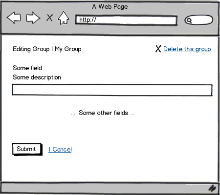
mockup

download bmml source – Wireframes created with Balsamiq Mockups

Here's what the actions do:

  • Delete will delete this group and redirect the user to a list of all groups. Before deletion, a modal confirms whether he is sure he wants to delete.

  • Submit save the changes made to the group.

  • Cancel allows the user to discard the changes he has made. This is because the application allows multitasking: If the user makes a change and navigates away, the page will be added to a pane containing screens with unsaved changes.

The delete group button deletes the group and is styled as a link with an icon. I am unsure whether that is the right location for the delete group button. One alternative would be to do:
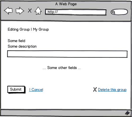
mockup

download bmml source

I have only ever seen forms with 2 actions, for example:

mockup

download bmml source

Or:

mockup

download bmml source

How should I deal with positioning these 3 icons, keeping in mind that Delete this group should be distinct and isn't something we want users to accidentally click?


Update:

For the positioning of the buttons, I am following Luke Wroblewski's recommendations from eye tracking research for web forms (basically, the best positioning is to have the actions aligned left with the primary action on the left). I do believe that right aligned actions would be more suitable in modals and dialogues.

However, Facebook places the primary action on the right: enter image description here

As for why having a delete action on the edit page, I feel that it is still quite useful, especially if the user determines the group to be useless after seeing its contents. Wordpress also has something similiar on the edit page: enter image description here
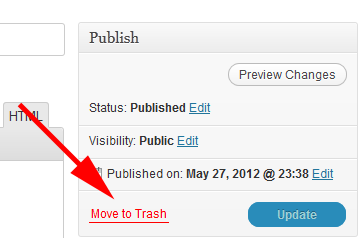
I appologize for not mentioning my intial rationale for placing the delete button the top right:

  • If there are lots of form fields and the page scrolls, it is easy for the user to see at a glance, that the Delete this group button does exist (rather than hunting around the page for it). Does this benefit outweight placing it on the bottom along with the other actions?
4
  • It could work well if you put it near "My Group". (near top left). Bottom right works well too. I think it can go either way depending on typical use-case, and how you flush out more detailed design.
    – Jung Lee
    Commented Jul 23, 2012 at 4:29
  • 2
    Is there a reason you need the delete function on the edit form? Conceptually I see "Delete" as a sibling (rather than a child) function of the "Edit" function.
    – Kit Grose
    Commented Jul 23, 2012 at 8:24
  • As an aside to your actual question, too, you might find changing the "Submit" button to something more meaningful like "Save Changes" or "Finish Editing" would test better ("Submit" is quite generic and doesn't always carry a tone of possible loss of data), and your cancel link should most certainly not start with a pipe (even if you use a pipe to separate the functions, the pipe should not form part of the link). I assume that's an artefact of the Balsamiq mockups more than your app design though.
    – Kit Grose
    Commented Jul 23, 2012 at 8:27
  • 1
    @KitGrose: In the actual app, I had them labeled as Save Changes, but I guess I forgot about that when I made the mockup :) The cancel link also does not start with a pipe, but there is a "pipe-like" element there to seperate the button and the link. As for the delete function being in the edit form, I feel that there is some benefit in the user being able to see the contents/settings for the group before deleting (rather than deleting blindly).
    – F21
    Commented Jul 23, 2012 at 9:19

4 Answers 4

8

Apart from putting the {Submit - Cancel} buttons separated from the {Delete}, given that delete is an irreversible action and you want the user to be really sure when clicking it. Having the three buttons inline at the bottom makes it more clear where user can find all the options for the current window. There are a lot of programs that use the {Don't Save ---- Cancel - Save} pattern in dialog boxes. Check this.

You should also put the "Submit" as the right-most item and align it to the right. You can read more about it in this article. {Delete ---- Cancel - Submit}

1
  • To add on the fact that delete is an irreversible action, you may want to add a confirmation alert/ pop-up. I would also recommend checking the decision tree in Android Design Guidelines for Confirming & Acknowledging to see if you should use a confirmation, an acknowledgement, or neither. Even though it's for Android, it's definitely applicable for UI design in general.
    – mgpugne
    Commented Jul 25, 2013 at 21:20
5

Personally, I put the primary, positive action bottom right - so in a process, "Next" and "Submit" go here. Cancel would appear to the left of Submit as a link - it's not a primary action, so we call less attention to it. "Delete" would appear to the left of cancel, but with more spacing. I'd also put a confirmation messagebox up onClick to ensure the user is making an informed choice!

3

I definitely prefer to have all the action "buttons" at the bottom right, especially if the form requires scrolling, so that it follows the logical workflow of the user. The problem with that in your case is that your users may know they want to delete the group before they even enter the page in question, so making them scroll to the bottom of a long form may add insult to injury.

A pattern I have used with success would offer the delete option on the page where they select the group to edit (previous to what you are showing in your question) as well as inside of it. I have found that when my users want to remove a category, most often they do not need to go into the details page to make that decision, so I offer the option sooner. This relegates the delete option on the group detail page to secondary, and now it does make sense to place it in the lower right corner with the other actions.

1

I've seen the situation you describe before, with the delete link on the lower-right. That's how I prefer it, grouped together with your other actions. I think it carries less weight down there because users will be focused on the submit button.

You've got a confirmation for the delete, which is good. I might remove the X icon if you'd like to draw even less attention to the action.

Depending on what the screen looks like that contains all the groups, you could consider moving the delete function to that page instead and not list it here at all. Probably not a preferred option, but I thought I'd through it out there.

Your Answer

By clicking “Post Your Answer”, you agree to our terms of service and acknowledge you have read our privacy policy.

Not the answer you're looking for? Browse other questions tagged or ask your own question.