3

The user profile in the app I'm building is across a few tabs, however, I've had a situation where I feel the expected save functionality will be inconsistent across tabs.

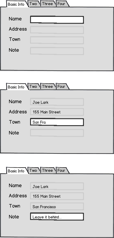
Most of my tabs look something like

mockup

download bmml source – Wireframes created with Balsamiq Mockups

So the Save button saves the entered info when the user enters it. Pretty basic.

BTW-This is not my actual app, but a close sample meant to illustrate my question.

But then when I get to Associates tab, it's an invite list, where the user enters email addresses of their associates. An email is sent, and if the associate accepts the connection, their name will show up in the list. This will look something like

mockup

download bmml source

I sort of envision this using ajax functionality as soon as a new contact is added (+), or removed (x). But that's inconsistent with the other tabs which use a save button.

Ok, no problem, I can put a save button on this page, and the adding & removing doesn't actually happen until you press the save button. And until then we have a few more commands (notice the deleted invite & the undo icon). It's a bit harder, but no big deal.

mockup

download bmml source

So far so good. Associates was a bit funky, but it's not a big deal.

But when we come to the projects tab, I want to do basically the same thing as the associates tab, only with more data. So much data that it really needs it's own page, which I had planned to show in a jQuery dialog.

mockup

download bmml source

Now I suppose I could jump through hoops to keep that save button consistent, but I feel the associates tab was about as far as I should push that. However, I don't like the inconsistency.

How should I do this?

Should I add the save button to the project tab to keep it consistent? Should I leave it as is in the mockup? Should I leave it as is in the mockup AND rollback the Associates tab to get rid of the save button as well? Something else?

4
  • What are the the deleted invite & the undo icon doing?
    – JOG
    Commented Jul 18, 2012 at 22:28
  • I felt I needed to display the deleted item until the save button is pressed, and if I'm going to display it as deleted, then I should also have a way to undo it. Commented Jul 19, 2012 at 19:39
  • Regarding the Basic Info tab, how will that look once the user has already saved info for that and is returning to edit it?
    – skybondsor
    Commented Jul 19, 2012 at 22:13
  • I didn't mention it in the question, but after thinking about it, it would be read only detail page with an 'edit' link. Commented Jul 20, 2012 at 16:51

5 Answers 5

7

Sometimes consistency for consistency sake causes consistent problem with user intuitiveness.

End user intuitiveness is much more important than putting a save button on every tab! Most users are use the to basic routine of filling in a few types of inputs and having to clicking save/submit button.

For the Associates tabs, if the data entered into the email input appears after clicking the add button would signal to the users that the information entered was saved. Same goes for the project tab; on completion of the proposed jQuery modal, if the a new record was to appear above most user would understand that the information entered was saved. Not to say additional messages reinforcement messages couldn't hurt in either case. Keeping users informed about the system state is important as well.

Another key advantage in the process is by saving the data automatically, user have one less cognitive step to think about. For the proposed mockups above, I believe less is more.

3
  • +1 I think you're right about the consistency for consistency's sake is wrong. It's also made me realize if those forms are only the 'edit' view, and the user is usually displayed the 'detail' (non-edit) view, then the Associates & Projects tabs will actually be 'detail' views wouldn't they? (still considering if they should be or not) Commented Jul 19, 2012 at 19:54
  • -1 for actively advocating UI inconsistencies without showing that said consistence is inappropriate. Also advocating for an additional step on the user's part right before claiming its a step less. Commented Jul 21, 2012 at 0:53
  • In other words "Sometimes consistency for consistency sake causes consistent problem with user intuitiveness." is true, but please, the absence of a save button, or the persistence of a save button is not consistently a problem Commented Jul 21, 2012 at 0:55
5

I would like to recommend doing away with the save button all together. If you have the capability of using ajax to update lists with multiple commands, then why not use ajax for all the other tabs as well (saving as the user types, or finding a way to catch when the users has stopped typing to save)?

Advantages:

  • Total consistency throughout the tab application
  • Fewer clicks for the user
  • The user has to think less == more certainty in the UX
  • User's cannot 'forget to hit save'
  • Ajax lovers will buy you drinks

As for the "Projects" tab that contains a trigger for a modal dialoug in input information, don't use the word 'save', use the word 'create' or 'add', then save the data after the modal is closed again with ajax.

I also undertand what @Jeff is saying: that users are used to hitting 'save' or 'submit', and to keep them informed of the state of the system. I don't disagree, but there are many many applications now that forgo the 'submit' button, and users are becoming increasingly accustomed to this. Additionally, by not having it in the UI (at-least in my experience) users just don't think about it, and assume confidently the work they are doing is being saved.

If informing the user of the state of the system is a big concern, having a save button does not really address this either. It would be a confirmation that the work is saved, not the user interaction itself that validates a change to the system in the UI. For this you can have a single consistent indicator that responds to ajax on every tab. While data is send it can be a pinwheel, and when the server responds it can change to a green check mark. This would allow indication that 'user activity has effected the system', regardless of the tab's structure. In other words, this type of indication works equally well for 'save as you type', and 'save the new sort order'.

2
  • 2
    +1 Saving automatically by ajax is nice, and informing the users isn't that big of a deal. However, there is functionality later in the program where something needs to be created in a single step. Saving it is absolutely critical, and it would be a disaster (at least as far as my app goes) if they assumed it was automatically saved when it wasn't. So I don't want to set that up as an expectation anywhere. Commented Jul 19, 2012 at 19:48
  • @JohnMacIntyre check my final paragraph, I provide a means for insuring the user knows work has saved. Plus if its later in the program and not a part of the tab UI, it is absolutely allow to be a variant. Commented Jul 21, 2012 at 0:51
2

Consistency of the Save button

If you choose to keep the Save button, it should be consistent across the tabs: If one thing needs to be saved after it is entered, then all things should. no matter if it is typed directly in a text field, or created through a dialog. As long as it looks like a row in one of the tabs, it should behave the same as the rest of them.

If you choose to keep the Save button, I would not require a decision to save per tab, but per profile. Hence the button should not reside inside the tabs, but next to all of them.

And I would also add a Discard button, if I had a Save button.

mockup

download bmml source – Wireframes created with Balsamiq Mockups

Associates and Projects

Some thoughts on how the less straight-forward content could be handled:

In the Associates tab, an item can have several states. An associate can be entered, and when saving, a confirmation box could clarify "Now sending 3 new invites to A, B and C. [OK/Cancel]. Then it turns to "awaiting invitation acceptance" and so on.

In the Projects tab, pressing the Discard button would also have to be confirmed as all the data of entered projects would be lost.

6
  • I don't disagree with your solution, but I think the discard option would need to be downplayed severely, as the average user would be saving far more often than they'd be removing all data.
    – thatuxguy
    Commented Jul 18, 2012 at 22:43
  • The Discard button would only discard the unsaved changes.
    – JOG
    Commented Jul 18, 2012 at 22:46
  • -1 for breaking the visual hierarchy. Buttons should be on the same level as that which they effect. Commented Jul 18, 2012 at 23:09
  • 2
    They should, and they are. :)
    – JOG
    Commented Jul 19, 2012 at 7:09
  • No, I don't know if the Discard button is the way to go. Thanks anyway. Commented Jul 19, 2012 at 19:56
1

The reason why there's an impetus to add "Save" button on the "Basic Info" tab is because it contains a lot of open fields that appear to be editable.

If those fields appear to be more read-only, users would feel more comfortable not having the "Save" button there, because then it would give more impression that the fields get saved automatically.

So removing the Save button on the Basic Info tab, and making sure data is saved via ajax is your best option. That's how all your other tabs work. You just have to make it more palatable on the "Basic Info" tab by not having so many open-looking fields.

Below are mockups. Colors are exaggerated.

mockup

download bmml source – Wireframes created with Balsamiq Mockups

2
  • I don't see how making the other fields look uneditable adds value. Can you explain why that would increase user confidence? Commented Jul 19, 2012 at 1:02
  • Thank you Jung, but I'm not crazy about this design. Commented Jul 19, 2012 at 19:50
0

I don't see how the Projects tab differs substantively from the Associates tab. Why not change your "New Project" button to look more like the "Enter an email address to add" line? It could say something like "New Project Wizard", which would indicate to the user that a modal will launch. Then have a save button like usual.

2
  • It's different in that it requires a lot more information. So much so that I need to open a new page, and would prefer to not get into passing around & maintaining large, unsaved, data objects. As opposed to the Associates tab being a simple email address that I can pop into a hidden input. Commented Jul 19, 2012 at 22:09
  • I see. I guess I read "jQuery dialog" to be an in-page element like a modal.
    – skybondsor
    Commented Jul 19, 2012 at 22:11

Your Answer

By clicking “Post Your Answer”, you agree to our terms of service and acknowledge you have read our privacy policy.

Not the answer you're looking for? Browse other questions tagged or ask your own question.