8

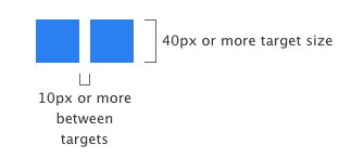
A recent Microsoft IE10 blogpost gave general guidelines for building touch friendly sites suggesting two rules for touch targets:

  • Target size
  • Margin between targets

enter image description here

Apple's iOS guidance only suggests touch target size:

The comfortable minimum size of tappable UI elements is 44 x 44 points.

It seems that the MS guidance for space between touch targets is unnecessary for interaction and will result in blocky interfaces with unnecessary borders - that the "between target" distance will almost always translate to visual margins. If anything it seems to be style guidance.

This blockiness is seen in the WindowsPhone/Metro style.

enter image description here

Is spacing between touch targets an unnecessary recommendation - as long as the touch target is of sufficient size? (for general touch interface guidance, not necessarily Metro specific)

6
  • 6
    Looking at the Metro interface - the spacing is actually a visual requirement rather than a touch requirement: ie if there are two adjacent blue tiles its difficult to judge visually where the touch areas meet.
    – PhillipW
    Commented Jun 30, 2012 at 18:09
  • @PhillipW ...seems like a visual requirement to cover the edge cases at the cost of making everything look like a button - should it even be a visual requirement for touch interfaces? Commented Jun 30, 2012 at 18:29
  • 3
    Surely it's a visual feature. The metro UI uses 'tiles' and simply by definition the tiles need to be separated from each other - just as physical tiles are. I'm not sure I agree that the borders are unnecessary - without them everything would be one big rectangular blob with icons scattered around it.
    – JonW
    Commented Jun 30, 2012 at 18:39
  • @JonW I was not saying borders are unnecessary... just suggesting that the 10px margin between touch targets may not be necessary for general touch interaction (app/desktop/web). Many iOS app touch targets have 1px margin or even none if the interface can stand on its own without "blobifying". Commented Jun 30, 2012 at 18:56
  • @LukeCharde Ah I see, so with Apple if you touch an item you're always activating something but with Metro you can touch between tiles and therefore not trigger any action? You want to know if that touch registered between tiles should still register for one of the items rather than for nothing at all. Am i right?
    – JonW
    Commented Jun 30, 2012 at 19:31

2 Answers 2

10

I have to start off by saying I haven't seen any research one way or the other.

Guideline vs. Requirement

I should note that you're asking if the spacing between the touch targets is an unnecessary requirement, when you reference their guidelines. The difference between these two is pretty key. I believe Microsoft isn't stating you should be required to space your targets that way. They're probably aware each situation is unique. I'm sure the guideline is just that -- a recommendation. I agree that proper spacing is key to their Metro styling, but here it feels separate.

Reasoning Behind Touch Target Separation

The main reason to suggest a minimum distance between touch targets I believe is to prevent users from touching and invoking the incorrect action. This becomes extremely important in scenarios where you have buttons like "Save" and "Cancel" right next to each other. The actions are polar opposites and when you invoke the wrong action, it can be disastrous to your work flow. This is fundamental ergonomics I believe.

As well the recommendation to separate your targets is more significant when the touch targets are at the minimum recommended size (because "near misses" are more likely). The gap is a good guideline for all sizes but it's less likely someone will miss a 200px square than a 44px one. (Thanks to @KitGrose for the excellent point.)

Just think of this site. When I finish writing this, there is a button to post my answer, directly adjacent to a link to discard all my writing. Imagine for a moment both were buttons. The closer the two actions are together, the greater the risk of invoking the wrong action erroneously.

A great example of spacing between buttons being key is a physical keyboard. If all the keys were on one flat service with only a colored border to divide them and no physical barrier or margin, then they wouldn't be as easy to interact with.

Read another example of when touch targets are too close here.

While I would definitely agree that there are other ways to accomplish this through different means of styling, I think Microsoft's guideline is just that: a generalized recommendation based off of research.

Inclusion in Guidelines

In the comments you mention you're wondering if it needs to be part of your guidelines. While I do think spacing between targets is key in some situations, it may not be necessary in others. Therefore if you're writing guidelines (and not requirements), it should be fine to add in, but it should be written as to be a recommendation.
4
  • Thanks... Changed wording from requirement to recommendation. Commented Jun 30, 2012 at 20:50
  • 2
    This is a great answer. The only thing I would add is that the separation recommendation is more valuable/significant when the touch targets are at the minimum recommended size (because "near misses" are more likely). The gap is a good guideline for all sizes but it's less likely someone will miss a 200px square than a 44px one.
    – Kit Grose
    Commented Jul 1, 2012 at 3:23
  • 1
    @KitGrose Thanks for the excellent point. I've updated the answer to include your suggestion.
    – GotDibbs
    Commented Jul 1, 2012 at 15:21
  • @GotDibbs Thanks for the well-thought out answer. I think we'll be going with recommendation of the Microsoft model noting that the necessity of space between targets decreases as the target size increases. Commented Jul 11, 2012 at 14:15
7

I agree with Microsoft, a very good example on iPhone is the music controls available while the screen is locked. I use these a lot in the gym or out for a walk, unfortunately the next/prev and play buttons are small in size and very close together in a small area of the screen. Occasionally I accidentally hit the prev function halfway through a podcast and then I have to find the point I was at via scrubber. If apple have more space between these controls this wouldn't happen so much.

1
  • 1
    Hear, hear! I do that with Audible all the time using the iPhone music controls in the app switcher tray (double tap home and then slide to the left). Drives me nuts!
    – Kit Grose
    Commented Jul 2, 2012 at 1:36

Your Answer

By clicking “Post Your Answer”, you agree to our terms of service and acknowledge you have read our privacy policy.

Not the answer you're looking for? Browse other questions tagged or ask your own question.