For a scenario like this you'd probably need to do some user testing to actually determine the preferred route. From the placement of your "Add New Player" button I would presume that the user is going to be adding editing a lot of player records at a time.
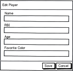
My initial thoughts from an implementation standpoint are that adding/removing or hiding/showing columns in that grid is not going to look smooth in any way. Thus I would avoid going that route and instead have the edit button open a new modal dialog with the additional fields for you to edit.
An example layout of this dialog:

download bmml source – Wireframes created with Balsamiq Mockups
From this dialog you could also add navigation buttons allowing you to edit the next record or add a new record. Realistically though another idea would be to reconsider why you're not showing all the fields in the first place.
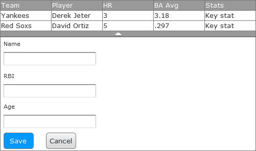
Additionally I would consider placing your Add New Player button on the top left in a toolbar so that it is in a consistent location as the table grows. I would also consider placing the actions on the far left as well.
An example layout of the grid:

download bmml source


