19

Use case

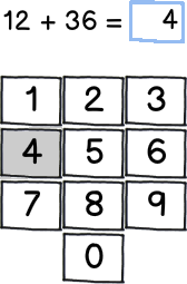
On a mobile device a user is improving her math skills using a native app (Windows Phone). There are many expressions being calculated in a series and the user is trying to get 10 correct answers in a row. Every time the user answers an expression, and the length of the users answer is equal to the length of the expression being calculated, the application compares the expressions answer to the user answer.

mockup

download bmml source – Wireframes created with Balsamiq Mockups

Statement

Not having a submit button in the above described use case is a tradeoff between flow in the application and usability, where a submit button would be appropriate. Not having a submit button makes the flow of answering questions easier since you skip the step of pressing that button. On the other side, a typo would have the consequence of the answer given by the user being wrong (in most cases).

Question

Is it OK to do this tradeoff even if at least one of the usability rules is being violated?


Info: The idea of this question comes from @dnbrv who made this problem obvious to me in his answer to my original question. My original thought was that it would definitely be OK, but I'm not so sure after reading his answer. That's why this question is here. It's also a separate questions since it was suggested on meta.


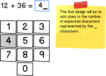
Edit The final design

mockup

download bmml source

5
  • Duplicate of ux.stackexchange.com/questions/16792/… Commented Mar 11, 2012 at 19:13
  • @DannyVarod The mentioned question have other input method (slider) and is limited to calculation only. This question could have other use cases such as entering a PIN code or a social security number. Not a duplicate, only similar. Thanx for the link, I've read those answers as well. Commented Mar 12, 2012 at 3:37
  • 1
    By the way, I have seen no submit buttons on mobile applications such as SPB Brain Evolution. It is a brain training game, and you just keep on entering the sums. :) Anyways, you can find a detailed answer from me below.
    – bhagyas
    Commented Mar 12, 2012 at 4:58
  • @bhagyas I do know of such a mobile app - Alarm Clock Plus (play.google.com/store/apps/…) - an alarm clock with math sums that have to be solved in order to stop the alarm. It does have a submit button and each failure changes question (can be configured). This falls underneath the clause "Calculation has side effects to system" in my answer to the linked question. Commented Mar 12, 2012 at 12:51
  • I did not specify there aren't any apps with a submit button. Please read the comment a little carefully. :)
    – bhagyas
    Commented Mar 13, 2012 at 4:45

6 Answers 6

32

In addition to typo, another consequence is that student may get confused when there is difference between number of digit of her answer vs that of the correct answer.

For example:

74+26. She might type 90, but nothing would happen, because correct answer is 100.

32/0. She might try to type 32, but as soon as she types 3, she'll get an error.

I would lean towards providing a submit button. However, since this is on a mobile device, you can provide an alternate way to submit by letting user just finger-swipe. You can try this on your smart-phone number pad too. The chance to swipe-action false-registering is low, and there's something very satisfying about using finger swipe to get the next question.

6
  • That was my thinking in the original answer.
    – dnbrv
    Commented Mar 11, 2012 at 17:08
  • 2
    If in doubt, add it as an option, and choose the default that you feel is best. Commented Mar 11, 2012 at 22:26
  • 1
    I just realized something: on Windows Phone swiping won't work because it's the gesture reserved to switch between panes within the application. In the video that OP forgot to include here, it's clear that side-swiping switches between exercises (addition, subtraction, multiplication, and division).
    – dnbrv
    Commented Mar 12, 2012 at 17:04
  • Lets say I visualize the number of characters expected, would it then be OK to not have the submit button? This could be done by showing _ _ _ for 3 characters or by showing a label "No of characters left: 3" which would decrement on number entry. Commented Mar 13, 2012 at 6:25
  • 1
    Benny, wouldn't that constitute as providing a hint to user? (especially if you look at the sample problems I listed earlier) Then again, what you're building is a learning tool, and not a standardized test, so I think your proposed remedy is a good trade-off, especially in light of the fact that swiping on Windows Phone might be problematic as per dnbrv's comment. I do prefer "_ _ _" over "No. of characters left".
    – Jung Lee
    Commented Mar 13, 2012 at 14:11
6

In situations like this it's a good idea to compare the two possible negative outcomes to see which has the bigger impact.

Not having a submit means the worst that could happen is that the user has submitted an incorrect answer by mistake, therefore giving them a fail and possibly needing to restart the whole test.

Providing a submits means the worst that can happen is the user has to press one extra button each time they answer a question; potentially 10 extra button clicks.

You really want to annoy the user as little as possible if you want them to use - and continue to use - your product. It only takes one little annoyance to get them to abandon the app all together. Unless your app is both completely unique or gives the user the ability to do something they can't do elsewhere then you need to keep them happy as much as possible or they'll leave it alone and go elsewhere.

3

In my original answer, I've suggested adding 3 buttons: Next question, Submit, and Try again (if the submitted answer is wrong). That bothered me because such a design would be cluttered despite being highly detailed and not requiring much training. I wrote it late at night, not at the prime of my mental capacity, and, as a result, didn't think much of the real-life workflow in such a situation.

Let's have a look a student taking a test on paper:

  • Step 1: Read the question
  • Step 2: Attempt to solve the problem
    • Step 2.1: If the problem is too hard, skip the question
    • Step 2.2: If the problem is solvable, write the answer
  • Step 3: Advance to the next question
  • Repeat steps 1-3 until there're no more questions left
  • Optional: Go back and review all answers
  • Step 4: Submit the test to the teacher

From this workflow, we notice that the student indicates that she's done with the problem by advancing to the next one after either writing or not writing an answer. At the end, she submits the entire tests to the teacher for checking.

The only difference between a real-life test and this software is that the goal of a test is to solve correctly as many of the pre-selected problems as possible and the goal of this app is to solve correctly 10 randomly generated problems in a row. This means that each answer must be submitted separately and checked in real time. So how can we let users submit answers, skip questions, and advance to the next one with the fewest buttons possible?

Rather easily: it all requires just one button that changes its label depending on the content of the answer input box. If there's nothing entered, the button reads Skip & show the next problem. If there's anything entered, the button reads Submit & show the next problem.

The second part of the button label (after ampersand) can also be continue or advance to save horizontal space. If anyone is concerned about using "big words" in an app for children, remember:

  • this is an educational app (no harm if a child learns a new word);
  • it's just one word (there's no frustration for reaching for a parent or a dictionary every step of the way to explain a new word);
  • the label doesn't matter much once the child is used to the application (motor memory for the location of the button that brings the new question trumps vocabulary knowledge).

Now, that we're done with confirming answers, let's take a look at going back to review or correct the wrong ones. This is the tricky part because it's mostly teaching methodology. You need to consult with an expert in the field to figure out which of the two approaches is best:

  1. Emphasizing that 10 correct answers in a row are necessary. To do this, you need to allow users change their answers only before advancing to the next problem, show the correct answer upon advancing to the next problem, and allow users only to review past questions & answers along with the correct ones. The workflow would be

    User writes answer ->
    User taps "Advance" ->
    System flashes a toast "Correct!" / "Incorrect. The answer is x" ->
    User taps the old problem in the list and sees the problem, submitted answer, and the correct answer

  2. Making the interaction resemble real-world experience. This way users will be allowed to go back to a skipped problem or one with an incorrect answer and try to answer it again. In this case, the system notice will be only Correct or Incorrect and the user won't know the answer until she enters it herself. The issue here is that the user may answer 10 questions, of which 2 will be wrong and 1 will be skipped, and then she will go back to those 3 to correct them and achieve the goal. While this workflow will be much closer to the paper test discussed earlier, it may be against the app's goal of teaching to solve math problems on the first attempt.
1

I would say that you should have the submit button there to make it obvious what is going to cause the flow to advance, but there's no reason why you can't automate things if you want.

This has 2 benefits, the first one is that the user understands the flow and will feel comfortable with that visibility, rather than a possible stalemate situation as others have described, but also if there is any issue with the automated step (eg. the JavaScript/AJAX doesn't work for some reason) then there is a fallback plan for the user.

A simple analogy I like to think of in this kind of situation is the design for lifts (US: elevators) which transport people between just 2 floors... it's a kind of binary position, and initial designs had no interface at all because immediately as the doors closed it would go to the only other floor, but from observing users they put in buttons for the 2 floors to give the users a sense of comfort and normality, as without them some users started to panic/worry about not knowing where the button was.

Sometimes giving users what they're expecting is necessary, even if they don't really need to use it.

5
  • This is a native mobile application. There's no space for the scripting to fail in performing the function.
    – dnbrv
    Commented Mar 11, 2012 at 22:14
  • ok. Are you giving continuous feedback, such as "nope, a bit higher"? If you really want to guide the user I would place the correct number of boxes for individual numbers to go in, although this does give quite a big hint for border-cases like the '100' answer if they were going to guess '99'.
    – dsample
    Commented Mar 11, 2012 at 22:24
  • On the mockup you posted I would see at least a couple of spaces I would consider putting either a message or a 'check' button (next to the 0 or below the question) in case the user gets stuck and needs to actively ask what they've done wrong. You could keep the button hidden to begin with, but if they spend too long on the question you could make the helpers appear.
    – dsample
    Commented Mar 11, 2012 at 22:28
  • I'm not the OP. See his previous question (linked in the description) for details about the application.
    – dnbrv
    Commented Mar 11, 2012 at 22:30
  • hey, nice example of placebo design.
    – Erics
    Commented Mar 12, 2012 at 3:32
1

If input text length is known, do I really need a submit button?

-> Yes, you still need it. The only reason is you know the length of the correct answer, but you don't know the length of what the user will enter. And it's that length that counts.

If input text length is fixed, do I really need a submit button?

-> No, here you don't need it. Examples are ATMs, pincode of your sim card, unlock codes etc. In this case you do know the length of what the user will enter.

3
  • 1
    Even with fixed-length input, automatic submission makes it harder to correct typos. Of course, with PIN entry, noticing and correcting typos is pretty difficult anyway, since, for security reasons, the user typically can't see their input. Still, you have my +1 for getting straight to the core of the issue. Commented Mar 12, 2012 at 16:11
  • BTW, my personal experience is that the typical practice for PIN entry has changed. Back in the late 80s and early 90s, most ATMs around here (pretty much nothing else used PINs back then) would accept a 4-digit PIN without any extra keypresses, but nowadays just about everything from ATMs to cellphones to door locks require you to press OK or Enter or # after the PIN. This might be related to the fact that, AFAIK, most such devices nowadays support longer PINs, even if those are rarely used. Commented Mar 12, 2012 at 16:22
  • IT depends from system to system and country to country. When I'm on holiday in France and want to buy something I have to press "VAL" (which is the french equivalent of OK). Of course, since I'm not used to do that I always forget, it takes about 10-20 seconds for the cashier to realize I forgot to press that green button. Commented Mar 13, 2012 at 7:31
1

If you want the short version of the answer, just skip the first section. Else, read on.


Looking into the background of this problem, this depends on where you apply and how you apply it. For an example, if you are designing an Automated Teller Machine (ATM) most of them would not require a Submit button when you are entering the Personal Identification Number (PIN). This makes the process fast, and users often try to memorize the PIN as it provides a faster way to access the system. Keep in mind that at this time, the machine is only expecting a single operation.

It often can be a pleasant user experience if you provide the ability to clear incorrect inputs at the time of entering text.

Additional enhancements can include progressive visual indications of the input against the expected input.


Some brain training games on mobile devices such as SPB Brain Evolution, do not require pressing a submit button at the levels where you need to calculate and enter the sums. The user just keeps entering the values till s/he gets it right and the exercise automatically moves on when the correct amount is entered. A clear button is provided which removes the last entered character / number.

2
  • Thank you for this answer. I thought I was alone in my view that the submit button was unnecessary. Maybe I need to improve and let the user know how many characters are expected, though?! Commented Mar 12, 2012 at 7:19
  • Yes, you can simply use a fixed length font and a fixed size input in that case. Else you can use a placeholder which would show the number of characters expected. :)
    – bhagyas
    Commented Mar 12, 2012 at 7:48

Your Answer

By clicking “Post Your Answer”, you agree to our terms of service and acknowledge you have read our privacy policy.

Not the answer you're looking for? Browse other questions tagged or ask your own question.