0

I'm a newbie. I have got a wire frame for ipad application, in which navigation bar and tool bars are placed on the top. And back button is placed in toolbar. Whether it violates apple's guidelines or will it be approved by apple for itunes store. Also one screen have toolbar like a navigation bar. Will it be a problem in approval?

After navigating to second view
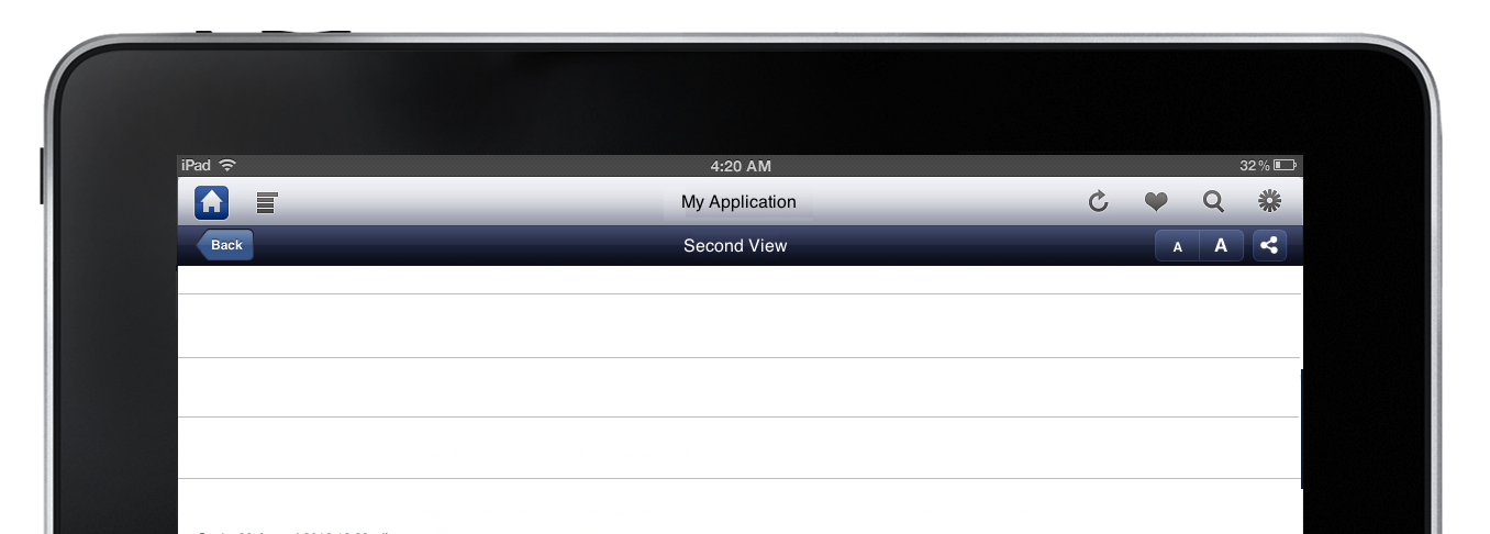
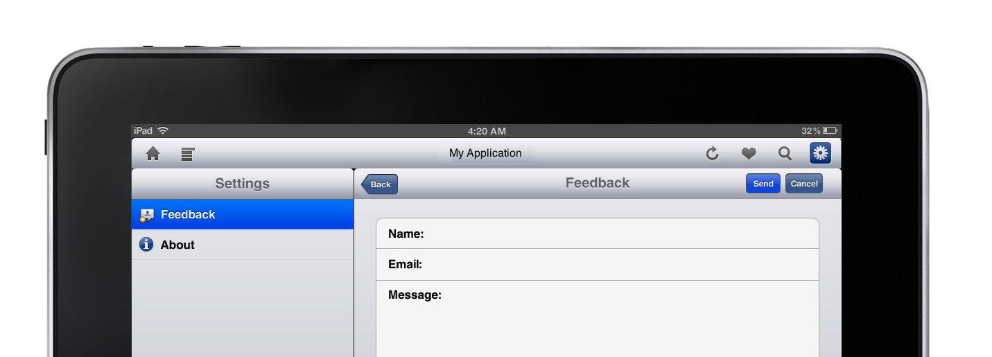
enter image description here

3
  • 3
    You're essentially asking people to check the guidelines for you-are you able to check the guidelines yourself (or look at how successful apps have addressed the problem) and come back with something more concrete?
    – Peter
    Commented Feb 10, 2012 at 8:15
  • Im a newbie. I checked guidelines. I couldn't find anything mentioned abt back buttons should not be in toolbar. But normally most application used back button in navigation bar. So asked for confirmation from experts.
    – Rocky24
    Commented Feb 10, 2012 at 10:01
  • We can't tell you whether Apple will approve anything; we can help tell you if a design decision makes sense but only Apple decides yes or no, and following guidelines isn't the only thing that matters to them. Guidelines are a great way to get a small developer's app approved but often very well done apps ignore some specific guidelines where appropriate.
    – Zelda
    Commented Feb 12, 2012 at 0:28

2 Answers 2

1

There's no way to know without seeing what the app looks like. Further, "violating Apple's guidelines" isn't a black and white thing; plenty of apps decide not to implement exact controls as recommened by the guidelines (which is why they're called guidelines) and have successful launches.

In other words: no, it probably won't be a problem unless you've designed something particularly terrible. However, if you have to ask, I recommend sticking to the guidelines - they're there for many reasons, one of which is "prevent newbies from making mistakes by putting controls in the wrong place".

Even then I can't really help you without seeing what the wireframe looks like.

1
  • Thanks for the tip. I have uploaded the wireframe. Pls take look at it.
    – Rocky24
    Commented Feb 10, 2012 at 11:15
0

As Rahul has said, it's hard to predict what Apple will approve/deny. However, you have 3 huge issues in the wireframe that stay in the way of good experience:

  1. Information organization: do controls need to be separated into 2 bars (especially in the first sample where share is in a different set than "favorite"/heart)? Do users expect the controls you have in the top bar to be up there and not on the bottom of the screen? Do users need to have a dedicated "Home" button? Why are controls split into left and right groups?
  2. Spacing between buttons: In the first sample, the two bars have the bare minimum of vertical spacing between them and the font size and the share buttons are too close horizontally to each other to be used comfortably regardless of user's finger sizes.
  3. Design consistency: why is the lower bar changing color and height?
0

Your Answer

By clicking “Post Your Answer”, you agree to our terms of service and acknowledge you have read our privacy policy.

Not the answer you're looking for? Browse other questions tagged or ask your own question.