13

I'm working on an apparently simple interface: 2 input fields right above a series of action buttons. Each button represents a different way to perform the same task (for example wizard, upload a document, etc…). When the page is loaded, all options would have the same visual design, but depending on user's input one of them would be "suggested" (maybe highlighting it or greying out the other ones).

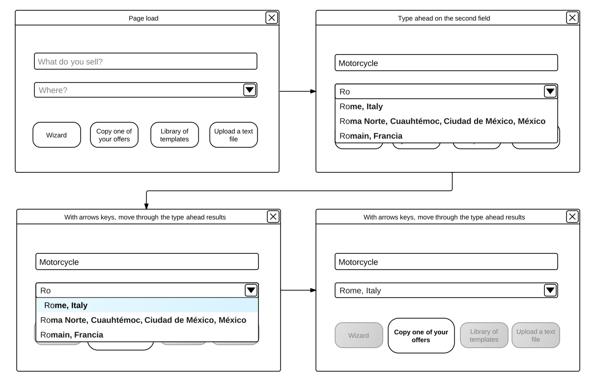
My problem is: both fields have a type ahead, so when you start typing in the second field, the type ahead results will cover the action buttons, and when you select one of these results, you won't even see the state change of the buttons. I cannot delete the buttons and just show the suggested one after user's input because, even if one option is suggested, each option should always be available from the first moment.

How would you avoid this "hover and cover" problem? I won't move the buttons too far from the other fields, it seems to me that too much distance makes you lose the relations between the elements

I've prepared a little wireframe to show you my case:
enter image description here

2
  • 1
    Does it matter? The user can dismiss the dropdown, and see the buttons again... Commented Jan 25, 2012 at 19:32
  • @mvicidomini: If we've answered your question, you can select the best solution so that if anyone comes across the same problem in the future, they know the course of action.
    – dnbrv
    Commented Feb 7, 2012 at 18:45

2 Answers 2

1

Can you have the type ahead dropdown push the buttons down below it while it is active and slide them back up when it retracts? This might give you an opportunity to add some nice subtle personality to the form with the animation.

2
  • This would also mean limitate the number of items in the type ahead menu, but that's something we should do anyway, so I think I'll try your idea. Thanks! Commented Jan 25, 2012 at 19:32
  • 1
    If you go this way, you should expand the lower field on focus and keep that size until the field loses focus. This way there'll be fewer visual distractions than if it would resize dynamically.
    – dnbrv
    Commented Jan 25, 2012 at 20:22
9

You are looking at this problem from the wrong angle. Right now, you're asking, "How can I make it behave the way I envisioned it?". However, you should be asking, "Does it behave the way my users think and work?".

Here's a user story based on the content of your wireframe:

Paolo from Rome wants to sell his old motorcycle. He comes to your site and is greeted with that 2-field form. He answers the first question: "motorcycle". Then he answers the second question: "Rome, Italy". As he confirms the location, he notices that buttons have changed and one of them is bigger than others.

Question: what is the most important thing on Paolo's mind right now? It's not that he hasn't seen buttons changing as he was typing. It's not that he's wondering how the buttons will change if he enters something different in the location field (he lives in Rome and it's a valid choice, after all). He's concerned with why the buttons have changed and whether he can proceed in a way that isn't recommended.

Thus, the quickest fix to the problem is to explain what the highlight is and tell the user that they can choose any other option, too.

Though, I think you need to review your entire process flow (not even the wireframes) and to determine what relationships (if any) there are between the inputs and the suggested actions. Chances are you'll just rearrange the steps.

If your wireframes aren't hypothetical but a real interaction from your application, you definitely have designed the process incorrectly because the item to be sold and the location have nothing to do with how to post the listing. In fact, the 2 questions you ask in the form should be a part of the process once the user selects how to proceed with the posting. Thus, you should first present users with the 4 options and then ask them for details.

8
  • Hi, the wireframes are hypothetical, anyway you're right, an explaining message is necessary. Thanks! Commented Jan 25, 2012 at 19:30
  • 2
    Excellent answer, this is really carefully considered and very thought provoking.
    – DigiKev
    Commented Jan 25, 2012 at 19:33
  • By the way, the message should be on top of the window and should read along the lines of "Please answer the questions below to see the recommended next step".
    – dnbrv
    Commented Jan 25, 2012 at 19:34
  • 1
    "As he confirms the location, he notices that buttons have changed" ... here is where the user story goes wrong. There's research showing that changes which occur behind an cover don't always get noticed once the cover is removed. Search for the phrase "change blindness"
    – Erics
    Commented Jan 26, 2012 at 1:18
  • 1
    @dnbrv: that would be more a case of "noticing one button is more emphasised than the others", and not noticing the change itself. A good point though, since the it's the bigness of the button that is intended to drive the user choice, and not any ephemeral animation between the normal and big sizes. Indeed, it's entirely possible that the user doesn't even realise that the bigger button was once smaller ... and it doesn't matter if they don't.
    – Erics
    Commented Jan 26, 2012 at 1:59

Your Answer

By clicking “Post Your Answer”, you agree to our terms of service and acknowledge you have read our privacy policy.

Not the answer you're looking for? Browse other questions tagged or ask your own question.