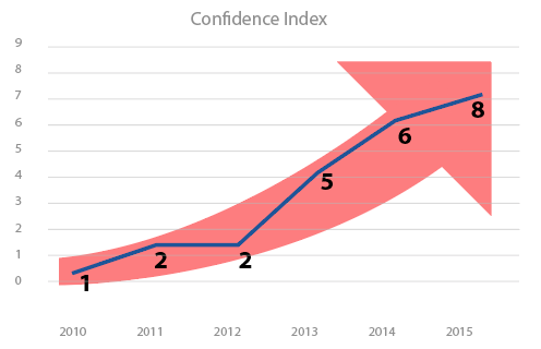
Let's say there is some Confidence Ranking - i.e. Consumer Confidence Ranking.
| Year | Rank |
|---|---|
| 2010 | 1 |
| 2011 | 2 |
| 2012 | 2 |
| 2013 | 5 |
| 2014 | 7 |
| 2015 | 8 |
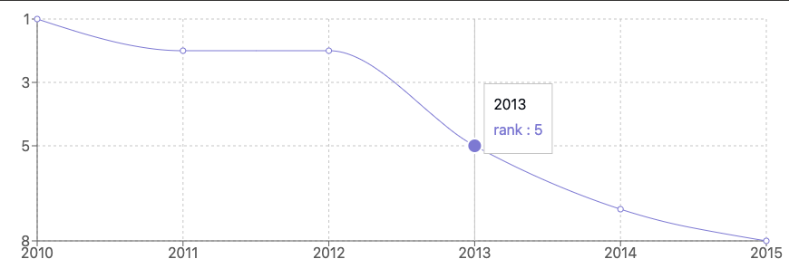
The rank is going down - i.e consumer confidence is going down - i.e. it's bad.
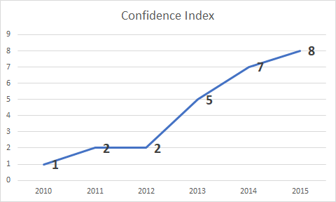
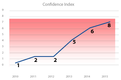
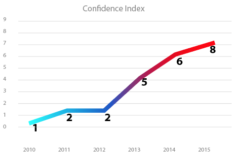
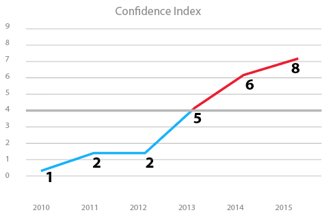
If I make a chart from this, it would look like this.
But in general, going up in a chart gives the perception of something good happening.
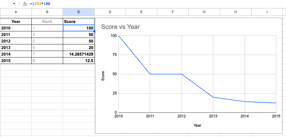
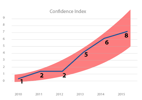
Is there a better way (other than labelling etc) to present this infographic?

